Our featured designs on this week’s Friday Focus put the paper motif to good use once more, focusing on its creases and folds. Not just in the corners and as borders, but as a way to demarcate sections of content at a time.
Designs of the Week

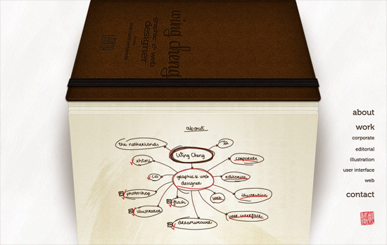
The entire site, except for the fixed navigation on the bottom right, is presented in an accordion-type notebook with all the text and graphics done in the designer’s own handwriting, contact form included. It’s only when you click on the images that you get the actual version of the logos. There are tradeoffs of course: legibility, seeing the real logos without having to click anything, accessibility, and so on.

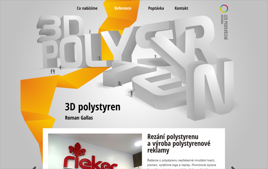
I always enjoy a good “power line” and this one, although yellow and chunky looking against the huge 3D header, is not distracting but a welcome trail all the way down. The text blocks are a bit long and heavy though.

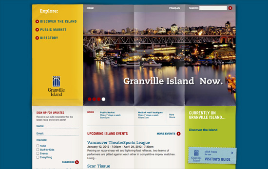
Love the worn quality to the background paper, like an opened and laid out map. Color block is also hot right now! Also, in the top left menu there’s a small “you are here” sign, again reinforcing the travel theme.

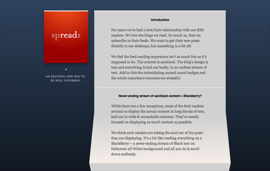
Another accordion sheet of paper, except this time the folds aren’t equal heights. Love the pop of read against the blue, which gradients into pitch black when you reach the bottom of the page. Also interesting is the decision to put a screenshot of the app nowhere above the fold, with introductory paragraphs coming first.
Build on DIYThemes’ Thesis Framework for rock solid SEO and great layout customization options.
Social Media Weekly
Programming – Light Table – a new IDE concept
“We need to be able to move things around, keep clutter down, and bring information to the foreground in the places we need it most.”
Design – Startups, this is how design works.
“This handy guide will help you understand design and provide resources to help you find awesome design talent.”
CSS, Tables – A #CSS grid system for tables, for you
“A neat way of aligning the columns in tables up with each other — a table grid system of sorts.”
Pagelines lets you build WordPress websites and it’s as easy as drag and drop, go check it out!
