I almost titled this post “5 Hot Color Trends for the Web”, but the truth is that I’ve never really considered myself “trendy”- and I’m not sure if trends are something we designers should give much importance to. With design- especially web design- we want to innovate, whether it’s a new spin on a vintage look or a modern design sitting on the cutting-est of edges.
If, like me, you spend an inordinately large amount of time over at COLOURlovers, you’ve probably seen some of these color palettes, which I’ve chosen as my current favorites, color combos that give me inspiration. Let’s hope they do the same for you:
Golden Yellow Sunset
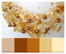
I love finding inspiration in objects handmade from natural materials. This color combination is based on a necklace at Etsy made of Amber and Citrine chips and freshwater pearls. A lovely, light and summery color palette.
Dive Into Color
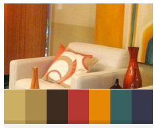
Everyone likes to talk about “embracing color” in design- but the truth is, putting a variety of colors together without coming up with something garish or circusy can be difficult. This combo, inspired by a room on HGTV is colorful in a comfortable way.
Kimberley and Luke
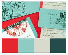
My husband and I designed (and printed!) our own wedding invitations ten years ago, and it’s always great to see other designer couples get creative. This color combination from Kimberley and Luke’s wedding invitation was obviously well thought-out, where “JCrew meets Pomegranate meets Tiffany’s”. Gorgeous.
Lubitel

If you haven’t discovered the Wear Palettes website yet, go. It’s one of my favorite bookmarks, offering up inspiration in way of street fashion, celebrity style, and plants. This one, based on the ultra-simple “jeans, jacket, scarf, gloves”, is a lovely neutral color combination.
Superawesome
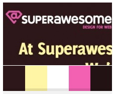
Anyone who knows my work knows I have a penchant for muted, monochromatic color combos. I’m not proud of this, and am always struggling to incorporate brighter hues into my designs. Superawesome’s use of bright colors is simple yet genius- it doesn’t blind you, but it does make you feel good. And isn’t that what color is all about?
Where do you find color inspiration?
