If you’re looking for something to go good with your Sunday breakfast, stop by Devlounge and have a look at the updated homepage. As promised, it was time to trash all of the extra stuff and put more focus on our articles. I still have some things to add (just a few more things to the sidebar on the right), and I’m still trying to determine the best amount of articles to have on the front page (more or less than right now…what do you think?). Let me know what you think of the change.
Friday Focus #44
What an extremely slow week! I apologize for a severe lack of new material this week. My first week back at school, and it just takes a little while to get back into the swing of things. Without any more delaying, let’s just right into things this week since this is the only new material coming out of camp Devlounge.
Sites of the Week
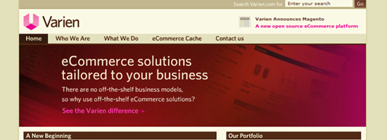
Leading off week 44 is Varien. I’m loving the color scheme here, the site is very clean as well. The layout is nothing over the top or ground breaking, but it gets the job done and serves the purpose just fine.
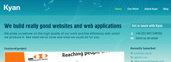
Second is Kyan. I really like how it goes from blue to green, obviously representing the sky and the ground. And their Carbon Logic project looks pretty damn nice.
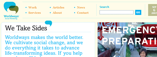
And finally this week is Worldways. The reason this one makes the list is because of how clean it is. Sometimes I just love how things are laid out, and this is one of those cases.
Digg / Design Float Weekly
Design – Web 2.0 Layer Styles
A bunch of Photoshop layer styles, with a bunch of gradients for you web 2.0 nuts. A time saver? Maybe for some of you.
Programming – 17 WordPress Plugins for AdSense
A Mashable article pointing out 17 WordPress plugins to help with displaying Google AdSense ads in WordPress.
Changes, Changes
You may have read it last week about the suggested changes that were on the way to Devlounge. Plain and simple, I’m removing all the bloat and putting 90% of the focus on what it should be on – the content. I feel right now, a lot of it falls by the way side. Currently if you land on the homepage for the first time, it can be difficult to navigate, and chances are you’ll end up clicking on content from somewhere else than from Devlounge, because there is so much more of it on the page. The homepage will be split into two columns, with a column on the right containing ads, recent interview photos (like they are displayed now but without the iframe), and some other goodies. The left column will feature someone between 5-10 articles, in large excerpt form leading to the actual full length articles. This should increase circulation of all of our content, which is always helpful, especially right now because I’m swamped with school stuff, upcoming SAT’s, college essays and applications, and a lot of other stuff that is going to be occupying most of my time. It should make it to the stage in a few weeks or less.
Saturday Slice (FF #43)
Late edition Friday Focus this week, and of course, it is all my fault. Please forgive me for a rare “Saturday” edition of the focus. Yesterday was my first day back at school, and after the seemingly forever when-the-hell-is-this-going-to-end day was over, I was out the rest of the night until early this morning. So no surprise I didn’t do any writing. The irony about the whole thing was all week I planned on writing about how helpful scheduling posts can be when a situation like this arises (like I knew it would), but I never even got a chance to write that one. Watch for it next week sometime. Anyways, enough talk. It’s Saturday Slice.
Sites of the Week
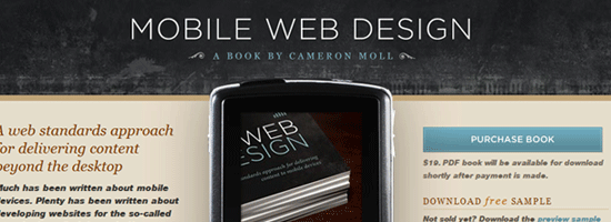
Kicking things off this week is Mobile Web Design, the store front page for Cameron Moll’s book on that exact topic. It was designed by 31Three. My favorite little feature is how you can actually use the More and Back buttons to look at some screenshots.
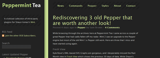
Next up is Peppermint Tea. The “official” repository for Mint Peppers. The design was recently updated, and has a much more “dark mint” appearance to it.
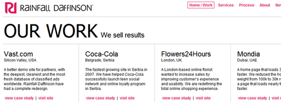
Rounding out this weeks Friday Saturday Focus is Rainfall Daffinson. A grid based portfolio layout, similar to Particles gives way to a nice collection of design work. Check them out.
Digg / Design Float Weekly
Design – Ultimate Web Development Cheat Sheets
Large collection of development “cheat sheets” in categories such as Javascript, CSS, Xhtml/Html, and Ajax.
Programming – Ruby on Rails vs PHP
The only top item in Programming for the last seven days. So here it is, a RoR vs PHP commercial.
Some Changes in Store
We are nearing the 300k unique visitor mark. Once we hit it, there will be some new and improved things in store for us here at Devlounge. The more people that come here, the faster we launch some of the new stuff and updates. I’ve been testing some of this stuff on the newest WordPress [beta] version, 2.3, and the site has been functioning just fine, which is only good news as we get ready to make some changes. Watch for them soon!
Have you advertised with us?
Without trying to sound too selfish, I thought I’d like to point out that we have a bunch of open slots right now for your advertising pleasure. This include 1 homepage slot and 2 sidebar slots. Be sure to visit our advertising page if you are interested.
That is it for this weekend. Enjoy it everyone!
Friday Focus #42
Issue number 42. Exactly 10 weeks to go until we hit a year. Enjoy the weekend everyone!
Sites of the Week
Leading off this weeks top three is Kineda. How many times are we going to feature this place? I believe this is the third time Kineda has made the list, but every redesign looks cleaner and cleaner. I wish the Devlounge homepage was arranged like this, as I think it is very effective and helps tremendously with exposing a lot more content to the visitor. It gives me ideas, but as I said, I’m not redesigning this anymore – I’ve done enough of that already.

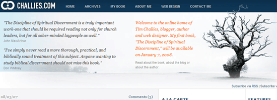
Next up is Challies. Another refreshingly clean magazine / portal style layout featuring lots of blues. Three columns and fairly polished up.
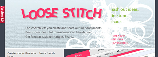
Wrapping up this week is Loose Stitch, an outlining app. It looks like the application interface itself is pretty clean, so I think I’ll be taking a look at this some time over the coming days.
Design Float / Digg Weekly
Design – A CSS Styled Table Version 2
Another great tutorial from Veerle. Nice and detailed, and comes with a clean final result (of course).
Programming – Image Browser Controls
Another tutorial, this time from Pup Image on the common right / left arrow controls found on a lot of images theres day when shown as a gallery / slide show.
Other News
Earlier this week I released Particles, our newest WordPress theme. As I mentioned, its lightweighty-ness (not really a word) makes it a great theme to build upon. If you didn’t believe me, check out this screenshot from a blog we’ve been watching via our refer logs that has been building off of the Particles theme to make a web gallery. Obviously, it is still a work in progress, but it’s only been a few days.
Inspiration from Within School Walls
It approaches. The humidity takes a slight drop for a few days, and you can feel a refreshing feeling in the air. The leaves on the trees are still green, but a small portion fall to the ground and dry up. August is drawing to a close and September is coming. Another school year is upon us.
Many, if not most of you are way beyond this point. But for me, my final year of high school looms just a few short weeks away. The last few weeks of summer always seem to play with you – you know as days go by you are getting closer and closer to the start of a new school year, which puts a damper on the “fun” the last couple weeks of summer should really be about. Time is quickly running out, and before you know it, the 10 weeks of summer have vanished.
As soon as the school doors bust open, my motivation to do much design work usually seems to slam shut. Especially early on, that first month always seems to be a motivational killer. School requires a major refocus of time and effort, meaning books and school work take the forefront and Photoshop begins to collect dust.
Up until last year, it was that very reason which usually led me to take very few clients over the course of a school year. I usually did most of my client work in the summer, and let it take the back seat once fall hit. But beginning in my junior year, the on and off periods flip flopped. Last year, I found myself gathering ideas all day long, in various forms, while sitting in the back of a classroom. Pens, pencils, and pads are good for a lot of things.
The truth is, you don’t need a fancy to do list application or Photoshop in front of you to get your ideas down and out there in the open. I spent a lot of time throughout last year using the back pages in notebooks to draw up ideas for new sites, client work, and just about anything else I could think of. I’d sketch out design concepts (including some of the ones that later became versions of Devlounge), and label different sections with numbers, including notes on what I planned to fill each section with and how I could get it to work. Then, whenever I got the chance, I’d go into Photoshop and create rough mockups of my sketches and save them, so that even if I didn’t end up putting them to use, I’d have the ideas stored up for future work or projects. It turned out to be a fairly productive method, which explains why I took more clients last year during my “busiest” year of high school.
So my advice to you high school or early college kids who are still trying to become the best designer possible – don’t let school get in the way of your creativity. Of course set your priorities in the right order, but when you have time for it and ideas come to you, write them down! Whether it’s with words or pictures, it can really help you learn by storing all your concepts somewhere you have easy access to them. Here’s what I recommend:
- Extra Notebook – Score an extra notebook specifically for random things, such as sketches and notes. When you finish your work and your sitting there with nothing to do, rather than trying to sneak your iPod up through your sweatshirt so no one notices, take out your “design notebook” and start brainstorming. Get all your ideas down on paper.
- Don’t throw away any of your failed concepts. At the end of the year it will do you great justice to have a compiled notebook of failed and accepted designs. You can see what worked and what didn’t, and hey, you might actually learn something from yourself.
- Learn from usability mistakes right in front of your face. You’d be surprised, but you can pick up a lot of usability details from objects you use everyday. If you have a recently published text book, compare it to that old one from 1960 in the corner of the room. You’ll notice most books these days are much more clear cut; they draw attention to the important things and fill the pages with a lot more useful information then back in the day. Your likely to see just a bunch of jumbled text in the 1960 edition of the same book, but a lot more whitespace and vibrant colors to draw attention to details in newer editions.