New Ad Formats for Blogs Sneaking Out
When monetizing a blog most people tend to put up a bunch of 125×125 pixel ads, something of an unofficial standard. I believe this is Michael Arrington’s doing, the relaunched version of TechCrunch (which we’re seeing an updated iteration of today) introduced this in a wider scale, at least to me, and bloggers happily jumped on the bandwagon.
The concept is sound, 125×125 pixel ads aren’t obtrusive, they’re small, lightweight, but still gets the message out there.
Problem is, when putting 8 or even 10 of these in a two column layout you’ll get a cluttered block that looks worse than a set of larger ads would.
The New Format?
But maybe there’s a new format in town to gain ground. The GigaOm network runs 300×100 pixel ads in their sidebars, which looks clean compared to the 125×125 pixel ones found on TechCrunch.

While I think 300×100 pixels is a pretty decent size, design-wise, I believe it is better to look at what default sizes are being offered and sold by ad networks. The closest one is the not so common 250×120 pixels, the half square ad (being 250×250 pixel, or sometimes 250×240 pixels, hence the “half” part). This is an ad that works well in sidebars as well, without being to obtrusive.
Incidentally, both these ad formats (300×100 pixels and 250×120 pixels) offer the advertiser a total of 30,000 pixels to work with.
The Future of Blog Ads
With blogs being more like traditional websites, we’ll see more traditional ad formats. That’s the good thing with the 125×125 pixel ads, there are several mainstream ad networks (such as Google Adsense) that will offer this size, whereas 300×100 pixels is something of an in-house creation from Giga Omni Media. I do think that 300×100 pixels is a better aspect than 250×120 pixels, but when running the latter I’ve been able to get media agencies to push out ads on my site, rather than having to have the one odd ad spot breaking my design.
Big shot blogs are already running traditional ad sizes, just look at the Gawker (Lifehacker, Gizmodo and more) and Weblogs Inc. (Engadget, TUAW and more) blogs out there. This is because they reach a mainstream audience (as opposed to the TechCrunch ones, for instance), and that mainstream advertisers used to the traditional ad formats.
Both the TechCrunch and the GigaOm network are running traditional ad spots as well, with the leaderboard ad (728×90 pixels, “the new banner” size) being the most common ground here. They are also running squares, like the 300×250 pixel ad found in GigaOm’s sidebar, and the 160×600 pixel skyscraper ad on TechCrunch.
What’s Your Poison?
Think about this when you design the ad spots for your next blog.
- Is your crowd mainstream? If yes, look to traditional ad format.
- Is your crowd very much web 2.0 new media-ish? Then you won’t go wrong with either, and might even get away with a custom size if your readership is enough to get the advertisers to do custom ads just for you.
- Is your crowd the same as the blogosphere itself? Then stick to your 125×125 pixel ads for now, but be at the ready!
What ad sizes do you prefer, and why?
Quick and Dirty Security Fixes Every Online Publisher Should Use
Having your site hacked is not a fun thing, I can tell you that. You might think that no one would want to hack your site, why should they? You’re wrong! Bots and scripts attack randomly, and chances are they’ve been sniffing your site already. And you know what, one of the reason for this is the amount of publishing platforms, such as WordPress or Drupal, available out there. That makes it easy for hackers to analyze the code, and find vulnerabilities. Likewise, it makes it easy for would be online publishers to get things going quick and easy.
There are a lot of things you can do to at least make it harder for these nasty things. Here are some tips.
#1: You’re Not Done Just Because the Site is Up
make sure that you won’t miss a security release
Congratulations, you installed your content management system of choice! Good for you, now get cracking on that content, will you?
Wait! Before you get carried away and forget all about the code behind the system that powers your amazing site, you need to make sure you’ve got a solid upgrade policy. And by that I mean you need to sign up for newsletters, RSS feeds from development blogs, bookmark sites, and so on, to make sure that you won’t miss a security release.
Take WordPress for example. A lot of blogs are insecure because the operators aren’t upgrading to the latest version. This goes for all online code, be it forums or pretty simple scripts. If there’s a security issue, you need to fix it. Usually that means staying up to date with the latest software, so do that!
#2: The Plugins, Extensions, Addons…
It’s not just the actual content management system that needs to be updated whenever there’s a new version released, the same goes for plugins, extensions, addons, or whatever they’re calling the extra features for your particular poison. Think about it, you’ve got this plugin that does things with your database, probably somewhat regulated, but still a vulnerability enough to make things difficult for you should it be exploited.
As a rule, keep your plugins up to date, and don’t use more than you have to. Actually, it might be a good idea to delete the ones not in use.
#3: The Username and Password Thing
The importance of a good password should be pretty obvious to us all. Don’t use a word, use both letters and numbers, use some caps, add special characters, make it at least 8 characters long… Easy tips. Today, most web apps have analyzers that look at your password and tell you if it is a strong or weak one. You should probably take that to heart.
everyone knows that every install will create this master account
However, there’s another thing here. Your username is right there in the open, after some installs. When you installed your content management system, you probably got an admin account created. That account’s username might be admin, root, master, god, or something like that. Login, create a new account with full privileges, and delete the created admin account! Why? Because everyone knows that every install will create this master account, called admin, root, god etc. – and that means that anyone who wants to hack your site already know the username to an account with full access, now they just have to hack the password.
Don’t make it easier to hack than it already is. And make sure that the privileges of accounts match what they need to do. For instance, the user who writes all the blog posts is pretty public, so don’t give it full admin access, just what you need to write, publish, and edit posts. Sure, you’ll have to login with another account whenever you want to change settings, but it is worth it.
#4: Add Security Stuff
You need to find out if your content management system of choice have any particular brilliant security features that could make life harder for hackers. Like the secret key in wp-config.php for WordPress, for instance.
This will be different from system to system, so read up!
#5: Move the System Core from Public View
consider moving the core files outside the public folders
I’m surprised that not more online platforms doesn’t do this by default. Your content management system’s core files is the ones that power the whole shebang. Without them, the site just won’t work, and that also means that if someone hack them, you’re in trouble.
First of all, consider moving the core files outside the public folders on the server. You won’t be able to move the admin interface of course, you’ll need to access that online, publicly, but the other core files might not need to be in the public folder. This makes it a little harder to mess with them, which is a good thing.
However, not all systems allow this. One solution is to put the core files in a different folder than it usually is, which won’t make it invisible online or anything, but people just surfing known URL:s won’t find it without some hassle. Not too much hassle though, this is something that is pretty easy to figure out, so don’t rely on it too much.
I hope these tips will help you make your site a little more secure. Do you have some tips of your own, or perhaps experience gained by being hacked? Then by all means share them in the comments.
CSS: Infoboxes and Pullquotes
This is an unofficial follow-up to my previous post, titled CSS: Fun With Floating in the Grid. We’ll be using some of the same mentality to make floating elements in your design, like pullquotes and boxes containing interesting facts, something I tend to call infoboxes.
Why Would I Want to Do That?
The idea with floating elements containing information or content is simple: It eases up the design. Let’s say you’ve got a mammoth bulk of text, a truly smashing article, but it’s really a heavy piece with lots and lots of text. There might not be any obvious images or illustrations to ease it up either, what to do, what to do?
So essentially, the idea is to make the design more appealing.
Simple! Use pullquotes, something magazines are really good at. They’re taking quotes from the text, and floats it to the left or right, to break the flow and add some much needed space.
Informational boxes, often containing interesting facts relevant to the content, is another way to do the same thing.
So essentially, the idea is to make the design more appealing. That’s why you’d wanna do that!
Pullquotes
You’ve probably noticed that we use pullquotes here on Devlounge. You can make your own, and add to your site, without much hassle. I suggest that you base it on the blockquote tag, which seems fitting. However, should you be running a blog, then it might clash with your present blockquote styling.
We’ll solve that by adding a class called pullquote. Here’s the code:
[html]
blockquote.pullquoteleft { float:left; margin: 5px 15px 15px 0; }
blockquote.pullquoteright { float:right; margin: 5px 0 15px 15px; }
[/html]
So should you want to have a pullquote to the right, you’ll use this code:
[html]
this is my pullquote
[/html]
Simple, yeah? Naturally, if you want your pullquotes to be styled differently from your blockquotes, you’ll have to edit that.
Infoboxes is Just More of the Same
As you might understand by now, infoboxes are just more of the same. We’ll use a div with a particular class, to float a box to the left or right.
[html]
div.infoboxleft { float:left; margin: 5px 15px 15px 0; padding: 10px; background: #eee; }
div.infoboxright { float:right; margin: 5px 0 15px 15px; padding: 10px; background: #eee; }
div.infoboxright h3 { margin: 0 0 10px 0; padding: 0; font-size: 14px; color: #333; }
div.infoboxright p { color: #666; font-size: 12px; }
[/html]
This is a very simple box, just a grey one with the same font etc. you’re already using. Naturally, you’ll want to complete this one with some styling that works well with your design. However, this is how you use it:
[html]
This is my headline
Here’s my paragraph. I can have several.
See?
[/html]
I recommend using a different font for the content of the infoboxes, as well as using a stronger color for h3 than the actual type (managed with the p of course).
Trimming Down the Code
A quick note to wrap this up! If you really are using the ideas from the previous CSS post, then you can trim down the code for these elements a bit. Since that post wants you to have global classes for floating elements to the left and right, then you can skip the float:left; and float: right; parts, of course.
CSS: Fun With Floating in the Grid
Sometimes for bigger design projects that will need to be pretty flexible, I tend to use several CSS classes to make it easy to maintain from a design and layout perspective in the long run. If you’re a fan of grid-like design, this is most certainly things for you to consider.
Flexible Floating
To make it easier to position elements in a design, from actual content areas (like columns and sidebars), to images and boxes, I employ a set of CSS classes that can be mixed together easily enough.
The core of these classes are:
[html]
.left { float:left; }
.right { float:right; }
.frame { border: 1px solid #aaa; padding: 5px; }
[/html]
This means that any element I’ve given the left class will float to the left. If I add the frame class, it will get a grey 1 pixel border, with some padding between the content and the actual border, to make it look better.
Now, to make sure that images get the necessary spacing to the left or right when being floated, I also add these additional classes:
[html]
img.left { margin: 0 15px 15px 0; }
img.right { margin: 0 0 15px 15px; }
[/html]
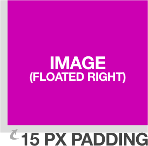
This will make sure that images floated to the left will get a 15 pixel spacing to the wrapping text to the right, and below. The same goes for images floated right, but to the left and below of course.
So how would this work?
[html]

[/html]
This image will float right, with a suitable spacing to the wrapping text. Well, let’s add a border to it to make it look better:
[html]

[/html]
 I just add
 frame to the class attribute to make this happen, not hard at all. In fact, I have in the explanatory image to the right just here.
The really nifty thing, however, is that I can use the classes left and right anywhere, which can be convenient.
If you’re a WordPress theme developer then you might want to add the classes alignright and alignleft to your CSS declarations. These are the default classes used by WordPress’ image uploader/inserter, so it might be a good idea to support them.
Practical Layout Uses
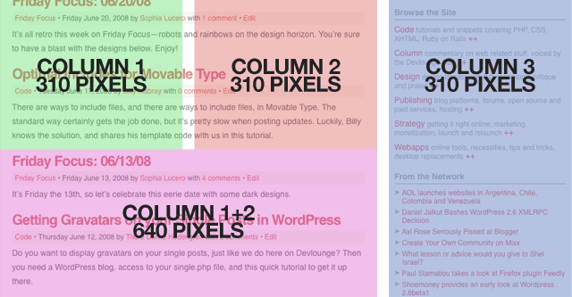
Nothing fancy so far, right? Well, as I said, by doing it this way, I can easily arrange my layout as well. Let’s say I have this 970 pixel wide design, following the grid with three columns of 310 pixels each. You might recognize the concept, it’s the new Devlounge design. What I do is that I define the column, like this:
[html]
.column { width: 310px; }
[/html]
No float or anything. I can also add a wide column, spanning over two columns (310×2=620 pixels), and add the spacing I have between each column in the design, being 20 pixels, bringing it to a total of 640 pixels.
[html]
.widecolumn { width: 640px; }
[/html]
So let’s have a wide (double) column to the left, and a single column to the right. Simple:
[html]
[/html]
For clarity’s sake, here’s an overview of the Devlounge layout, with the columns marked:

It can be convenient to keep the float attributes free of the actual content containers. As you remember, the classes left and right are global stuff that I can pull out whenever I want.
The whole current Devlounge design is built like this, using columns and separate classes as much as I could. I could optimize it a lot more (and I am, whenever I have time), but this suited this build.
Do you use this technique, and if not, why not? Share your thoughts in the comments!

