This week we’re featuring designs that use buildings to represent parts of their site’s navigation. Does this interaction design technique make browsing around more effective? Let’s find out.
Designs of the Week
Create unique, extraordinary websites with Squarespace. No experience necessary!
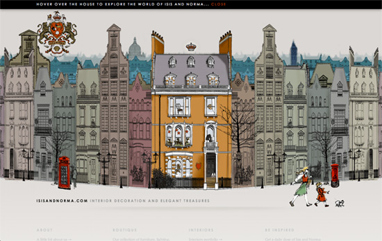
The buildings at the top are layered and move with the parallax effect as your mouse cursor does. They also appear in a bottom up transition when you load the page, somewhat alluding to a structures being built from the ground up. I like the illustration style on this site—it’s a mix between chic and homey.
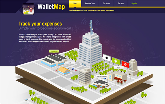
Nice isometric graphic going on here. It’s great how they represented each idea in the context of that space but I would’ve liked to see more interactivity with the illustrations (feels like that’s a minimum these days). It could even be an evolving landscape in one page.
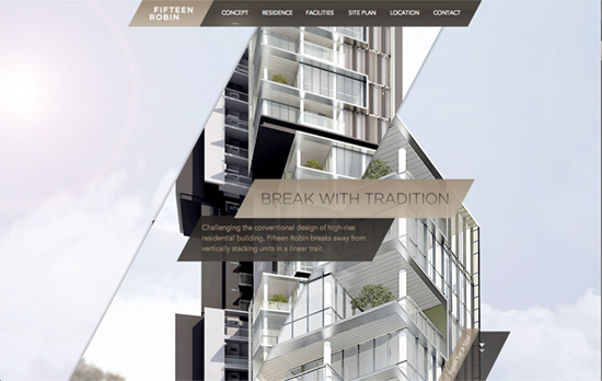
Cool interaction from the top of the building to the bottom triggered by scrolling down: text slide in from left and right, images are uncovered with parallelogram masks, the same boxes for the content areas. Overall a very sleek look.
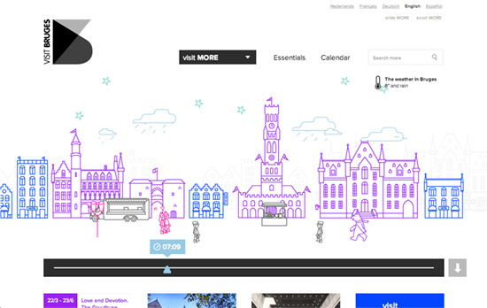
Here’s a time-sensitive landscape which you can also control. The featured landmarks change by hour, showing the visitor appropriate things they might want to check out at that time, or one can scrub through the possibilities in the horizontal slider. If you want a more organized way of navigating, use the dropdown at the top or scroll further down, and see the spots color-coded by category (including “Romance”).
Social Media Weekly
Build on DIYThemes’ Thesis Framework for rock solid SEO and great layout customization options.
Typography – Narrowing the Field: How To Bring Great Type Into Focus
“Choosing type is an exercise in understanding your subject and interpreting its meaning in a visual form. To paraphrase Robert Bringhurst: typography exists to honor the subject. Arriving at an appropriate choice depends on balancing how a typeface feels with how it functions.”
Design, Typography – Reconciling SVG and Icon Fonts
“I’ll explain how to set up a powerful design workflow, going from Sketch (my new favorite SVG editing app), all the way to the browser as Icon Fonts, all automated.”
Web Design – Common Patterns in Styleguides, Boilerplates and Pattern Libraries
“I thought there’d be more overlap between frameworks than there is. I recorded over 160 distinct patterns, none of them ubiquitous.”
