With a new year it is time to give my personal weblog an update. First I just wanted to re-align my current design, but once I opened Photoshop I decided to start from scratch. I bought Pictos font a while ago and I downloaded a free font from The League of Movable Type. If you follow my postings you know I’m a fan of minimalism.
I decided to check out current weblog designs to get some ideas on what to design. I almost never visit the websites, I read their entries in my feed reader. But once in a while I will check out all the weblogs just for the design.
I appreciate simple designs and intricate ones. Personally I prefer a simple and clean look for websites I have to look at everyday. I think if Facebook was heavy on graphics I would get a headache, no matter how well designed. In any case, people don’t visit the actual weblog everyday, only when there is new content, so going all out with the design isn’t an issue.
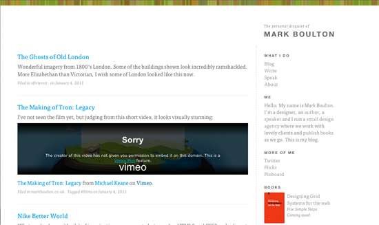
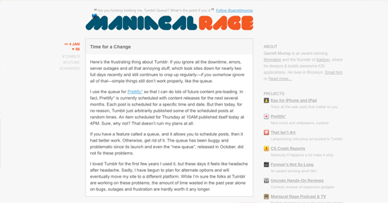
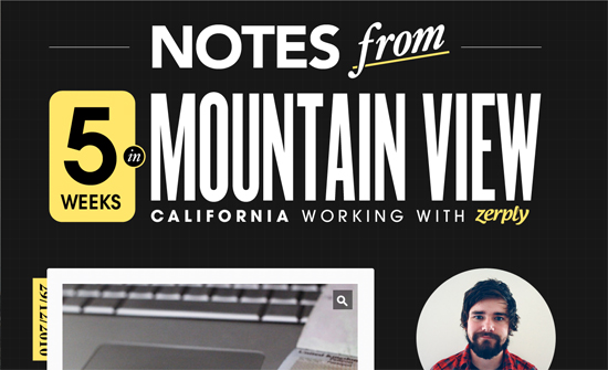
From the mass of weblogs I chose nine, four minimalist and five with graphics. You’ll see Mr. Boulton’s website, which is very minimalist but makes good use of typography, which is what he is known for. I have always been a fan of Garret Murray’s minimalist designs for his weblog and he also makes killer iPhone apps.
If you know beautiful designed weblogs that aren’t mainstream, especially minimalist ones, do share with us!
Minimalist
Mark Boulton
Garrett Murray
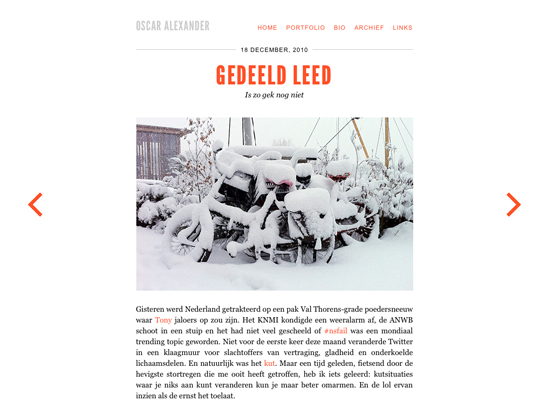
Oscar Alexander
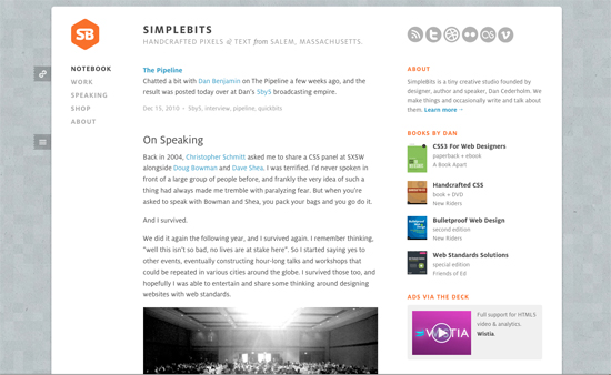
Dan Cederholm
Graphic Galore
Lukes Beard
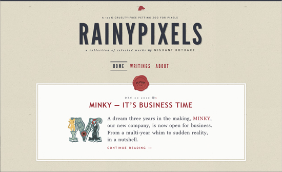
Nishant Kothary
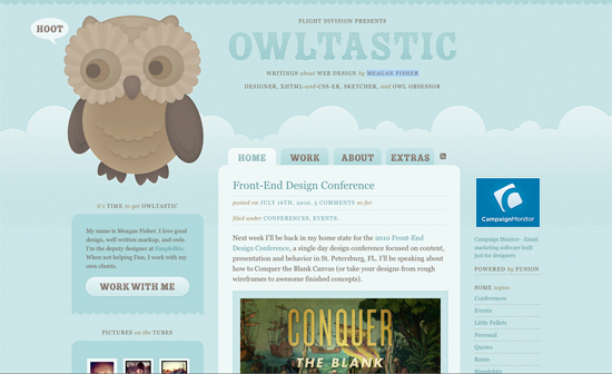
Meagan Fisher
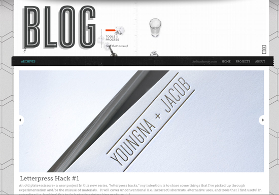
Kelli Anderson
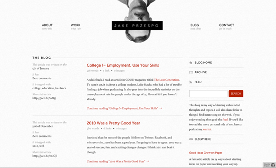
Jake Przespo
