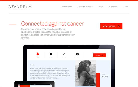
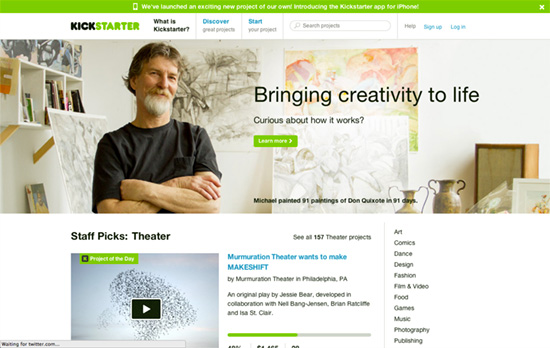
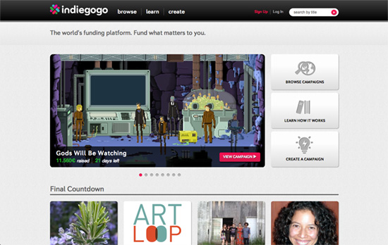
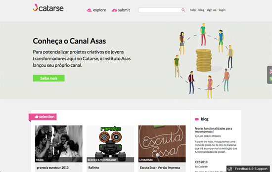
These designs make quite the statement with their almost exclusive use of bold red: logo, photographic tint, background, text color, you name it.
Designs of the Week
Create unique, extraordinary websites with Squarespace. No experience necessary!
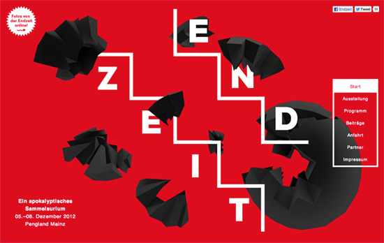
The first screenful serves as the header and branding of the event in animated form: the black shapes move around in 3-dimensional space when you move your mouse around the area (in a couple of lower sections you’ll see some of those fragments again). To the right is a fixed menu for all the sections which turns red when you reach the next screenful. The map is also colored red, and so are the partner logos.
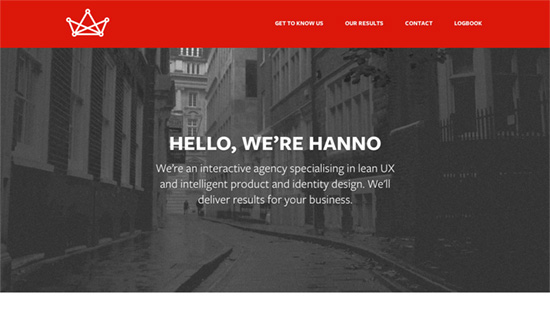
This site’s look is a combination of grayed out photographs with crisp copy as page headers (except for the Logbook section), minimal icon work and subtly shadowed boxes, and that primary color. For the icons, they used a shade of orangey red with blue accents as palette.
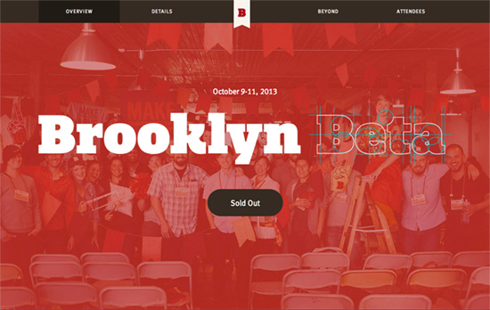
On this site isn’t as bold and ubiquitous as the rest, but it’s there in memorable amounts and places. Mixed in are hues of off-white, brown, and cyan, while graphic elements make use of old-style illustrations and and event photographs.
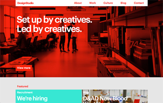
Red figures largely in what we know today as the Swiss Style or the International Typographic Style, and you can see a homage to it here right alongside the use of Helvetica. What’s interesting is a lot of the text are actually in that same bright shade of red as other elements. The bold choices don’t stop there, and you can see lots of brightly-colored boxed areas and content laid out to product maximum impact.
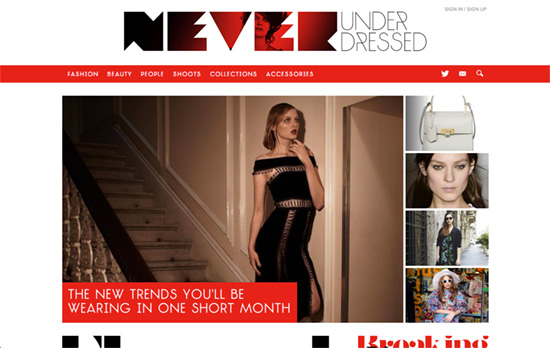
First off: it’s interesting to see an animated gif for a logo; might be distracting for some but I personally like it. As you scroll down the menu below it, which uses mega dropdowns, goes fixed. There are a lot of geometric touches to the design: hexagon buttons and photo collages, triangles, slanted hover transitions, and even that back to top button. For gallery / slideshow content, the layout shifts to a more immersive layout, while all being responsive.
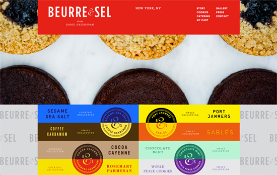
What I really appreciate about this design is the integration between the product, the packaging, and the overall brand. You’ve got great beauty shots of the cookies in the slideshow header, which are echoed right below in the boxes: the photo of the cookies are cropped so you only see half circles, and seal for each flavor is cut like so. Then for every two rows of flavors, you can see the top and bottom halves of the seal combined, then everything is mixed in contrasting colors just like the packaging. It’s thoughtful and playful at the same time.
Social Media Weekly
Get solid WordPress themes, plugins, and web design training from iThemes.
Typography – Brewing a Better Workflow
“A type-first approach isn’t just for new websites and major revamps. By experimenting with new tools and workflows, the team at mStoner has been working out ways to focus on type no matter the project scale or starting point.”
Web Design – Meet Me in the Browser
“Start deciding in the browser by building from mockups, where form follows function and real content leads the way.”
User Experience – Your app makes me fat
“Help them conserve and manage their scarce, precious, easily-depleted cognitive resources for what really matters.”
