A few years ago, WebKit resurrected the ability to style browser scrollbars the way Internet Explorer first did. These days customizing the scrollbar is still not as rampant or recommended, since it’s not that advisable to mess with behavior that users are already used to, but featured below are sites that went ahead anyway. Some of them have pretty striking results.
Designs of the Week
Build on DIYThemes’ Thesis Framework for rock solid SEO and great layout customization options.

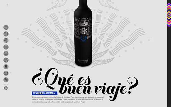
The most fabulous and colorful custom scrollbar I’ve seen, designed to match the festive and tribal-themed illustrations on the page, from the vertical navigation on the left to the social icons in the footer. I like that they added hummingbirds that flap their wings as you scroll down; an animation concept used on Andrew McCarthy’s site featured here. Even the slider and gallery are atypical, framing photos in diamond-shaped containers.

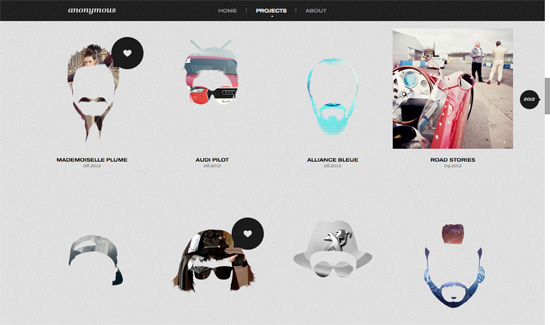
I love the use of different head silhouettes as masks against their portfolio images to drive home the “anonymous” concept. Instead of the usual grid of boxes they made it quirky and interesting. Scrolling through the projects section you see the scrollbar a bubble label with the year they were made, which I think is a clever and functional way of customizing it. Lastly: check out the way the form fields were arranged on the About/Contact part.

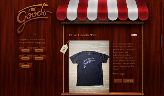
The poster boy for interface realism and fine attention to detail. I love myself some minimalist, “flat” designs but I don’t find this “skeuomorphic” look outdated at all. The different kinds of woodgrain, the sliding out drawers on the sidebar, and the shelves connected by ropes, the price tags punching holes into the product images—they all point to a special creativity that comes with this kind of design, and it’s still a delightful experience to have.

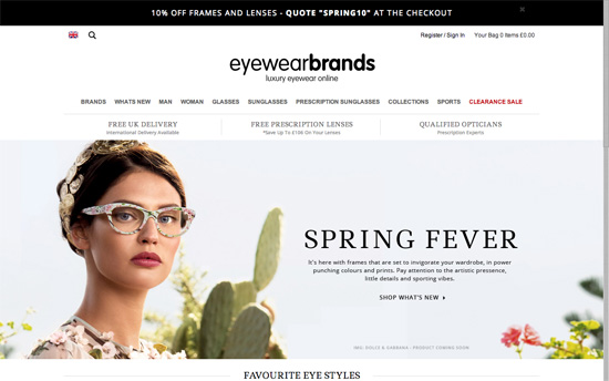
More conservative design compared to the others on this list, although there’s some artsy illustrations found within its pages. One notable interaction pattern here is dimming out the rest of the page when one hovers over the top mega dropdown menu.
Social Media Weekly
Get solid WordPress themes, plugins, and web design training from iThemes.
Web Design – Style guide links
“As a follow up to my article on A List Apart I thought I would put together a list of links that have been extremely helpful to me as I’ve thought about style guides.”
Design – Inside Monument Valley: How ‘Impossible’ Sketches Became An Amazing Game
“Wong cracked open his sketchbooks to give Cult of Mac readers a glimpse at how Monument Valley‘s breathtaking designs came to be.”
Interaction Design – Motion Ui Design Principles
“These basic principles I’ve outlined focus more on the what and why, rather than the how to of motion / animation. With the increasing emphasis on motion (largely thanks to the more paired back design of iOS 7) its important that it is implemented with the same integrity and purpose as all the other aspects of Ui design.”
