• Home
  • About
  • Contact
  • Advertise

Devlounge

Design, Develop, and Grow

  • Home
  • Code
  • Design
  • Design Focus
  • Interviews
  • Publishing
  • Strategy
  • Webapps
  • Extras

Friday Focus 10/22/10: Beautiful Data

October 22, 2010 By Sophia Lucero

Pie charts and graphs have never looked sexier with their integration into these websites. It’s beautiful data visualizations on this week’s Friday Focus.

Designs of the Week

Daytum

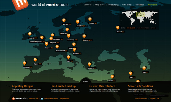
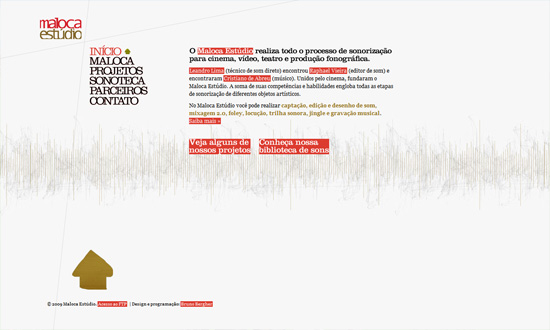
This could look a little light for some but I think it’s got enough contrast and keeps the jumble of numbers and figures pristine. The notecard style boxes looks great, and it’s also the logo of the site.

Swedish Podge 2010

Pure eyecandy. The only way this site could get any better is if the charts were interactive.

Nosotros

The gray against the white text is hard to read, but it’s effective with the rainbow graphs.

Bermon Painter

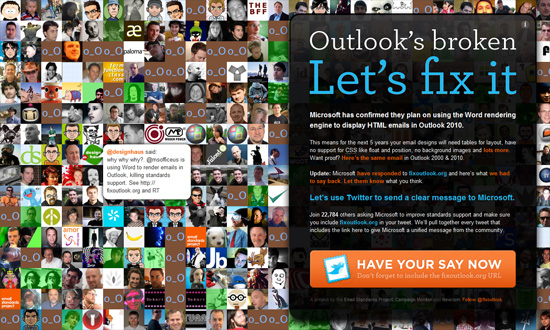
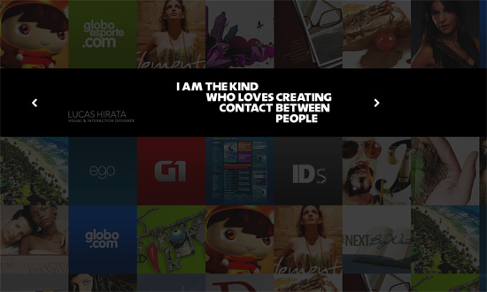
A little disappointed that even the text is part of the image, but it’s clear that more designers are translating summaries of their resumes and skill sets into graphs like this.

Coffee by Week, 2009

Barely designed, but the concept of using pictures to illustrate the bar graph is great.

Joey Lomanto

Another rainbow chart, but looks more decorative than a real graph, which isn’t really an issue if that’s the goal anyway.

Sofasurfer

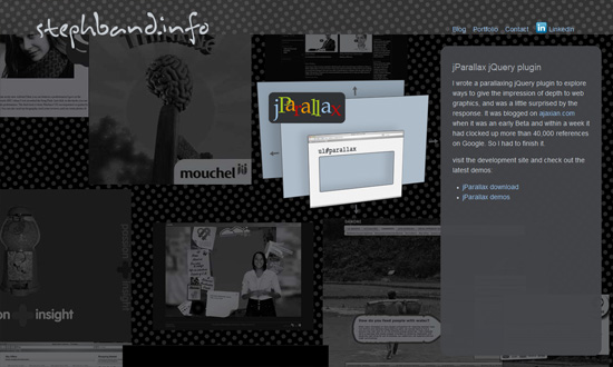
Similar look, similarly decorative, but great inspiration for developing a particular style in data visualization.

Social Media Weekly

Design – Welcome to the Era of Creative Meritocracy
“Without creative meritocracy, we suffer because our talent and hard work aren’t enough to land the job. Clients suffer because they receive inferior work. Moreover, our industries and society suffer from mediocrity.”

CSS – Why we don’t have a parent selector
“On a seemingly regular basis, I see this discussion come up as to whether CSS should have a particular feature like the parent selector and while I haven’t worked on a browser engine, I have my theories.”

HTML, JavaScript Semantic Markup or Death? Part I
“Despite the title, this post is actually mostly about JavaScript, or more specifically, the relationship between JavaScript and HTML.”

Friday Focus 06/26/09: Interactive Backgrounds

June 26, 2009 By Sophia Lucero

Backgrounds are so called for a reason. They’re meant to support and complement instead of attract and distract. This week’s featured sites, however, provide a whole other level of interactivity and usefulness to backgrounds. You decide if they’re a good idea or not. Either way, they’re interesting concepts that can only be executed on the Web, so, enjoy!

Designs of the Week

Information visualization

World of Merix Studio

Showing clients/web resources/cities on a world map as a background is brilliant. I don’t think it’s been done this way before. If the movement gets too annoying, you can stop it with a click. The “worldwide” concept carries over to the Time Zones section, which shows both the current time in your area and theirs, as well as how long before their office closes—what a sensitive little idea!

Fix Outlook

Lots of Twitter-related sites that pull tweets on a certain topic are mostly text-based and don’t usually create a wall of avatars with random popup tweets in the background. When new tweets arrive, the avatars shift right as new ones appear. And as for the foreground? Good typography, contrast, colors, and use of icon. Another well-done one-page site.

Parallax effect

Milk

Flash-based, but definitely well done.

CSSSquirrel

Bright, fun illustration-based design. Fluid width too.

Maloca Estudio

I like that the parallax effect works whenever your mouse moves. The background is light and subtle enough to not be distracting.

Navigation

Alexey Abramov

The foreground and background fuse on the homepage, but when since the inner sections are loaded in a lightbox, you can still click on what is now the background. Anyway, very cute design elements, including the tilt-shift effect for the photographic background. And don’t you love the paper boat on the river? The greatness is in the details!

Lucas Hirata

I love what the copy says, which at the same time serves as the navigation to the inner sections of the site. And the background is literally made up of the designer’s portfolio. And it looks good!

Stephen Band

This effect might give some people a headache. But I like that the objects in the background can be any size or type—image, video, Flash animation, screenshot, poster, etc.

Siebennull

This one’s got more design elements for a polaroid photo collection metaphor, shadows and all. Not pictured: the designer’s latest tweet and an anti-IE6 disclaimer. One more thing about this effect: it works regardless of browser width.

Social Media Weekly

Applications, Workflow – One Day in the Life of a Web Designer
Great twofold guide for discovering helpful apps and formulating an effective routine for professional designers.

Design – 27 Must-Have Starter Kits For Web Designers
You don’t always have to start from scratch; you don’t have to reinvent the wheel.

Programming – How to properly “speak” HTM language
A nice little tutorial on HTML semantics.

« Previous Page

Code & Tutorials

Which Front-End Development Languages Will Grow in 2017?

Your Guide to Leveraging APIs as a Developer

Bitcoin Processing Website Integration For Web Developers

Website Security For 2016 That All Developers Need To Know

5 Reasons You Need to Be Using jQuery

About Devlounge

Want to read more about Devlounge, or maybe you want to contact us, or even advertise? Oh, and don't forget to subscribe to updates!

The Best of Devlounge

4 Tips to Personalize E-Commerce Websites

Search