This week’s Friday Focus will inspire you to think out of the box. Get ready!
Designs of the Week
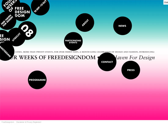
I like the use of the scattered black circles as the main feature of this design. Though I would suggest being able to distinguish the clickables over the non-clickables. Another good thing about this site is that they included an HTML-only format for those who don’t want the zaniness.
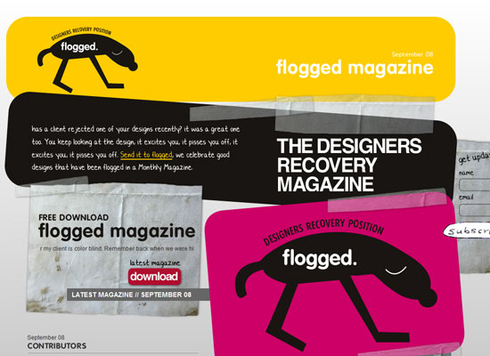
Technically, you can still make out boxes in the different areas of this design, but the graphics just break out of them. Minus points for using the <marquee> tag, but it somehow contributes to the quirkiness of the site.
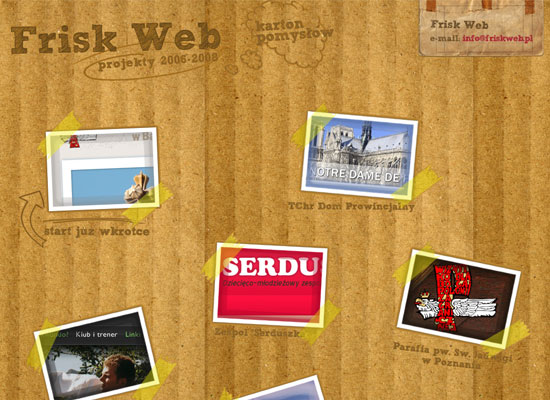
The implementation of this look is just excellent. And it doesn’t take much to scatter all the images throughout the whole page. Inside it gets a little more organized, which is fine, but I wish the sticky tape was retained for more consistency.
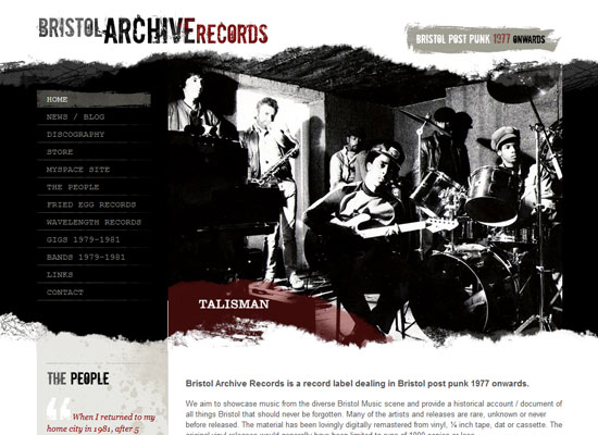
Grunge is practically commonplace these days, but sites like these remind us it’s not just about the “dirt”, but how that dirt plays into the basic structure of a web page. It can eradicate the boxiness and make an impression at the same time.
Social Media Weekly
Design – 20 Creative and Inspiring Free Design Magazines
Another great source of inspiration: magazines. Grab a ton of them for free!
Programming – Understanding Disabilities when Designing a Website
Some very thoughtful tips on making sure your sites is friendly enough for users with disabilities.
