At the heart of all designs and websites are words, and these featured ones for the week take extra care to make the most pertinent words on the page the stars. They’re broken down and transformed into graphic elements of their own.
Designs of the Week
Need help in promoting your site? INeedHits has been in the search engine marketing since 1996!
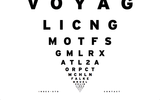
This layout reminds me of the eye chart at the ophthalmologist, except prepare to be blown away by the zooming in effect that occurs when you scroll down—making it look like inverted version of Star Wars scrolling narration. Each line contains 5 letters, sometimes abbreviated, as project label, and hovering over it shows a grainy, grayscale icon. On the project page, sites are framed with Chrome browser windows (designers usually favor in OS X Safari) and scattered around. Clicking on one image draws up a larger version, but not before blanking out the other images and putting x marks over them.
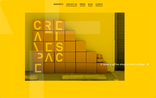
Except for the blog and some accent images, this design is done in yellow, black, and white—a yellow background that is, which is a very strong look. The homepage and manifesto is an example of non-linear scrolling, and you can see their logo’s letters also distributed in a much larger scale in the background. The sentence by sentence message is also overlaid on live, clickable snippets of the other pages. The blog page is an equally interesting study: there’s a drop-down menu for the category list set in very large, uppercase, yellow type. Search also appears in a similar way. Post images occupy majority of the width on the left, but are also arranged dynamically.
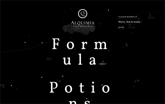
There are astrology and alchemy motifs to this design, with the parallax starfield interacting with your mouse movement and the map design in the background, as well as the labels for the different sections and the chemical elements-style naming for their team members. The loading bar at the bottom of the page, a pattern YouTube also does, is a nice feature.
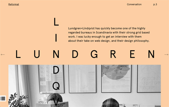
This zine uses varying pastel colors as backgrounds, stark black text and spaced out lettering, a bordered homepage / table of contents with various symbols, and playful headlines.
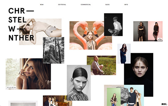
This is like the third site in this list that has taken to arranging images outside of a grid and more like a collage.
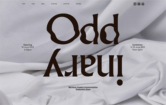
Clever effect with the title. The navigation has even tinier text than the last, reaching uncomfortable to read levels. I would also have preferred a smooth scrolling for those anchor links to fit the parallaxed background.
Social Media Weekly
Get solid WordPress themes, plugins, and even design training from iThemes.
Business – Job Titles in the Web Industry
“Since they are out there and we use them, there should be some consistency to their definition. Perhaps we can get closer to nailing that down.”
User Interface Design – 3 Parts of Good Visual Interface Design
“If all are satisfied, we arrive at work of the best degree. If only one or two are satisfied then the work will be mediocre.”


