These websites use maps to illuminate information or as a primary motif in their designs.
Designs of the Week
Ready to go out and design your next website? Try building with the Catalyst Framework.

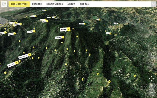
Not flat, but a three-dimensional map traversing the different regions of Mount Tamalpais.

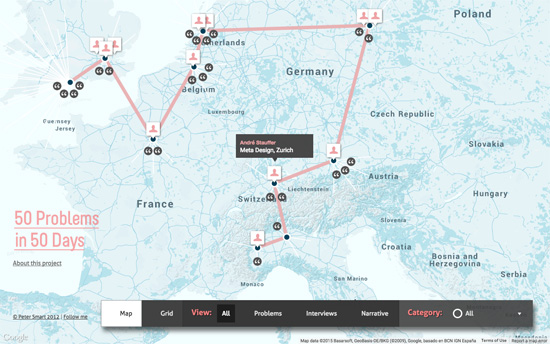
Not a literal map of designers, but a portfolio of one. Map elements like lines and icons are animated and used as markers.

The logo is oriented and cleverly spins like a compass. Also as your pointer moves around the background map, the coordiantes on the lower left update.

It’s always cool to present location-based stories on a map, and here you also have the option of viewing them in a neater grid layout.

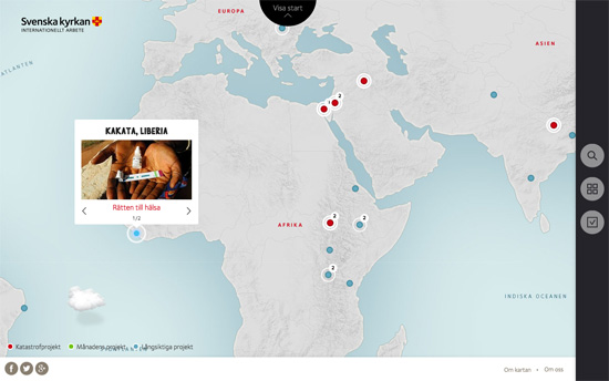
This one also has a side drawer with filter and list views, and I like the subtly pulsing effect on the circular markers and the popup animation with the photos.

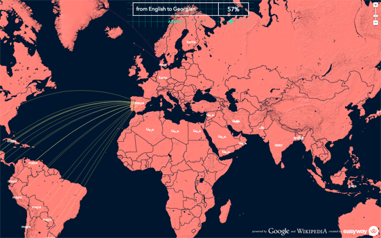
Not only is this a great idea for an informative map, but you can also see how a word is adopted from one country to others.
Social Media Weekly
Get solid WordPress themes, plugins, and even design training from iThemes.
Email Web Design – Using Images in HTML Email
“ALT text should be baked into your image tags, at least for most images in an email.”
JavaScript – Interview: The Future of Web Animation with Julian Shapiro
“The higher we can push animations to perform — across all browsers and devices — the sooner the slick motion design commonly found in mobile apps will exist without compromise on the Web.”
Mobile Web Design – Why ‘Mobile First’ May Already Be Outdated
“Only tracking someone on a “mobile device” is an incomplete picture and will result in poor targeting of messages and ads.”
JavaScript – Replacing jQuery with D3
“Although D3 has powerful features like its selectors or an ajax wrapper already built-in, we are often times missing some jQuery functions in our D3 projects. That’s why we will show some approaches on how you can replace jQuery by only using D3.”
