Tick is an upcoming web 2.0 app with a different flair. Once again, it’s another tracker, but this time, it helps you manage time. In an exclusive insiders look at the current pre-release version, we’ll let you know if Tick has a future as a successful web app, or if it should be swept away in the web 2.0 craze.
The Interface
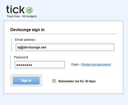
Upon joining Tick (currently invite only, lucky for me being the admin of a site like this, I get into all this private previews ;)), I was immediately greeted with a beautiful looking login screen. It was just a sample of what was to come.

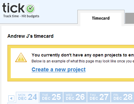
Logging in took all but a few seconds, before I was greeted with a web 2.0 app familiar dashboard. The three main dashboard tabs included timecard, projects, and reporting. The initial login view lands you under “Timecard”, with a faded away background to represent what the page would look like if you had something there yet (37signals like).

Creating a project
It took me a few minutes to have a look around the interface and figure out what was what. Once I was settled, I took the advice given on the homepage view and created a new project.
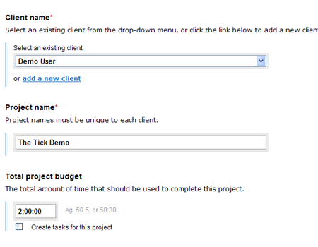
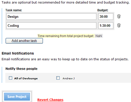
I was presented with a “Create New Project” screen, with a few options such as Client Name, Project Name, Total Project Budget (time, not money), and Email Notifications. Once again, Tick allows you to have multiple users included in a project, so you can notify them of updates and deadlines.

From the project screen you could also add Tasks, using some simple javascript slider / dropdown effects, the task menu appears, allowing you to add individual tasks and assign amounts of time to work on them.


