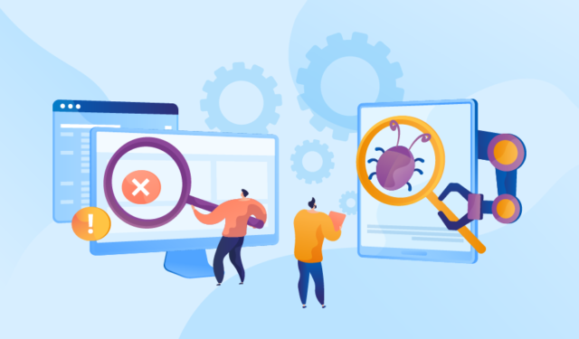
It’s no secret that the business world is rapidly changing. With the advent of AI and other technological advances, businesses must adapt to stay afloat. One such adaptation is the increased use of AI testing software and the automatic means to look for errors in computer systems. While some businesses may be hesitant to make the switch, there are many benefits to be had from utilizing this technology. In this article, we’ll discuss some of the benefits of using artificial intelligence and automatically testing software, so consider why more businesses should be doing it.
Improving Quality
One of the main benefits of automatic software testing is that it can help improve a product’s quality. This is because AI-powered testing can find defects and errors that humans may not be able to see. In addition, automatic testing can help improve a product’s consistency, as AI is not subject to the same human limitations (such as tiredness, distraction, etc.) that can impact manual testing.
There are many distractions in life, but automation has meant that a machine approach can be used that eliminates these distractions by focussing on the task at hand and reducing errors. When looking for software errors, they are less likely to be missed.
Saving Time and Money
Another benefit of automatic software testing is that it can save businesses time and money. This is because AI-powered testing can be done much faster than manual testing and can be done without needing a large team of testers. In addition, automatic testing can help reduce the amount of time spent on reworking products with defects or errors.
We can think of AI software testers as the equivalent of another member of staff and more. Once bought and invested in, they can continue to check for software errors in multiple systems. It is very time-consuming to even now contemplate the old way when businesses are so reliant on not just one computer but a whole network of them all using software to run them.
Increased Efficiency
In addition to saving businesses time and money, automatic software testing can also help increase a business’s efficiency. This is because AI-powered testing can help to streamline the testing process, making it more efficient and effective. In addition, automatic testing can help improve communication between businesses and their customers, as AI can provide clear and concise feedback.
We cannot afford to be anything less than efficient with anything our business involves. This is from the processes within to what the customer sees. With the amount of competition out there, it is vital to stay several steps ahead. We can achieve that by using AI more than someone else is and always as much as possible.
Improved Customer satisfaction
Finally, automatic software testing can also help to improve customer satisfaction. This is because AI-powered testing can help ensure that products are of the highest quality and meet customer expectations.
Every business should be customer-focused in the way it is run. Speeding its processes and being more efficient is one way to achieve this. The software we continue to use must be error-free, run like clockwork, and be secure to give customers the desire and confidence to use it to make their transactions.
Overall, there are many benefits to be had from automatically testing software. Businesses that are hesitant to make the switch should consider doing so, as it can save them much effort, time, and money and increase the quality of their products.