• Home
  • About
  • Contact
  • Advertise

Devlounge

Design, Develop, and Grow

ateşli sevgilisi fantezisini yaşamak istediğini söyler porno ona arkadaşları varken onunla gizli saklı seks yapmak istediğini sikiş söyleyen kız hafta sonu için gelen arkadaşının görmediği bir sikiş açıdan sakso çekmeye başlayınca adamın yarağını bu altyazılı porno şekilde indiremez ve açık şekilde salonda sikişimeye sex izle başladıklarında misafir kızı da bu sekslerine rokettube konuk ederler seks yapacağını düşünmeyerek onun sex izle oyun oynadığını zanneder sabah olur ve herkes uyanır hd porno bu sırada yanında şişme mankenini de getiren sapık erotik hikayeler genç sınav haftası ders çalışan genç adam üvey annesinin sikiş eve gelmesiyle hayatının şokunu yaşar

  • Home
  • Code
  • Design
  • Design Focus
  • Interviews
  • Publishing
  • Strategy
  • Webapps
  • Extras

5 Ways to Get Trust Through Design: A Look at Healthcare Design

October 19, 2016 By Andy Clarke

medical-1617364_1920

Fostering a sense of trust in a business logo is always a priority; but it’s arguably even moreso with healthcare-related logos and websites. After all, the internet isn’t as secure as it used to be. According to published statistics, 50% of all adults in the U.S. are hacked every year, and issues from credit card skimming to identity theft crop up at increasing rates. Healthy skepticism helps keep consumers safe, and reminds them to practice due diligence… but it can also make them more reserved with purchasing decisions, and reluctant to provide identifying information online.

That said, it’s far from impossible to help consumers trust your website and brand. From traditional small practices to boutique healthcare offices, there are a few common visual aids which can help produce a sense of trustworthiness.


  • Avoid Common Pitfalls


According to this article on medical logo design by Chase Design, there are a few common pitfalls with healthcare logo design to avoid! The most egregious of these is to use common stock art. This is usually a hot-ticket item which can make your website feel illegitimate and spammy. Another big problem? Going too complex. Using several different font styles or crowded icons can give users a negative takeaway: plus, it can look like you’re trying too hard. Another issue to avoid is being too generic. If your logo could be used for any kind of practice interchangeably, it probably needs to undergo a little more personalizing.


  • Use the Right Colors


There’s a reason that blue is a popular logo color in and out of the healthcare community. In fact, roughly 1 in 3 logos use blue! The why is tied up with human psychology. Most people find the color blue cool, pleasant, and calming: which is just what you want when you’re trying to impart a sense of trust. Red is more stimulating and intense, likely to create a sense of urgency, which is why it’s used often to indicate emergency medical centers and urgent care offices.


  • Use the Right Font


It might be a surprise to hear that even fonts can impart trust, but it’s true! Writer and filmmaker Errol Morris once conducted a secret test with the help of the New York Times, and found overwhelmingly that the serifed typeface Baskerville was more agreeable than compared fonts, which included Helvetica and Comic Sans. But the right font needs to do more than just be trustworthy. It must also be legible at a variety of sizes, and fit optimally within your website.


  • Communicate Yourself Effectively


Your logo should accurately and concisely communicate any healthcare brand. For example, a clinic for prenatal services and a clinic for radiology wouldn’t be expected to look the same, and a high-end luxury clinic should communicate that sense of luxury in its logo. A great way to see if your brand is communicating effectively is to remove its text, and look simply at its icon. Would a stranger seeing this for the first time have a good general idea of your services? Work on your logo until the answer is ‘yes’.


  • Use Associated Logos for More Credibility


This last tip isn’t about the logo of your firm, but about other logos which could (or should) be placed on your website. Using Better Business Bureau logos in your footer, as well as the logos for other business or medical associations, can help foster a sense of security. On an ‘About’ page, you could also feature the logos of the publications which provide media mentions of your business.

The Bottom Line

It’s true that trust is important for any website: but healthcare websites in particular rely on building trust from the first second. When someone’s health and well-being is at stake, they want to rest assured that they’re in good hands! To help convey trust, make certain that your logo uses appropriate colors, a legible and trustworthy font, and fantastic iconography. Build more trust by artfully placing other trust-building logos at the footer of the website as appropriate. And of course, avoid the common pitfalls of using stock art or getting an overcrowded design.
Going Meta With Circuit-Inspired Design

October 5, 2016 By Andy Clarke

flat-design-successful

There are many thematic approaches to web design, and it’s always been important to match the look and feel of a website with its intended purpose and audience. Some website owners enjoy rich colors over natural patterns and backgrounds, like wood grains or filtered photos. Others prefer the stark, clean look of flat design, which highlights bold colors and crisp illustrations.

Design inspired by circuit boards can be a fantastic way to immediately give a high-tech feel to a website, and can be a great option for websites relating to tech topics or industries. From an IT blog to a PCB design website, highlighting this iconic element in your web design 

We’re going to give great insights, tips, and tricks on using both rich or flat design to achieve great circuit board visuals on your website.

Flat Design Options

If you’ve opted for a flat design for your website, your job will likely be a little bit simpler! Circuit and PCB looks are a bit easier to generate when you don’t need to hunt for high-quality imagery or match colors and filters. In fact, there’s a fantastic source for free flat stock images and tools to help complete the look.

Head to Canva

Canva.com is a free graphic design tool which can help you create fantastic graphics for all kinds of purposes. Not only are there free stock photos and hundreds of pre-set layouts, but there’s also a massive library of free shapes, icons, illustrations, and more. To start making a wide variety of header and body graphics to complete your look, head to Canva.

Once there, select the canvas size you’d like to work with. You can use one of the pre-set layouts if you’re wanting to highlight text in your graphic, or with a blank canvas go straightaway to the lines option under the elements tab. Scroll down enough and you can find several pre-made circuit designs which you can mix and match to create your own completed graphic, easily changing colors to match the primary color from your website. You can create circuit paths into the body from your header and footer, or simple circuit elements to pepper through the body of your pages. You can even use this tool to grab easy graphic content separators, or to make unique drop cap graphics.

Rich Design Options

Rich design options are much trickier, and will generally require access to high-quality photos, and if you really want to knock the ball out of the park, some good Photoshop and CSS skills. 

CSS Glow Effect

One great way to highlight the circuit-board tech aesthetic is to work with electric blues or yellows, and incorporate a glow effect on hover for menu items or major areas. You can use the following css option for graphics and images:

-webkit-box-shadow: 0px 0px 3px 6px #035096;

-moz-box-shadow: 0px 0px 3px 6px #035096;

-box-shadow: 0px 0px 3px 6px #035096;

This can be used to fantastic effect with the website logo and/or your menu items.

Finding Fantastic Imagery

When you’re using rich design, if you’re not wanting to fabricate rich graphics, you’re going to be leaning on high-quality photos. To avoid paying fees and messing with rights-management, you can find a few fantastic high-resolution circuit board images at cc0 stock photo websites like Pexels and Stocksnap.

Making Great Graphics

If you’re an illustrator pro, it should be relatively simple to create a circuit-look just using line tools and applying shadow functions. If you’re working with Photoshop, you can simply snag a high-quality photo, use the magic wand to select the circuit paths, and transfer them over to a blank canvas to begin touching them up for use as a background or to accompany page elements like headers, spacers, and so forth. Layer effects can help you incorporate your primary colors.

The Takeaway

Whether you’re designing a website meant to have high-impact rich visuals or crisp clean design, you can use a circuit-based aesthetic to achieve a great emphasis on technology and tech-related fields. These tips and tricks can help you up the wow factor of these designs using simple and free tools.

Design Focus: In Waves

July 28, 2016 By Sophia Lucero

Site layouts are filled with boxes and corners, but not everything has to be so straight-laced. These designs feature touches of something a little more organic: animated waves and curves that soften the look and can even make things more fun. [Read more…]

Design Focus: Wiggly BG

July 1, 2016 By Sophia Lucero

Get a shot of energy by looking at these websites with background animations. How do you tow the line between eye-catching and too-distracting movement? Let’s see: [Read more…]

Design Focus: Site Frames

June 1, 2016 By Sophia Lucero

Designs of the Week

Get solid WordPress themes, plugins, and even design training from iThemes.

Velvet Hammer
Velvet Hammer

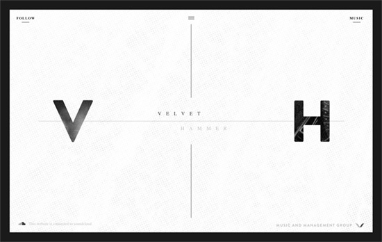
There’s a nice mix between a modern feel and subtle grunge touches here, which sort of represents both the music management and artist aspects to their company. The page scrolls inside the box and there are three menus which overlay on the area once clicked: social media, music, and the main menu.

Chilli
Chilli

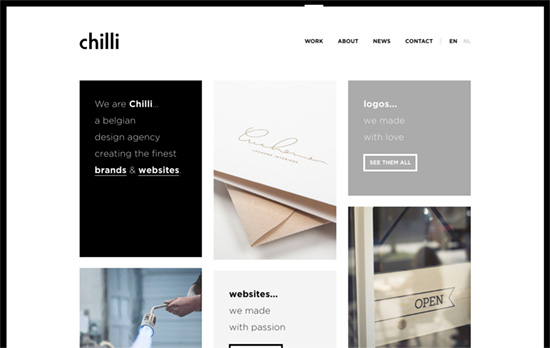
A clean, simple, predominantly black-and-white site with a boxy, bento-style layout.

Neybox Interactive
Neybox Interactive

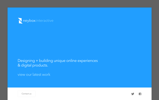
Nice bright colors marking each section and product of the homepage. The large imagery and small descriptions are a familiar pattern in websites these days, but the fact that the layout doesn’t span the entire width of the browser instantly makes it look different from the rest that’s out there, not to mention the treatment of the above-the-fold block.

Social Media Weekly

Search Optimized, Turn-Key Designs, Unlimited Everything. Start building with the Genesis Framework today.

CSS – Ways You Need To Tell The Browser How To Optimize
“Rather than the presumed “browsers will get faster at running my code”, there is a little more “I need to change the way I code for browsers to get faster.””

Typopgraphy – glyphdiff
“Glyphdiff is a simple tool comparing the differences of two fonts on given glyphs.”

JavaScript – JavaScript for Designers
“Rather than sit, and try to digest boring definitions, we’ll dive right into building an interactive HTML prototype, and have fun learning JS together along the way.”

« Previous Page
Next Page »

Code & Tutorials

Which Front-End Development Languages Will Grow in 2017?

Your Guide to Leveraging APIs as a Developer

Bitcoin Processing Website Integration For Web Developers

Website Security For 2016 That All Developers Need To Know

5 Reasons You Need to Be Using jQuery

About Devlounge

Want to read more about Devlounge, or maybe you want to contact us, or even advertise? Oh, and don't forget to subscribe to updates!

The Best of Devlounge

Randa Clay On Breaking Barriers

Search