Happy February Friday Focus! Our featured websites of the week highlight informative, for-good topics in a vertical storytelling format.
Designs of the Week
Need help in promoting your site? INeedHits has been in the search engine marketing since 1996!

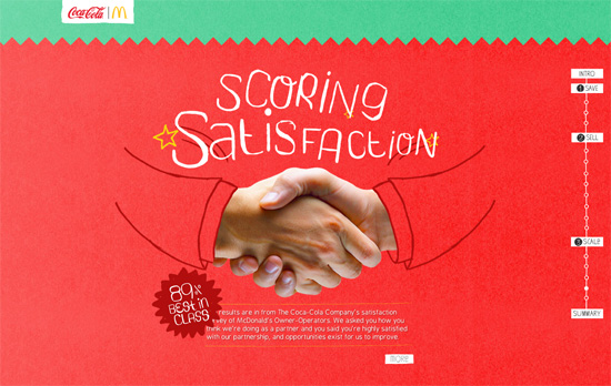
The combination of hand-drawn illustrations and photos and the parallax animations that “lift off” each object drives home the charm and quirk of this design. The backgrounds are very bright so the small text is a little difficult to read at times but other than that, a fun little ride.

Some sites like to do their storytelling with different slides per screenful but in this case it’s one long connected trail, from roads going through factories all the way to underground tunnels. And aside from the usual navigation marker, you’ll see icons pop up and stay at the top of the screen as a summary of the facts you’ve scrolled through so far.

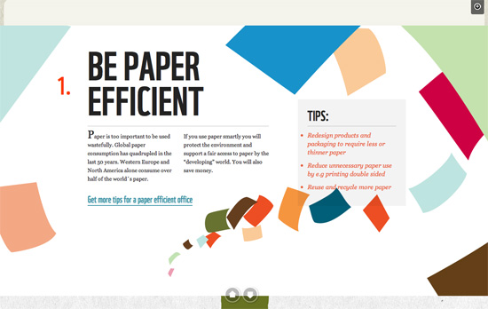
This one’s also colorful but on a warmer, more “organic” palette. Aside from the large graphics, the different paper textures at work, it’s the typography that gets the message across effectively, with every screenful easy to read.
Make Headway, make intuitive layouts, make it your WordPress theme of choice!
Social Media Weekly
Accessibility – Skip links and standards?
“Q: Are there any standards associated with skip links? A: Yes!”
HTML5 – The best of <time>s
“Avid HTML5 watchers will know that the <time> element was dropped from HTML, then re-instated, with more New! Improved! semantics.”
CSS – CSS Specificity
“Some people are confused by CSS Specificity, especially with all of the (not-so) new CSS3 Selectors. The image below may help make sense of CSS Specificity.”
Debugging, User Experience – Support Details
“Tech support management.”
Accessibility, User Experience – Did we lose track of the big picture?
“Let’s think Responsible Design before anything else.”
