This last Friday Focus of the month we’re looking at websites designed with framed content as the focal point, as though you’re in a virtual museum.
Designs of the Week
Need help in promoting your site? INeedHits has been in the search engine marketing since 1996!
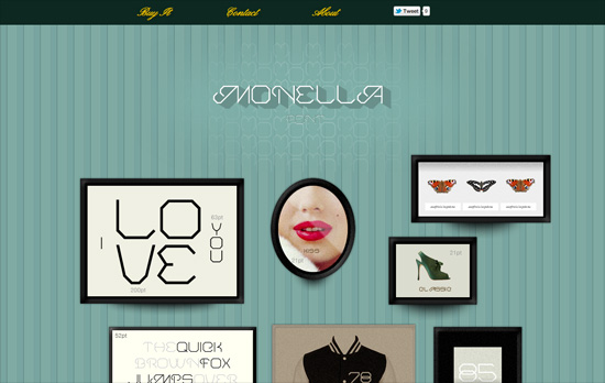
Having a gallery design doesn’t mean it has to be arranged in a rigid grid, as you’ll see here. This page is mostly just images in frames of different styles and textures, and when you do a hover you get a teensy, subtle tilt.
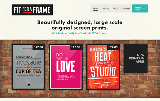
I like the larger than usual (but not so large) text sizes on Futura, not to mention the snappy hover effect on the images and the overall blocky, geometric feel. It’s also out of the ordinary to find a site that uses a light on dark color scheme for the content area alone, while the rest of the site is the usual dark text on a light background.
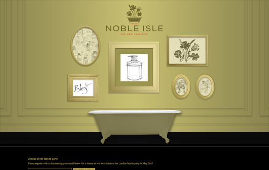
I really like the idea of a freeform navigation tool, and in this case it’s the framed illustrations in monochrome/black and white, though I was hoping for a more discernible hover effect, and perhaps more than just tooltips to describe the pages they’re linked to, since the illustrations don’t give much of a hint about them.
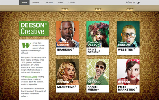
These days it’s quite easy to give the feeling of a gallery: it’s all in the wallpapered background! Add some lighting effects to complete the atmosphere, but make sure your photos pop. Each page is color coded, from the heading to the drop caps, and there’s a bit of a Pantone color chips feel to some of the elements.
Social Media Weekly
Build on DIYThemes’ Thesis Framework for rock solid SEO and great layout customization options.
Web Standards – Stop solving problems you don’t yet have
“What I am seeing is an increasing reliance on a whole slew of polyfills, CSS frameworks and boilerplate starting points. I am concerned that these things are being promoted as something everyone should include from the outset, rather than being a toolkit you draw on to deal with problems once they have arisen.”
CSS, Content Strategy – Content Folding
“It may be a more appropriate approach to “interdigitate” content. That is, to fold bits of content together into that single column in a more thoughtful or useful manner.”
