It’s almost Halloween dear Friday Focus followers! While these designs won’t scare the lights out of you, the use of hands without showing much else of the rest of the person’s body is a somewhat creepy concept. Don’t let that chase you away though, their use in these designs are clever too.
Designs of the Week

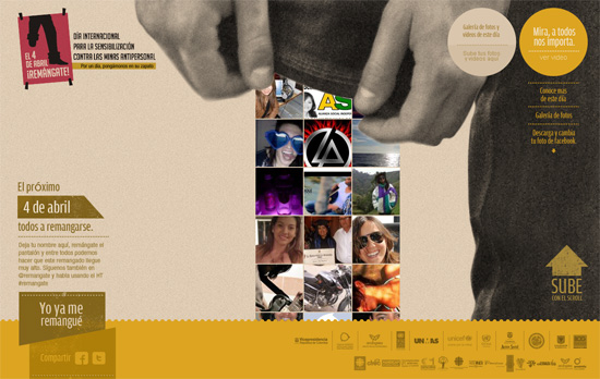
Really like the idea of scrolling the page so the shoe meets the edge of this anonymous person’s jeans. The only drawback to this approach is it takes a while to load the content in between those two endpoints. Wish I could give points for typography but much of the text are just images.

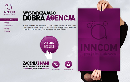
Love the open layouts on every page, most make use of power lines and circular icons with a nice touch you don’t see everyday—droplets. Another thing I don’t see everyday? It’s so obvious but it’s still fun to see: using an iPhone as the background for the contact form.

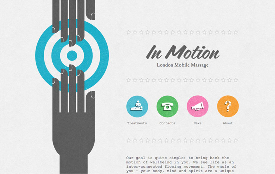
I love the treatments on the headings and illustrations, the shadows and textures really take you several decades back. I think the body text could be tweaked more, I don’t think many people actually enjoy monospace fonts regardless of the mood one tries to convey.

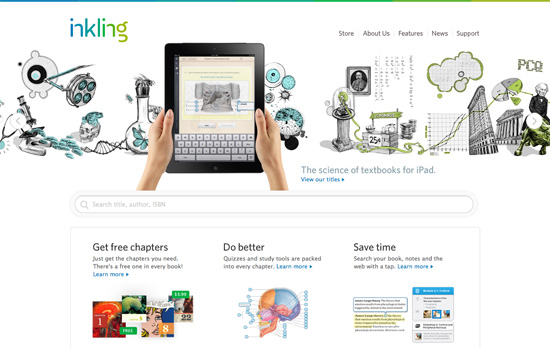
A wonderfully clean design amidst the sketchy scrolling illustrations that speed up when you move back and forth the carousel items. You don’t see that break in formality anywhere else on the site, though, which is admittedly a little disappointing.
Social Media Weekly
Web Design – The Coding Designer’s Survival Kit
With some cool effects to boot!
Design – 7 Ways To Avoid Scary Web Design
Monsters are cool, but not design monstrosities.
