Another round of video backgrounds used in the wild in this week’s set of featured sites.
Designs of the Week
Create unique, extraordinary websites with Squarespace. No experience necessary!

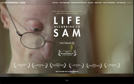
Video backgrounds are a great fit for film websites but this design doesn’t rely solely on that feature. Navigation from one page to the next is animated horizontally, and then downwards. Using the scrollbar isn’t necessary as the content are all fitted into one screen, and keyboard shortcuts are enabled, but it would have been nice to mouse interaction to trigger the directions, not to mention active/inactive states for those arrows. The About Sam page is a nice take on the traditional FAQ, and so is the Gallery.

The bright purple-blue definitely has an oomph factor, and the feature-by-feature animations below are lovely.

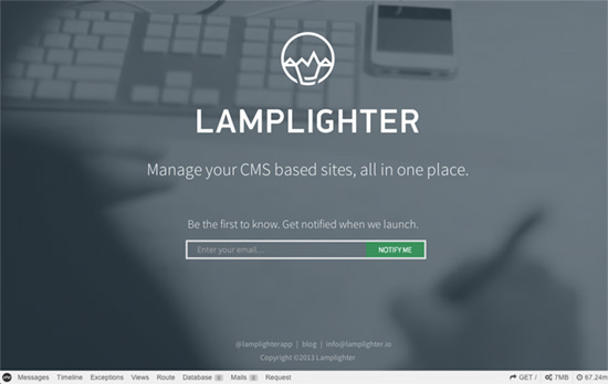
On first load, you get several descriptions of the product with the same video looping in the background, and then culminates in this screen, with an email form. Simple and elegant.
Social Media Weekly
Want your site to be as good-looking and inspirational as these? Start by choosing a well-designed theme from ThemeForest.
Typography – Choosing the perfect Typeface – Cucumbertown’s journey
“Unlike the other design choices that are data driven or research oriented, type choices we designers make tend to be ad-hoc and impulsive even today.”
Design, Business – How to give constructive design feedback over email
“Email feedback also arrives all at once, and when done poorly, it’s hard not to interpret it as a big ball of negativity — even if the sender meant well.”
Optimization – Jank Free!
“Here are some links for those of you who want to make the web smoother.”
CSS – CSS3 Inheritance Tips and Tricks
“It’s easy to overlook the cascading features of stylesheets. Most developers are aware of the inherit keyword but there are a few new inheritance features in CSS3 you may not be aware of.”
