Robotic doesn’t mean drab, boring, or lifeless. Not with these featured site designs for the week.
Designs of the Week
Need help in promoting your site? INeedHits has been in the search engine marketing since 1996!
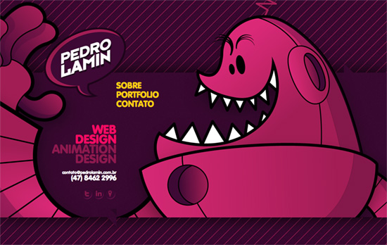
Colorful and cheerful site that uses horizontal scrolling and plays with foreground-background elements.
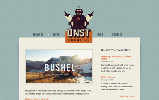
The menu markers / hover icons are quite amusing: various artillery the pop from under the white area. I love the retro futuristic look of the robots and gadgets in this design.
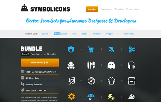
Clear and bright approach. The content areas alternate in layout, so the title and details can be found on either left and right to break the monotony.
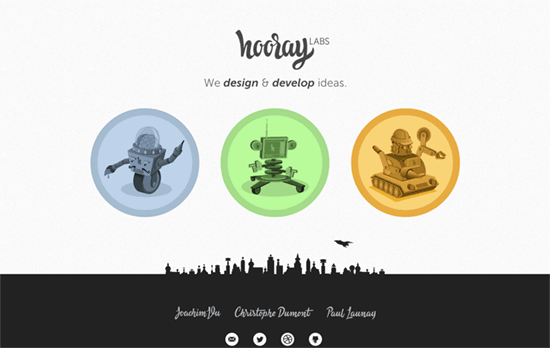
I like the plane that flies over the skyline illustration in the footer occasionally. The script fonts look lovely and so do the robots.

Such fabulous illustrations! Just needs refinement with the menu button appearance.
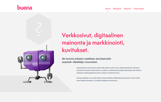
There’s a curving line in the background that doesn’t really move but feels animated when you scroll.
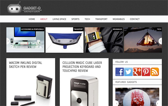
A very neutral looking design so the photographs do all the attention-grabbing.
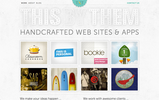
Love the textures and how the text and illustrations blend into them.
Social Media Weekly
Ready to go out and design your next website? Try building with the Catalyst Framework.
CSS – CSS Length Explained
“When styling a web site with CSS you might have realised that an inch on a screen is not an actual inch, and a pixel is not necessarily an actual pixel.”
JavaScript – Formstone
“A growing collection of jQuery interface plugins focused on structure and customization.”
