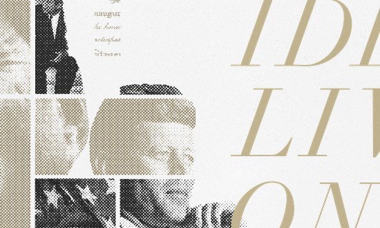
Adding a halftone graphic filter to images can quickly take your audience to that vintage, nostalgic place, and these websites use it for a couple different reasons.
Designs of the Week
Build on DIYThemes’ Thesis Framework for rock solid SEO and great layout customization options.

Elegant for sure, but I also like how the design feels light. What I don’t like, however, is the fact that after this tribute site had gone past its schedule, the inside links have gone broken and they just redirect to the main homepage of the JFK Library.

There’s a recurring theme here of industrial/revolutionary elements and stars, set in a very bold, graphic tone. As you scroll down the top navigation hides, except for the bottom part of the cog that reads “design”, which sways just enough to let you know it’s there.

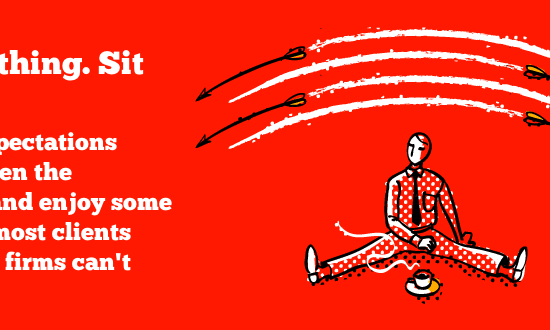
I like this company’s take on the common slider/carousel element: free advice on communication strategies, which is their specialty. You get a taste of their services right upfront, which is very smart, and they’re styled in a peppy way to break from the usual corporate fare. I would have loved to see more of those illustrations elsewhere though.

The header is quite fun, but wait till you get to the contact form. I like the combination of these blocky fonts and just a touch of handwriting.
Social Media Weekly
Get solid WordPress themes, plugins, and web design training from iThemes.
CSS – Common practices do not necessarily mean best practices
“Be critical of everything. Do your homework. Think outside the box. Think for yourself.”
HTML, CSS, JavaScript – Medium’s CSS is actually pretty f***ing good.
“As we continue to grow our story pages and push them to the next level, you can imagine how getting accurate, reliable measuring tools around layout and rendering performance is incredibly important… and kinda just sad that we don’t already have in 2014.”
Typography, Webfonts, Optimization – Minimising font downloads
“When it works, this is a great feature, especially for sites that handle a variety of locales, sites that allow users can submit their own content, or even just for downloading that fancy-ampersand font only when it’s needed.”
Design – Michael Bierut On (Design) Bullshit
“In discussing design work with their clients, designers are direct about the functional parts of their solutions and obfuscate like mad about the intuitive parts, having learned early on that telling the simple truth — “I don’t know, I just like it that way” — simply won’t do.”
