Playing with depth is still one of the most interesting things you can do on this medium, and these three websites do it with the illusion of foreground objects contrasting with background objects. Let’s check ’em out!
Designs of the Week
Search Optimized, Turn-Key Designs, Unlimited Everything. Start building with the Genesis Framework today.

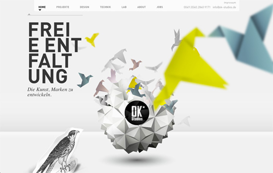
Love the paper bird and origami motif at the top of the page, which gets hidden beneath the next screenful, which is a sliding grid of portfolio thumbnails. I find it interesting that they’re arranged by color, so it looks more harmonious. More layered scenes in parallax come after, still using an interesting mix of objects both old and futuristic, but when you get to the footer it goes back to the yellow and white paper crane theme.

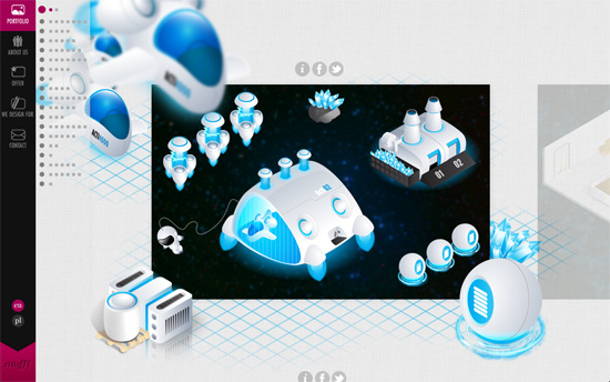
Every showcased work has its own little parallax scene that frames the horizontally scrolling sliders. It’s a little overwhelming since it shifts from one project to the next with the scrolling action but it’s very immersive! They show you the elements of a design beyond its rectangular and two-dimensional boundaries, and that kind of changes the conversation a bit. That’s just the portfolio page though; the other pages are much more tame. They slide the viewport to the right so their content area loads on the left of the vertical menu, so that’s another play with spatial relations right there.

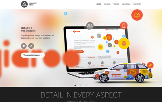
It’s become apparent that the easiest application of this technique would be in the slideshow part of webpages. In addition, he same foreground-background design elements are added to the thumbnails on the Work page to give variety to the screen/laptop/phone shots. You’ll also noticed that everything besides these sections are in grayscale/neutral colors.
Social Media Weekly
Get solid WordPress themes, plugins, and web design training from iThemes.
CSS, Responsive Web Design – display: none; Or The things you think are common knowledge but really they aren’t.
“Just hiding content is a lazy design solution. Yes, it’s hard designing for smaller screens, but maybe that will help you ensure that every little piece of content you’re putting on that site is worthwhile. Responsive design should be about rearranging, not changing, your page elements.”
