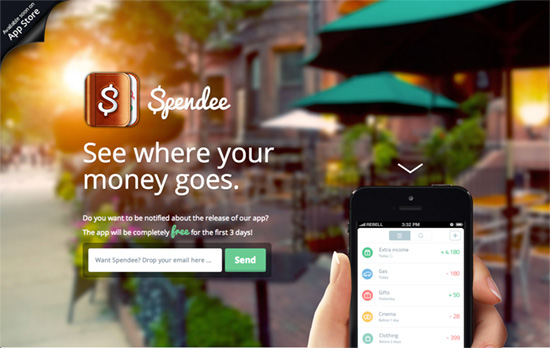
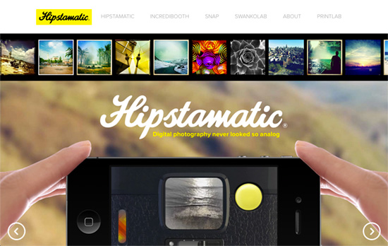
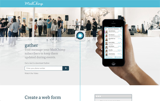
There’s a bit of rivalry going on between native apps and web apps but the best ones of the former will still go out of their way to build a site to promote them. And more often than not, there’s a design pattern they usually follow: a prominently featured photo of a hand holding a phone (usually the iPhone) with the app loaded.
Designs of the Week
Build on DIYThemes’ Thesis Framework for rock solid SEO and great layout customization options.

This trend of animating the app as you scroll further down is great, because while a video demo is great, your scroll sets the pace. As you reach the bottom, a slightly translucent black footer covers the content and asks you to sign up for updates via email or like and tweet.

I really appreciate that unlike the boatload of sites that how just one photo of a hand holding a phone, this site shows two, and the angle works great for the product they’re selling: photography software. Also a nice touch: adding images taken with the app from the community, located not at the bottom of the page but right below the header, which makes, a nice colorful border.

Here’s another subtly implemented split layout, with the icon sliding down the middle as indicator. I like the layering and translucency also done here. Apart from the photos, there’s a very minimal, subdued, and not just flat look to the elements on this page.
Social Media Weekly
Want your site to be as good-looking and inspirational as these? Start by choosing a well-designed theme from ThemeForest.
Responsive Web Design – Adventures in Responsive Navigation
“So this is a little list of some popular methods of dealing with navigation on a responsive website. I’ve included code samples as well. Feel free to check out the source code and craft your own navigation pattern.”
HTML – List of Pseudo-Elements to Style Form Controls
“While all of these pseudo-elements are rendering engine specific (and therefore behind vendor prefixes), they can still be handy for customizing the display for that engine.”
Web Design – The process behind designing a website
“Most clients have little idea of what exactly goes into designing a website. In this new series, I unpack the process we use at Headscape.”
