Our featured sites this week all use another shape gaining popularity in the design world: hexagons. Probably for their tessellating properties and their sturdiness as a building block in things like honeycombs and chemical compounds.
Designs of the Week
Search Optimized, Turn-Key Designs, Unlimited Everything. Start building with the Genesis Framework today.

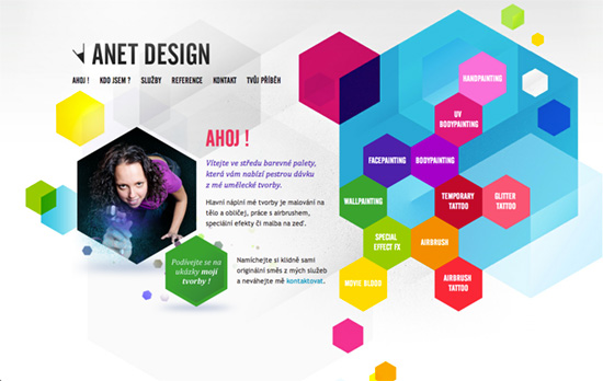
We’ve seen this navigation choice before: putting the menu to the side, with each link inside one shape. Very colorful and has that kind of intentional chaos to the look, topped off with some glittery texture to break up the blocks and gradients. I find the hover effects on the polygons, both the navigation and the social icons on the footer, to be a simple but still interesting touch.

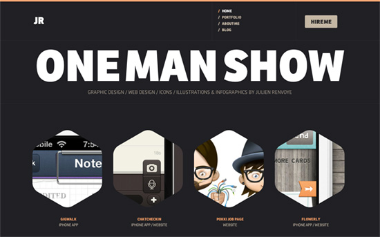
Simple but solid design, makes quite the impact in fact with its bold headings, large image thumbnails, and white-melon-charcoal color scheme. There’s a bit of “about me infographics” in the bottom half, and useful fixed navigation cues as browse around, but I would have liked something that distinguished the way the portfolio is presented on the index and on its own page, because there isn’t much difference. Kudos, however, for the page transitions. They seem more and more like a necessity these days to polish the user experience.

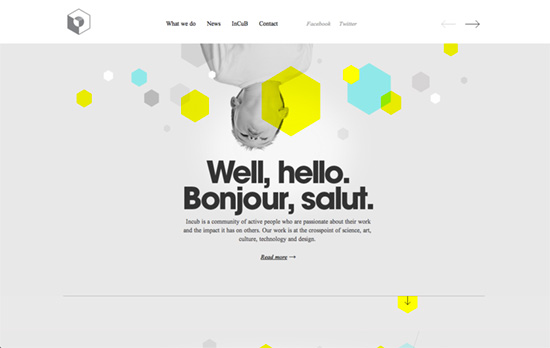
Offering both horizontal and vertical movement throughout a site is risky but the implementation here is straightforward enough. Love the ample space and the use of yellow to a non-intimidating degree. Why the Times font, though, I’m still never happy about such a choice!
Social Media Weekly
Make Headway, make intuitive layouts, make it your WordPress theme of choice!
JavaScript – Some Random JavaScript Coding Tidbits
“Although my knowledge of HTML and CSS seems somewhat rounded and complete, I don’t feel the same way about JavaScript. I always seem to be learning something new, or else reminding myself of stuff I might have learned years ago but have forgotten. So here are a few things I’ve recently learned or read about that might be useful to you.”
User Experience, Social Media – Sweep the Sleaze
“Social media buttons are not a social media strategy, even though they’re often sold that way. Excellent content, serious networking and constant human engagement is the way to build your profile.”
Design – MUD: Minimum Usable Design
“I’m coining the term Minimum Usable Design, and that is when you reach your 50% mark for your design. If you can’t use your design after you have reached 50% (or a person can’t understand at least 50% of what is going on) then you haven’t reached the 50% mark yet.”
