Last year we featured designs that expose the behind-the-scenes in creating a website. Here’s another round of interface imitation inside the web browser, with really interesting twists.
Designs of the Week
Pagelines lets you build WordPress websites and it’s as easy as drag and drop, go check it out!

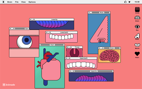
A modern, humorous homage to Frankenstein that lets you play with different parts of the body in their respective windows, with sound and animation to match. Works quite well as both a web toy and an artistic installation online.

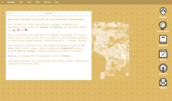
You don’t see yellow—or in this case, gold—used as text or the primary, foreground color very often and this site pulls it off. I like that you can get to know him through his books, travels, habits, and podcasts. Also, it’s smart move to show all the pertinent contact information in messaging format. Since message bots are all the rage lately, I’d say this is definitely on trend. Another interesting trend popping up everywhere? Emoji—and it’s pretty obvious why.

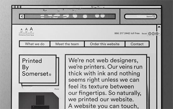
They literally printed out their site and then put it back up on the Web—that’s at least three levels of inception right there. The analog interactions are brilliant: scratch-off address bar, pull-out social media, and tear-out/flip-up layers. If companies want to showcase their brand and personality through their website, this is the way to do it.
Social Media Weekly
Ready to go out and design your next website? Try building with the Catalyst Framework.
HTML, CSS, SVG – How to work with SVG icons
“There are many ways to use SVG icons in HTML and CSS, and I haven’t tried them all. This is how we do it in our small front-end team at Kaliop.”
Design – R/m Design School: Grid
“Essentially, in making the grid, the designer works out the rules and limits to be followed. These rules and limits create, as the work goes forward, a specific statement that often defines and directs the further development of the layout and sometimes leads to unexpected but very welcome results.”
Interface Design – Building the UI for the new The Times website
“The redesign of The Times and The Sunday Times is all about content. It is about showing the right piece of news in its dedicated amount of space on the screen. The challenge of keeping this sort of strict hierarchy in a responsive layout determined by content can be difficult.”
