Keyboard navigation is a browsing feature, but it seems in this week’s featured websites, those controls are integral to the design and experience. Did the layout influence their decision to use that feature, or is it the other way around? Does it make these sites better or more difficult to use?
Designs of the Week
Get solid WordPress themes, plugins, and web design training from iThemes.

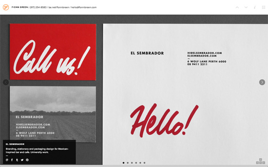
Let me get this out of the way: this site and the next don’t allow mouse scrolling, which is not very user friendly, but it does let you click on directional arrows with the mouse as well as the keyboard. Each screen from top to bottom represents the category of work, and moving from left to right shows each project. No drop down menu in the header with quick links, but on the top right there’s mini guide indicating your location on the “map”.

Controls are also on the upper right portion of this page, and that grid icon loads a lightboxed array of thumbnails so you can jump from one portfolio item to the next in case you don’t want to follow the order when using the keyboard. The content also seems to be dominated by gray imagery with pops of solid colors like red and green. Another interesting feature I noticed: the contact information is right up there as well, beside the logo, and does away with the traditional footer.

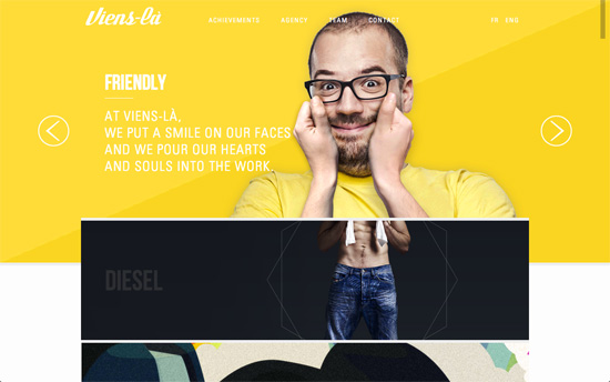
From the quirky photos in the top slider to the interactions in the lower sections as well as the color palette throughout, this web design definitely gives off an energetic vibe. The trade-off with being able to use the mouse is that it’s still controlled; you can’t accelerate and skip forward. I like how the currently focused section (which even includes a rock-paper-scissors game!) expands to full width, and clicking on it covers the entire screen. Possibly the best part of the page would have to be team portraits. There are multiple shots of each team member looking in 8 different directions each, which are then are oriented to “follow” and “look” at your mouse cursor. I’m just a little surprised the contact form is a standard affair after all those easter eggs.

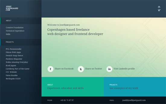
In contrast to the previous design, this one’s a lot more subdued. It’s not trendy in terms of today’s sensibilities but I really like it. The parallax animation as the portfolio images slide in is a nice touch; one does not need to do a full-blown storytelling-style site just to show off with parallax. One major problem here though is it limits desktop browser widths to 950 pixels, and throws a dark overlay when the window goes narrower than that and advises the visitor to load the page on a mobile device instead. A designer who truly values responsive web design and user experience would have made provisions for such a situation and not have limited the user’s options or prevented them from using the site completely because of screen size on a desktop.
Social Media Weekly
Pagelines lets you build WordPress websites and it’s as easy as drag and drop, go check it out!
JavaScript – Weaning yourself off jQuery
“For fancy things like animation libraries make sense but for basic stuff like simple dom manipulation the browser already provides you with some really good primitives.”
User Interface Design – A thought on Amazon’s new product page design
“Amazon has designed themselves into a Local Maximum but mobile and tablet use will help get them out of it.”
Design – Relentless Quality
“Take that feeling and turn it inwards. Vow to make things better. Make sure you’re always producing the best quality product you can.”
