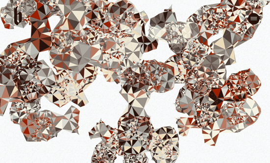
It’s common these days to use big, bright images for the top section of your site, but there’s a growing sub-trend where there’s little to no text accompanying it. As if to let the art speak for itself, and for you to bask in its distraction-free glory.
Designs of the Week
Search Optimized, Turn-Key Designs, Unlimited Everything. Start building with the Genesis Framework today.

There are things in here that I find less than polished but I like the emphasis given to the portfolio images.

There’s actually some navigation links in the top middle, but you can barely make them out because they fade into most of the slideshow’s photographs. What’s curious is they didn’t choose to add the name of the site/collective in that same area. For the inner pages they adapat another portfolio trend of images arranged asymmetrically, while text and descriptions appear beside the mouse cursor when you hover – which is a very “retro web” design pattern for those who caught it in its original incarnation of custom cursors.

The whole screen is there for you to click on and view details about the work. Inside, you get a dark gray, centered content block with few words describing it, then you scroll down and go back immersed with more pictures.

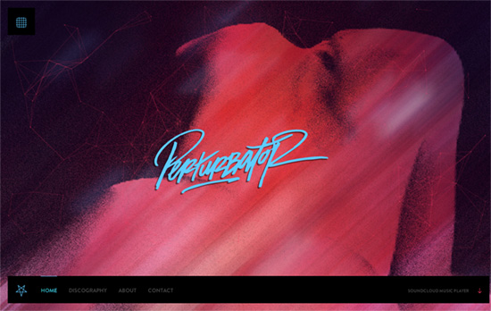
The “art” on this site is technically the music, but there are some cool stuff going on with the thin, 3d wires and the background, designed to bring the spirit of the record to life. Then the bottom navigation links flicker with an interesting texture, like a textured, neon stream of light. The color scheme and gradients carry over to the other pieces of art inside and the contact form.

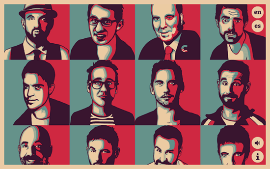
There’s that bordered look again, as well as a split layout/animation going on for individual pages. And I’m sure most of you are familiar with this blue and red treatment on a portrait. I find the controlled scrolling a bit unwieldly but one nice feature here is being able to download the faces as SVG vector files—what a cool tribute.
Social Media Weekly
Need help in promoting your site? INeedHits has been in the search engine marketing since 1996!
Design, Branding – Generic and overused logos (avoid them!)
“Because of their overused logotypes the company is not able to establish their brand in the marketplace. In this way they’re going straight in the opposite direction than to distinguish themselves from others (which is the whole point of having a logo).”
Responsive Web Design, Optimization – How we make RWD sites load fast as heck
“I’ve reaffirmed my belief that we don’t need to compromise the well-known benefits of a responsive layout in order to make our sites load as fast as heck.”
CSS – CSS Triggers
“I figure we needed a definitive reference for what work is triggered by changing various CSS properties.”
