We’ve seen special scrolling effects before but it’s usually top to bottom, or left to right, with a little parallax thrown in. This week’s featured sites go at it in every which way, making for an unusual and exciting browsing experience.
Designs of the Week
Pagelines lets you build WordPress websites and it’s as easy as drag and drop, go check it out!

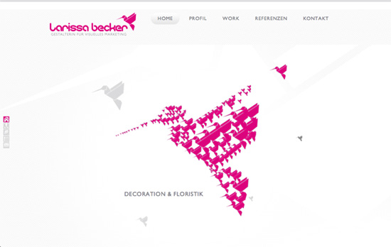
The thing about controlled scrolling is it’s best to stick with the navigation links rather than scroll manually, otherwise the effect might feel erratic. What’s interesting here is the use of origami instructions as a marker for each screen. Most of the images are framed inside circles, with interesting stacked and slider layouts.

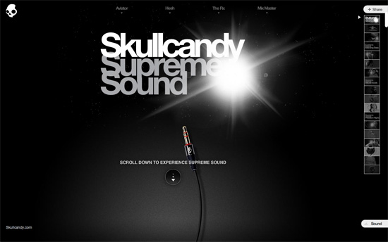
We follow a headphone cord as the content slides and rotates into view. Some dust particles on a separate layer also respond to mouse movement for added depth. After reaching all the way down you somehow wind back up!

A top-view design is another way to play with perspective and the gorgeous photography helps a lot. It’s also a great idea to add animated smoke coming from the soup bowls to drive that warm, cozy feeling home.
Social Media Weekly
Get solid WordPress themes, plugins, and web design training from iThemes.
Web Design – “What Constitutes Good and Bad Web Design?” — a response
Design – Ingredients for automatically great design
Front End Development – Windows workflow for web designers and front end developers
