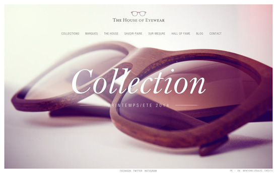
Have you ever wondered about the user experience and interface design of shopping for spectacles and sunnies? This week we’re looking at online shops for the eyeglass- and sunglass-wearing crowd.
Designs of the Week
Search Optimized, Turn-Key Designs, Unlimited Everything. Start building with the Genesis Framework today.

No scrolling on this page and you have to go through a few steps to see the products, from Collections and Brands to picking your gender and sun vs. optical. When you finally get to the glasses page, there’s a progress bar at the top that counts down a few seconds until it twirls the product photo to give you a 360-degree view. It seems the only way to get it to turn again is to repeat the page load. On a few other informational pages there are videos playing in the background, which you can also view in full after hiding the box of content, so sometimes the navigation links at the top aren’t too visible.

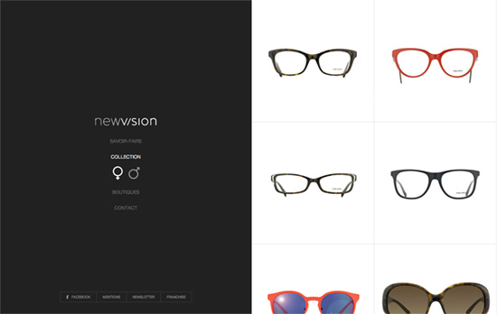
The site takes a split-page approach; the menu moves to the left once you pick something and the content appears on the right side. Save for the eyewear pictures the site is pretty much black, white, and gray, even the custom-designed map.

Such a bold statement with their models that it’s gone from to lookbook to almost something of an art piece. Scrolling down peels of the virtual cover and brings you to the lookbook, description, collection, and teaser video all on the same page—no navigation links to skip to each. The product pages show full-width photos of the glasses with the model and without, as well as meta information like color and size.

Clicking anywhere on video and large logo unfolds a matching diamond-shaped set of links. The photoshoot snaps are for the collection’s different categories, while the individual products have different angles of the glasses and helpful links like an animated, hand-drawn illustration for the size guide, and a pretty psychedelic color guide page animating the letters of Oxydo based on your mouse location. There’s a handful more of animated illustrations on the Society page.
Social Media Weekly
Get solid WordPress themes, plugins, and web design training from iThemes.
Web Design, HTML, CSS – WTF, HTML and CSS?
“A curated list of commonly frustrating HTML and CSS quandaries, miscues, and dilemmas.”
User Experience, Interaction Design – IxD (Interaction Design) Checklist
“Form a better understanding of interaction through using the IxD Checklist.”
Business – Why I Need to Know Your Budget
“But most of all, what that number tells me is how to guide you toward the appropriate solution for you, and to stay away from solutions that are outside of your price range.”
Design – Layout in Flipboard for Web and Windows
“How do we automate the whole process of layout design and editing? By slotting your content into custom designed page layouts—like fitting puzzle pieces together.”
