Tiled, bento box, quilt, mosaic, collage…whatever you call this web design trend, these designers still keep coming up with ideas to make it interesting.
Designs of the Week
Search Optimized, Turn-Key Designs, Unlimited Everything. Start building with the Genesis Framework today.
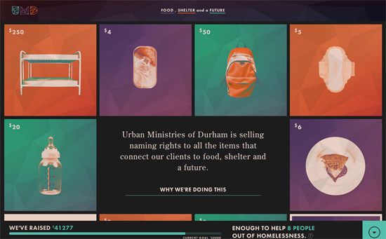
Love the color palette and color coding, the geometric logo also echoed in the backgrounds, how the squares morph into circles, the use of every-versatile Futura.
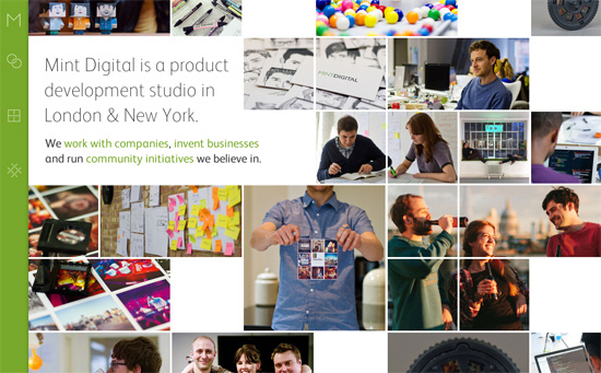
The touch of icon animation on the sliding menu to the left is a reflection of the growing popularity in dynamic interactions on webpages. I find it interesting that they’re atypical forms and the most familiar one belongs to the studio name / logo. It’s also fascinating to see how blocks of photos rearrange and collapse responsively.
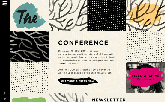
The hand-drawn or hand-painted effect is great, but I haven’t actually seen it carry over to the “hamburger” menu icon yet. Even the newsletter input field and action buttons are paint strokes.
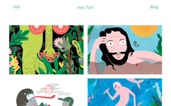
Besides the illustrations, there’s something equally quirky with the artwork title that continuously scrolls horizontally on hover. There’s also the loading animation of a melon (in reference to one of the works) whose seeds represent the familiar trailing dots.
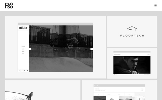
This one’s clean, classy, and quiet in black and white. I also like the bento-style footer navigation, which spaces out the icons instead of occupy as minimal space as possible just because they’re small.
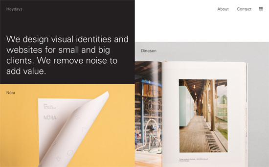
This page has an option to filter by type of work and gives you a smaller thumbnail view of all the projects for quick skimming. The layout is predominantly in two columns and is also primarily black and white save for the color photographs.
Social Media Weekly
Get solid WordPress themes, plugins, and web design training from iThemes.
CSS – Flexible CSS cover images
Web Design – (My) Best Of 2013 Conference Talks
