You may have heard about the “flat” design trend gaining a lot of buzz these days, and while it’s not exactly a new style, new techniques and a clean break from shadows and gradients encourage us to focus on lean, clean, and the stuff that matters.
Designs of the Week
Get solid WordPress themes, plugins, and web design training from iThemes.
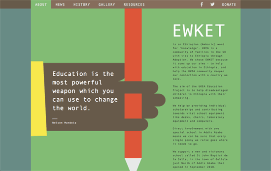
I would have wanted a bit more introspection on the way the photos are designed and laid out, not to mention the choice of font for the body text, but this site’s look is excellent. There’s a recurring theme of hands and pencils that act as buttons and guiding lines.
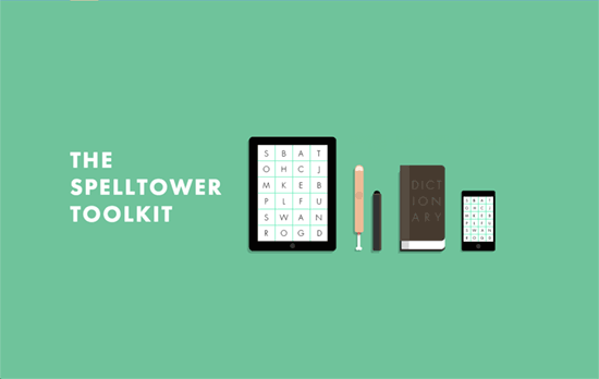
There’s just something delightful about a minimalist design, combined with subtle and clever animations and copy. Noticed the detached finger beside the stylus? Or the nightcolors screen with the couple of z’s floating upwards?
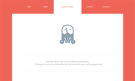
This kind of orange seems to growing in popularity right alongside this flat design trend. Complementary ideas also include lots of whitespace (it’s clear on the homepage, but check out the Contact page too) and large clickable areas, and letting the shine while displaying text only when necessary. I think the only weak point in the design would be the numbered list in the Offers page, which could have had a cool infographic-inspired look.
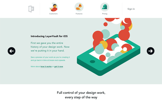
Come for the product, stay for the gorgeous site. Topnotch animations, and not just the ones on the homepage, but some of the more “serious” explanatory ones in the Features page. It’s also a good idea to feature testimonials as a “Customers” page, much more friendly sounding.
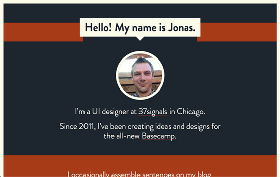
This light on dark site uses a pretty strong but warm color palette, boxed up in a cream frame. Center aligned layouts is also pretty big lately.
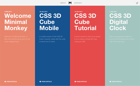
Color-coded posts on a horizontally-scrolling layout with some snazzy interactions and CSS demos to boot? All very cool stuff.
Social Media Weekly
Want your site to be as good-looking and inspirational as these? Start by choosing a well-designed theme from ThemeForest.
Performance, User Experience – Test Your App Under Slow Network Speeds
“These kind of indicators are often hard to objectively define but they count a lot and might contribute more to the overall user satisfaction than you might actually think.”
Responsive Web Design – The In-Between
“As you’re building out your responsive design, you should be focussed on watching how the content adapts as the viewport changes.”
