While I for one am a fan of all things colorful, I also appreciate these almost monochromatic, sepia- and gray- dominated designs, that give an air of seriousness meets style.
Designs of the Week
Search Optimized, Turn-Key Designs, Unlimited Everything. Start building with the Genesis Framework today.

It does help when your products have a particular color palette which you can draw inspiration from. But in this site’s case it’s not just that; what strikes me most is how they are photographed and laid out—the textures and workmanship really shines through. The rest of the “website-y” elements like the navigation exist not to distract but to supplement. There are only two concerns I have: on first load, you’re asked for a shipping location, and there’s a design-y check/submit button but no drop down arrow. It’s a bit confusing. Second, the center alignment for the text that runs all the way to the footer area looks a bit off.
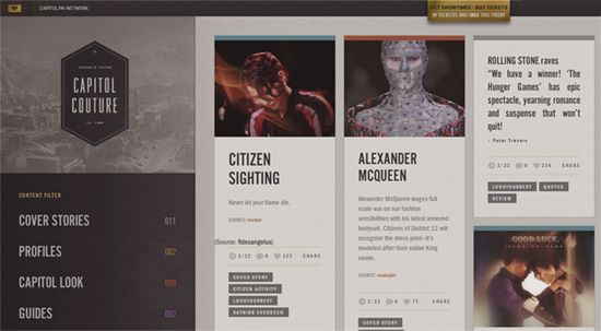
This Hunger Games in-world site carries that dystopian feel the trilogy is all about, even down to the image treatments. The typography stumbles a bit with the quote posts (justified text on the web is still unreliable) but I like how the animated GIFs are done.
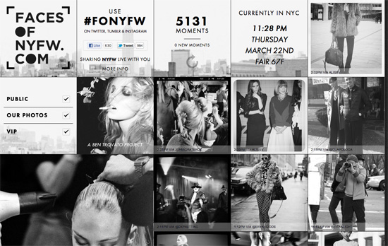
I don’t think anything spells fashion more than going black, or in this case going black and white. A wall of Instagram photos, tweets, and custom coverage, combined with minimal text, lightbox, and keyboard navigation.
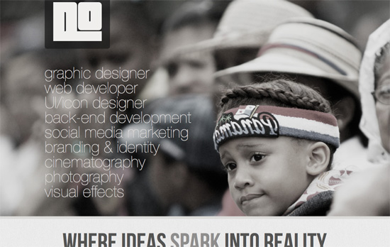
Nice use of distressed elements: torn paper to separate sections and worn frames on the images. The use of Courier looks also quite good. The contact form also seems to be in the running for largest one ever.
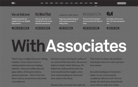
You don’t usually see dark text on a background this dark, and yet it’s still very legible. Inside it gets lighter with custom “art direction” per page, but it’s really all about the typography. And this font of choice (Chaparral Pro) makes all the difference.
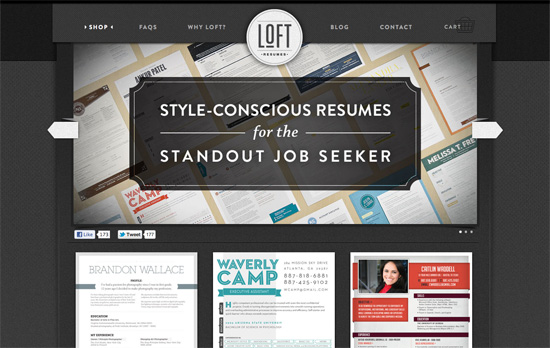
I like how the textures are all in these different layers and sections of the site. It’s all very dark yet the text and images stand tall and never get drowned out.
Social Media Weekly
CSS – Maintaining CSS Style States using “Infinite” Transition Delays
“When we release the button, the old transition property will kick back in, setting the delay to 116 days. This will make sure that the text will keep the new color instead of going back to the default.”
Programming – The developer’s guide to new exciting web technologies
“People will call them “HTML5″. They’re not. But they are NEWT (New Exciting Web Technologies) that you should be keeping half an eye on.”
Create unique, extraordinary websites with Squarespace. No experience necessary!
