This week on Friday Focus, we’re looking at lovely visualizations embedded in designers’ portfolios. Infographics as standalone articles are the darling of the crowd these days, but using them to describe onself is another great use for them.
Designs of the Week

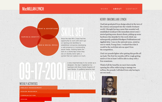
I like the warm monochromatic orange palette and the mix of translucency and patterns, although the location of the descriptions seems a little cramped. One interesting choice here was to use of circles with varying sizes for the education history graphic, where one would normally expect some kind of timeline. One last nitpick: using <div> as content separators instead of <hr>? Not cool (read: semantic)!

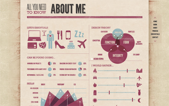
There’s a bit of a blueprint feel going on in the background. It’s a little disappointing to see that like the previous site, the graphs are just images, not clever reinterpretations of actual meaningful markup. But the infographic/magazine “vibe” echoes throughout the one-page site with mechanical diagrams (check out the Process section for another visualization), multi-column text blocks, and stylized headings (that are unfortunately also just images, not even image-replaced HTML heading tags).

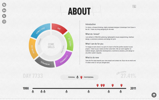
I quite like the contrast between the colorful wheel of competencies and the toned-down timeline below it, and yet if you hover over each tick mark and read his notes in the tooltips, it actually becomes more laid-back than the circular chart. This section left me wanting more! Or maybe I’m just used to seeing infographics that are thousands and thousands of pixels tall.
Social Media Weekly
Design, Content Strategy – Content Choreography
It’s not enough that apply media queries for various sizes, but contemplate what the rearrangement of content in various screen sizes will do for the users’ browsing and consumption experience.
Design – Using the Black Box Model to Design Better Websites
Get a dose of psychology and consumer theory before you design your next site. “No matter what you’re designing, you’re almost always selling something.”
User Interface Design – How to Arrange Interface Elements
Learn how to group, prioritize, and layout the important features a user will need on a page.
