This week on Friday Focus, we’re zooming in on designs with a superhero slant. We’ve had robots and ninjas before, so it’s no surprise people turn to yet another persona to welcome visitors to their sites.
Designs of the Week

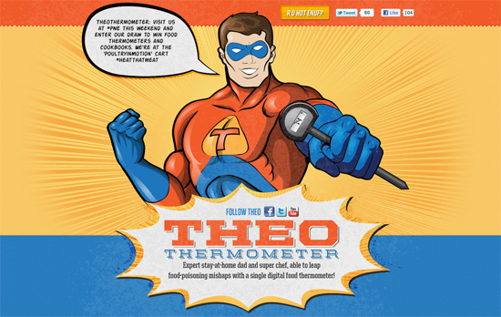
The first screenful of this one page site perfectly captures that action-packed look found in superhero comic books: complimentary colors, action bubbles, and of course, a sunburst. I love how seamless the latest tweets displayed inside the speech bubble looks with a nice comic font. Lots of nice subtle textures too, including the halftone pattern you see in printed materials. Scroll a bit lower and after you get some nice animations on the thermometer, both in digital and analog formats.

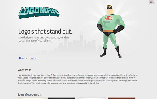
This one’s a little tame, if not underdesigned, compared to the others. I would’ve wanted less gray and more green at least. I do love the way their logo is styled, and how the logos in their portfolio have vignettes and small drop shadows, more like business cards than framed portraits. The superhero look just needed to reach out to more parts of the site.

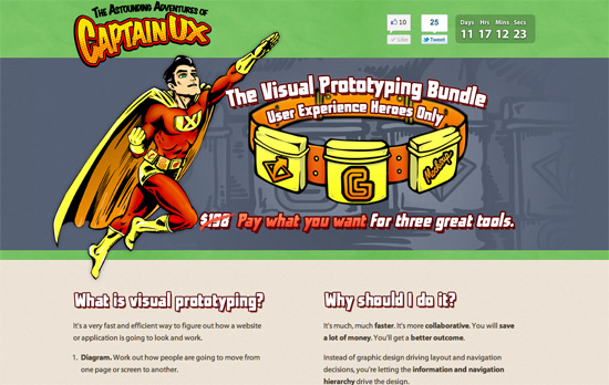
Love the utility belt to reinforce the superhero look. It gets a little “safe” in the middle part (another one page site) but there are very nice interface details at the bottom / checkout portion: you use a slider to specify the price you’re paying for the bundle, and your virtual receipt is appears to print out from a slot.
Social Media Weekly
User Experience – Tiered, Adaptive Front-end Experiences
Let’s go over this again: do websites need to look exactly the same in every browser? No!
HTML, Accessibility – Block level links and accessibility
How do screen readers deal with HTML5 links wrapped around block level elements? Check out the results and solutions.
CSS – Tabs with Round Out Borders
Tabbed navigation has been around for ages, but do yours round out like this one does?
User Experience – Internationalization
The Google engineers provide tips on designing and building pages for different locales.
