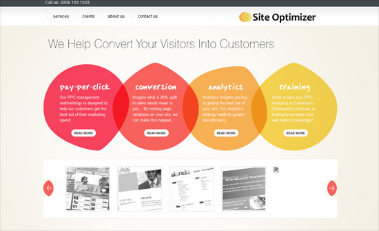
This week on Friday Focus, we’re looking at designs with edges and figures that you don’t see everyday. Instead of the usual rectangles, rounded corners, and circles, why not try these kooky shapes?
Designs of the Week
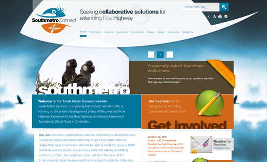
It’s always a good idea to echo your logo’s silhouette in the design. I also like how everything is layered one top of the other and stepping out of what would otherwise be boundaries.
I think some of the content areas need a little more distinction, but how snazzy looking is that subscribe box—see what a single slash down a rectangle can do?
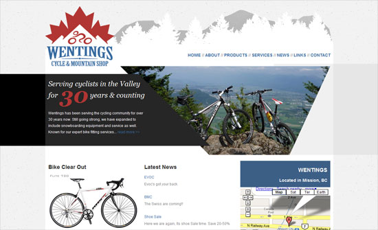
Content area distinction, check. Is the shape too repetitive though, and does it make the too-straight edge photo slideshow a little out of place?
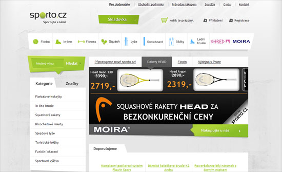
Lovin’ every slanted edge here. Despite predominant use of green here, great idea to color the winter sport icons blue.
Great way to convey speed, action, excitement. Also, thin arrows repeat all over the design.
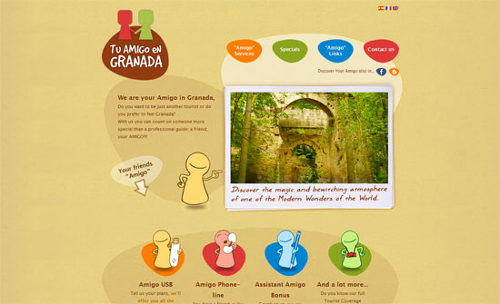
Another design inspired by the logo. It would have been nice, though, if there were more color in other parts of the site.
Social Media Weekly
Design – Create An Animated Gif Banner
“This technique is very useful for any serious marketers of any industry who need create animated banners for ad networks, it’s also good fun.”
Design – Great Questions Lead to Great Design
“Without constraints a designer cannot operate, but if you don’t ask the right questions, small issues can lead to big problems down the line. Here’s a typical set of questions I use to sift out the constraints within a design project.”
