Happy December Friday Focus! This week’s featured designs contain sketches and diagrams with a scientific slant, quite reminiscent of the drawings that Leonardo Da Vinci was renowned for.
Designs of the Week
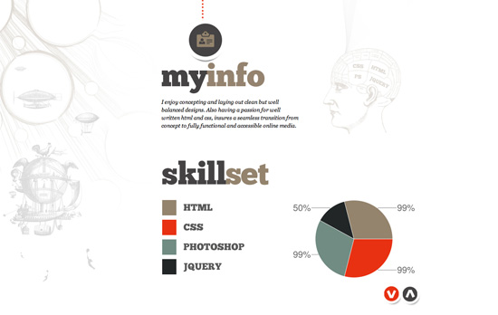
Nice icon-based navigation although I wish the whole circle were clickable. I also wish the up/down arrows scrolling from one screen to another were in the same place, but I see how the layout affected the positioning.
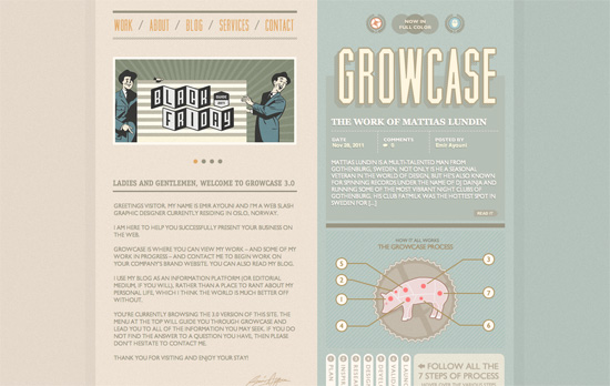
This design looks swell, there are so many nifty details that went to it, especially how the social media icons were fashioned at the footer—as part of an atom! probably the best idea I’ve seen—but there seems to be too much uppercase styling here.
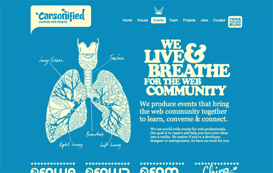
Every page uses an ivory-colored foreground on a very strong colored background—orange, green, purple, you name it—and remains highly readable while gunning for maximum impact. The key to this design is definitely great illustrations and typography.
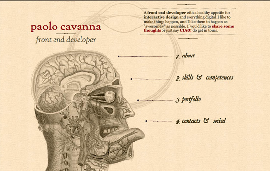
There’s a section that runs text a little too long but I really appreciate the use of old style fonts and graphics. There’s no horizontal menu, just the vertical one opposite the head diagram. Looks straight out of an old anatomy textbook.
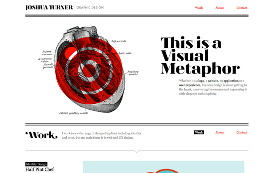
Beautiful grid-based, black and white design with a pop of red here and there. The one thing about anchors and one-page sites is that if a section isn’t tall enough, it won’t be apparent that you’ve skipped to that place once you click on the link. Here, when you click on the Contact link, it doesn’t place that section in focus because there’s no more space to scroll down.
Social Media Weekly
HTML, JavaScript – The Script Tag
“I’ve noticed that on a <script> tag, there are all kinds of variations that all seem to work cross-browser. What is necessary and what isn’t?”
Web Standards – Move the Web Forward
“You love web standards. You want to give back to the community. Curious about where to start? We’re here to help.”
Design – Stitches – An HTML5 sprite generator
“Drag and drop image files into the space below and click “Generate” to create a sprite and stylesheet.”
Mobile Web Design – A Look Inside Mobile Design Patterns
“Although these patterns are based on best practices in mobile application design, they may also be inspiring for mobile web design.”
