If you’re looking for something to go good with your Sunday breakfast, stop by Devlounge and have a look at the updated homepage. As promised, it was time to trash all of the extra stuff and put more focus on our articles. I still have some things to add (just a few more things to the sidebar on the right), and I’m still trying to determine the best amount of articles to have on the front page (more or less than right now…what do you think?). Let me know what you think of the change.
Archives for September 2007
Friday Focus #44
What an extremely slow week! I apologize for a severe lack of new material this week. My first week back at school, and it just takes a little while to get back into the swing of things. Without any more delaying, let’s just right into things this week since this is the only new material coming out of camp Devlounge.
Sites of the Week
Leading off week 44 is Varien. I’m loving the color scheme here, the site is very clean as well. The layout is nothing over the top or ground breaking, but it gets the job done and serves the purpose just fine.
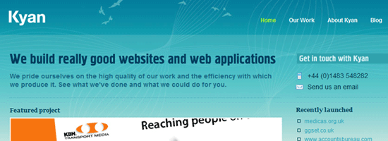
Second is Kyan. I really like how it goes from blue to green, obviously representing the sky and the ground. And their Carbon Logic project looks pretty damn nice.
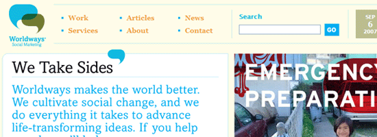
And finally this week is Worldways. The reason this one makes the list is because of how clean it is. Sometimes I just love how things are laid out, and this is one of those cases.
Digg / Design Float Weekly
Design – Web 2.0 Layer Styles
A bunch of Photoshop layer styles, with a bunch of gradients for you web 2.0 nuts. A time saver? Maybe for some of you.
Programming – 17 WordPress Plugins for AdSense
A Mashable article pointing out 17 WordPress plugins to help with displaying Google AdSense ads in WordPress.
Changes, Changes
You may have read it last week about the suggested changes that were on the way to Devlounge. Plain and simple, I’m removing all the bloat and putting 90% of the focus on what it should be on – the content. I feel right now, a lot of it falls by the way side. Currently if you land on the homepage for the first time, it can be difficult to navigate, and chances are you’ll end up clicking on content from somewhere else than from Devlounge, because there is so much more of it on the page. The homepage will be split into two columns, with a column on the right containing ads, recent interview photos (like they are displayed now but without the iframe), and some other goodies. The left column will feature someone between 5-10 articles, in large excerpt form leading to the actual full length articles. This should increase circulation of all of our content, which is always helpful, especially right now because I’m swamped with school stuff, upcoming SAT’s, college essays and applications, and a lot of other stuff that is going to be occupying most of my time. It should make it to the stage in a few weeks or less.
Saturday Slice (FF #43)
Late edition Friday Focus this week, and of course, it is all my fault. Please forgive me for a rare “Saturday” edition of the focus. Yesterday was my first day back at school, and after the seemingly forever when-the-hell-is-this-going-to-end day was over, I was out the rest of the night until early this morning. So no surprise I didn’t do any writing. The irony about the whole thing was all week I planned on writing about how helpful scheduling posts can be when a situation like this arises (like I knew it would), but I never even got a chance to write that one. Watch for it next week sometime. Anyways, enough talk. It’s Saturday Slice.
Sites of the Week
Kicking things off this week is Mobile Web Design, the store front page for Cameron Moll’s book on that exact topic. It was designed by 31Three. My favorite little feature is how you can actually use the More and Back buttons to look at some screenshots.
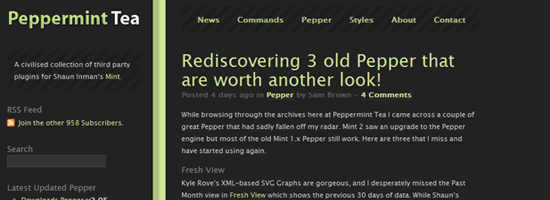
Next up is Peppermint Tea. The “official” repository for Mint Peppers. The design was recently updated, and has a much more “dark mint” appearance to it.
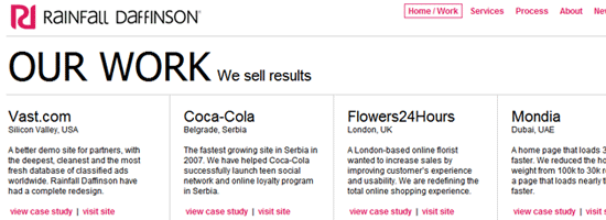
Rounding out this weeks Friday Saturday Focus is Rainfall Daffinson. A grid based portfolio layout, similar to Particles gives way to a nice collection of design work. Check them out.
Digg / Design Float Weekly
Design – Ultimate Web Development Cheat Sheets
Large collection of development “cheat sheets” in categories such as Javascript, CSS, Xhtml/Html, and Ajax.
Programming – Ruby on Rails vs PHP
The only top item in Programming for the last seven days. So here it is, a RoR vs PHP commercial.
Some Changes in Store
We are nearing the 300k unique visitor mark. Once we hit it, there will be some new and improved things in store for us here at Devlounge. The more people that come here, the faster we launch some of the new stuff and updates. I’ve been testing some of this stuff on the newest WordPress [beta] version, 2.3, and the site has been functioning just fine, which is only good news as we get ready to make some changes. Watch for them soon!
Have you advertised with us?
Without trying to sound too selfish, I thought I’d like to point out that we have a bunch of open slots right now for your advertising pleasure. This include 1 homepage slot and 2 sidebar slots. Be sure to visit our advertising page if you are interested.
That is it for this weekend. Enjoy it everyone!
