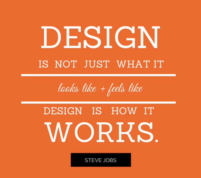
Web design, like everything else, doesn’t stay the same for centuries. It is constantly evolving to match the needs of today’s online browsers. As more technology emerges, we learn new things about web design and how to keep it functioning smoothly.
Today, the fundamentals of web design are largely about understanding your user and catering your design to meet the demands of search engines. Whether you’re new to web design, or just need a refresher on what’s trending today, use these four basic principles to catch you up on what users are looking for right now in web design.
1. Google’s Material Design
While you don’t want your web design to exactly mirror every website that uses Google’s Material Design, it’s important to understand what it is and why it’s popular. The overall concept of this design frame is not meant to copy the child-like feel of Google’s web pages. It’s about using a visual hierarchy to guide the reader, which isn’t much different than some of the most fundamental design elements.
Essentially, this design trend involves giving the consumer relevant information first, and then leading the eye downward, whether through imaging, color, or wordage, to a distinct and compelling call to action at the bottom of the page. It’s essential design with UX in mind, and it’s an important concept to master for successful web design.
2. Use High Quality Imaging
This concept isn’t new, but it’s still important. Web visitors want to read as little as possible to understand the purpose of a web page. They’re looking for a quick answer, and imaging helps make that happen. High quality images help to tell part of your story. For example, if you’re trying to rent out apartments on your website, you need high quality photos that show the reader your claims about the property are true.
Likewise, utilizing other forms of imaging is very important for attracting customers. Videos can explain complex concepts much easier than a photo or a blog post can, and infographics, whether static or animated, serve as visual teachers that consumers can recall easily.
3. Easy, Full-Screen Navigation
This element isn’t necessary for every website design, but it can be useful in some areas. Full-screen navigation is generally activated by clicking an icon with three solid lines located on the top left corner of the screen. You see this most often on mobile websites, but it’s effective on desktop websites as well.
When you activate the navigation, it veils the current web page with your navigational buttons, making it easy for consumers to access any part of your website. It leaves a streamlined, uncluttered design when inactive, and reveals everything the website has to offer when activated. It also makes it easy to maintain cross-device continuity.
4. Mobile Responsive Design
Above all, the biggest thing you need to know about web design today is that it’s going mobile, and if you fail to keep up with that trend, you’ll be left behind. Just a few weeks ago, Google updated their algorithm to factor in the mobile-friendliness of a website. If the website loads slowly or looks distorted on a mobile screen, your website will take a serious hit in the rankings. Creating a mobile responsive design is one of the best things you can do to increase the visibility of your website and make users happy.
As a web designer, it’s your responsibility to keep up with the latest in web design principles. If you fall behind on these concepts, your website will do the same, and your company will suffer the consequences.

