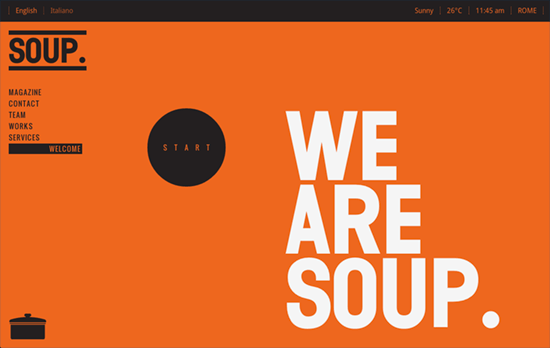
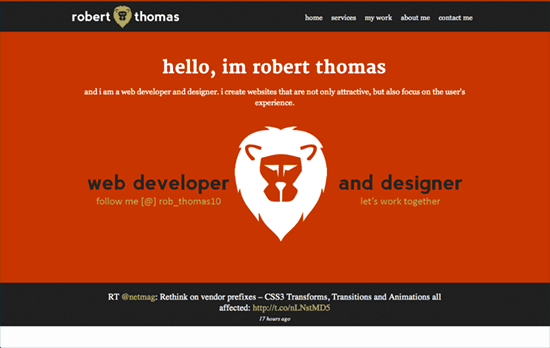
This week’s designs of note sport a cheerful, energetic, healthy dose of the color orange. Cheers!
Designs of the Week
Create unique, extraordinary websites with Squarespace. No experience necessary!

Bold move to start navigation at the bottom and work your way up—is this a growing side-effect of Apple’s “natural scrolling” now? Circular illustrations and frames are a huge theme in this design, accentuated with diagonal lines in the background, making for an edgy look. Lastly, I’ll always enjoy Google Maps that have a custom color scheme applied to them.

The strong header is immediately covered by a clean, light, lower content area featuring rounded fonts and baby blue accents, which we all know is the complimentary match of orange. Very friendly and informative.

Actually extremely simple, no frills whatsoever, but very readable and the use of orange is not too heavy at all.

It’s okay to use orange not just in the links but also as text (in this case, intro text and some of the smaller headings). It’s also a good idea to shift to black to not take away from the other colors in the portfolio page.

I like how the background has the texture of an orange peel, and how all the small icons are just that colorful they don’t get drowned out by it. The lightbox styling could have been customized further though!
Social Media Weekly
Get solid WordPress themes, plugins, and web design training from iThemes.
Typography, Responsive Web Design – Responsive Typography: The Basics
“Instead of mashing up all our articles on the matter, I decided to start from scratch and explain responsive typography step by step. This is step one.”
CSS – How CSS Handles Errors
“It’s really simple. At any given time, when parsing a CSS stylesheet, the browser is either trying to build an at-rule, a style rule, or a declaration (/property) inside of one of those.”
Design, CSS – Visualizing Colors in HSL Space
“In an effort to overcome my discomfort, I started messing around with the relationships between HSL and more familiar colors, starting with keyword sets. I’ve spun two visualizations out of that effort.”
CSS – Keep your CSS selectors short
“By this I mean that if you want to create extensible and maintainable, flexible and predictable websites, you should really take care to make your CSS selectors as dev-friendly as possible; i.e. short.”
CSS – Rethink on vendor prefixes
“Vendors can now officially unprefix CSS3 Transforms, Transitions and Animations.”
