A short list of websites where the & symbol is the star. Grab some inspiration from everyone’s favorite typographic mark.
Designs of the Week
Get solid WordPress themes, plugins, and web design training from iThemes.

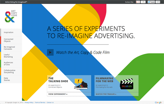
If you’re wondering why the color scheme looks familiar to you, that’s because it’s actually from the ubiquitous Google. Aside from being section markers on the side, even the icons carry the trademark four colors as accents. The interactions combine both vertical and horizontal uncovering effects—the former for scrolling and the latter for page-hopping.

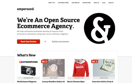
This design speaks in black, white, and red, on top of bold slab fonts and icons in circular frames.

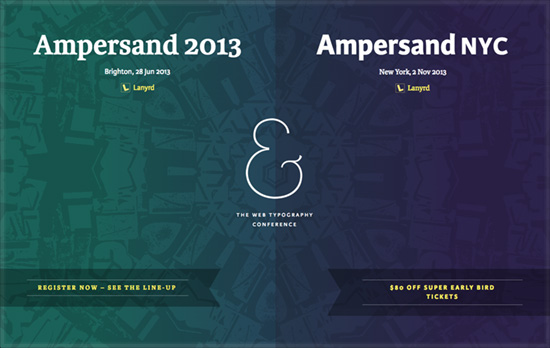
I see design elements that look familiar and made new again: gradients, repeating backgrounds, ribbons, translucent layers. All with a responsive touch.

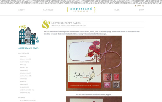
This one’s more of the homey, personal, crafty style—highlighted by lighter text colors and elegant patterns and swashes. The ampersand on each post heading falls right into place.
Social Media Weekly
Make Headway, make intuitive layouts, make it your WordPress theme of choice!
User Interface Design, User Experience – How to radically simplify your user interface
“Cutting too many UI elements may complicate the problem and not be the right solution, but designing the most minimal solution will show you new methods you wouldn’t have thought possible before.”
Design – Web Colour Data
“With a crowd-sourced data-set, the ultimate goal is to answer questions like: What is the most common colour/s or hue/s on the web? Do certain industries prefer certain colours over others? What colours are generally found together?”
