The next avenue for interactivity are logos that look brilliant in both static and animated states. Get inspired here.
Designs of the Week
Get solid WordPress themes, plugins, and web design training from iThemes.

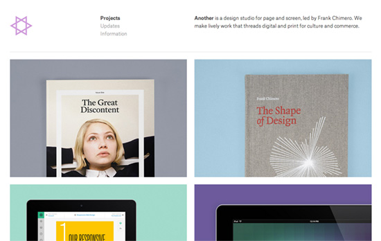
A familiar typographic layout whose minimal looks is broken by a colorful dance of shapes. One takeaway from this portfolio would be: it’s a good idea to screencast website design work along with screenshots.

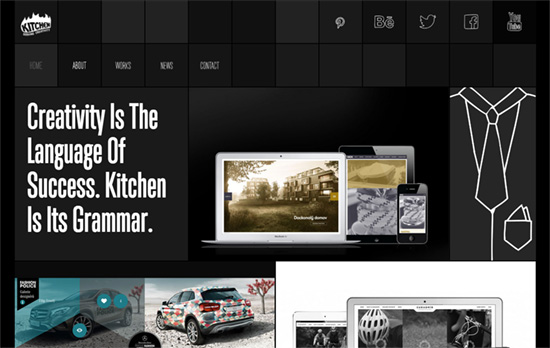
I enjoy the touch of quirk brought by the hand-drawn icons and words, which are wiggling like the logo. Clicking on the portfolio image once shows the name of of the project and a short description; clicking on it for the second time loads more information about it. Content blocks load asynchronously with a swinging animation.

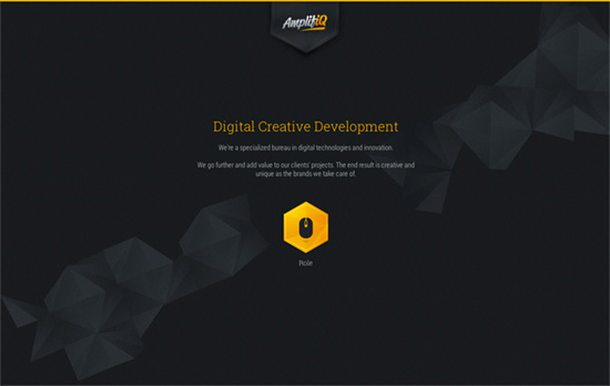
This logo suffers a little from getting blurried with native CSS transformations that animate the canvas element into a wavy banner. Softening it up, however, is an interesting contrast to the hexagon/polygon theme. Is it overkill? I like that arranging the images in a non-linear way following the shape edges makes the top-to-bottom scrolling more interesting.
Social Media Weekly
Pagelines lets you build WordPress websites and it’s as easy as drag and drop, go check it out!
Web Design, User Experience – Design principles for a payments experience
“Technology will change. People will want new features. Design for the unknown future.”
Interaction Design, User Interface Design, User Experience – The Scroll Up Bar
“Less annoying than bars that just sit there as you scroll down, and makes the menu easy to access without having to scroll up to the top of the page.”
HTML, CSS – Adaptive Placeholders
“The person who enters a value first isn’t always the same person who sees it later. To solve this problem I tried making the placeholder persist through the typing.”
