• Home
  • About
  • Contact
  • Advertise

Devlounge

Design, Develop, and Grow

ateşli sevgilisi fantezisini yaşamak istediğini söyler porno ona arkadaşları varken onunla gizli saklı seks yapmak istediğini sikiş söyleyen kız hafta sonu için gelen arkadaşının görmediği bir sikiş açıdan sakso çekmeye başlayınca adamın yarağını bu altyazılı porno şekilde indiremez ve açık şekilde salonda sikişimeye sex izle başladıklarında misafir kızı da bu sekslerine rokettube konuk ederler seks yapacağını düşünmeyerek onun sex izle oyun oynadığını zanneder sabah olur ve herkes uyanır hd porno bu sırada yanında şişme mankenini de getiren sapık erotik hikayeler genç sınav haftası ders çalışan genç adam üvey annesinin sikiş eve gelmesiyle hayatının şokunu yaşar

  • Home
  • Code
  • Design
  • Design Focus
  • Interviews
  • Publishing
  • Strategy
  • Webapps
  • Extras

Design Focus: Scroll Control

February 29, 2016 By Sophia Lucero

The interactive highlights of these designs are controlled by how much you want to scroll, so instead of just passively “watching” the animation go by, you say stop and go to experience the sites as you please.

Designs of the Week

Get solid WordPress themes, plugins, and even design training from iThemes.
Ginventory
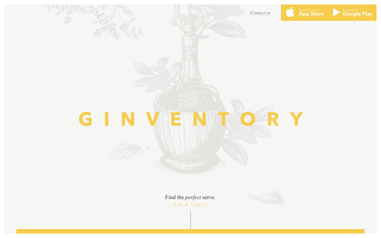
Ginventory

I wish this weren’t “scroll-jacked” but everything else is just lovely. Definitely not the usual website featuring a mobile app.
The Glitch
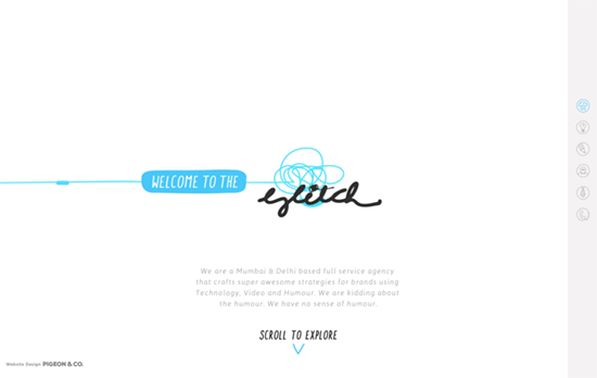
The Glitch

Such a fun idea to do stop-motion animation by going around the agency’s office and do all sorts of quirky twists. The weird thing is if you use the right-side navigation it moves too quickly, so definitely scrub through by scrolling.
Innovation - Boegli Gravures
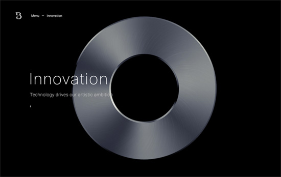
Innovation – Boegli Gravures

The whole site uses a various animations on its elements as you scroll down, but it’s the Innovation page in particular where you get this satisfying experience of rotating an object mid-air by your scrolling back and forth. I also like the rectangular animation that overlays the menu.

Social Media Weekly

Create unique, extraordinary websites with Squarespace. No experience necessary!

Design – Why Bother Making Beautiful Team Pages?
“There’s no one right way to design a team page, but I think it says so much about the company’s respect for an employee when it’s willing to pay for the cost of high quality photos of its team.”

CSS – REM vs EM – The Great Debate
“Turns out, rem and em have their strengths and weaknesses. They should be used differently, depending on the circumstances.”
Design Focus: Reading List

January 29, 2016 By Sophia Lucero

These featured designs are all in keeping with a publication theme in terms of content and presentation. Although they don’t necessarily have to look like a shelf of books, it’s interesting to look at how they came up with such websites to accomplish their goals.

Designs of the Week

Build on DIYThemes’ Thesis Framework for rock solid SEO and great layout customization options.

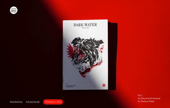
Dark Water
Dark Water

A one-pager about a journal that looks nicely typeset and keeps that masthead feel with its footer credits. The way it’s photographed in the above-the-fold picture, not to mention the red accents, give it a bit of intrigue too.

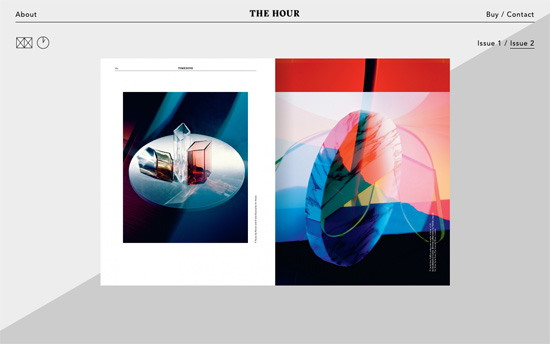
The Hour
The Hour

This magazine featuring watches does a very clever thing with the background mimicking the second hand rotating round a clock. To the left you’ll see a couple of icons that switch between the magazine pages and its featured watches. The upper two links in both corners show content sliding in from their respective sides.

Reading Design
Reading Design

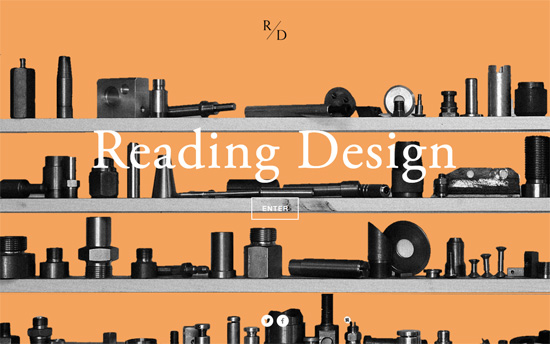
You don’t see “splash screens” too often except in asset-heavy, interactive sites. Here it’s a threshold to a text-heavy site, particularly an alphabetically arranged index of topics. Pretty much every detail here has that traditional print publication feel, apart from the quite-modern photo essays which you can view one at a time or as a grid.

Swiss in CSS
Swiss in CSS

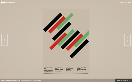
A beautiful throwback brought into this century: the International Typographic Style is recreated as different dynamic posters with CSS, and I would have loved to read the thought process on what the animations were chosen for each design.

Publishing as (part-time) Practice

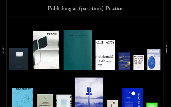
Covers of books arranged horizontally on imaginary shelf lines become vertically rotated “book spines” when hovered on. Very curious is the use of red, yellow, and blue as accent colors as you don’t see that everyday. Aside from that though, super elegant typographic details in here too.

Social Media Weekly

Need help in promoting your site? INeedHits has been in the search engine marketing since 1996!

Performance – Performance Budget Builder
“The Performance Budget builder lets you lay out your template types, set a size budget for each template type, then plug in the sizes for each asset category that will load in the template.”

UX – Any Research is Better Than No Research
“No matter how simple or complex your product, without research you are designing it based on assumptions.”

JavaScript – The Controversial State of JavaScript Tooling
“Other languages and ecosystems are victims of all-encompassing standard libraries, but the web development community takes pride in not having that problem.”

CSS – Learn CSS Layout the Pedantic Way
“CSS layout can be difficult to learn, because websites usually evolve incrementally. This means that you end up learning small tips and tricks here and there, and never learn the underlying layout algorithm.”

Design Focus: Get Some Perspective

December 29, 2015 By Sophia Lucero

As this year ends and a new one begins, it’s good to think different and look at things from a different angle. Here’s some inspiration to get you started.

Designs of the Week

Make Headway, make intuitive layouts, make it your WordPress theme of choice!

Tennent Brown Architects

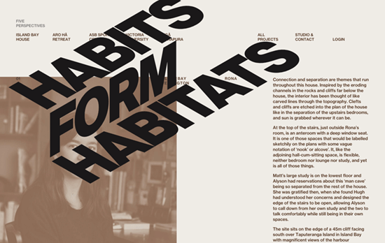
Not only is the large heading text reminiscent of the lines and shapes of buildings, it has an excellent sliding animation following the same 3-dimensional form as you scroll down.

Tapmates Inc.
Tapmates Inc.

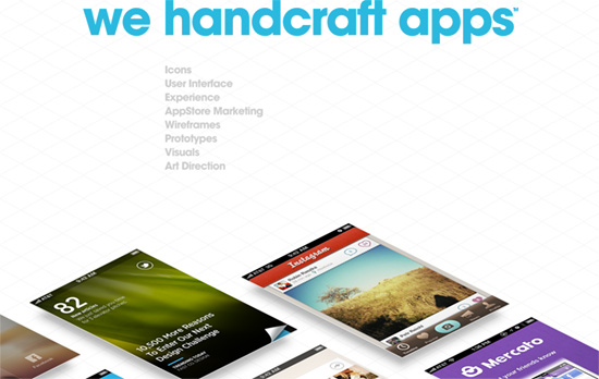
There are many different ways to show portfolio images and here it’s all about the isometric look combined with tiles of app screens sliding in and out along the same perspective lines, although with not the most readable of angles.

YES
YES

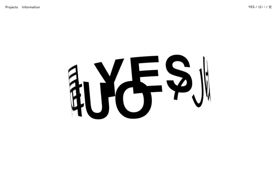
There’s something amusing about a perpetually spinning logo on a website, like an endlessly flashing sign in a busy urban area.

Leanne Bentley
Leanne Bentley

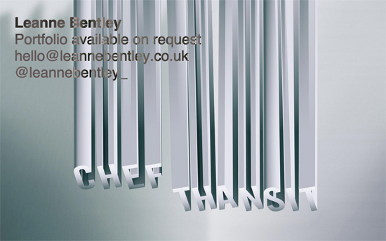
Still in the infinite loop department, this one’s a single page of works that continuously scroll up, with the upper left text using a differential blend mode making for an interesting effect.

Social Media Weekly

Ready to go out and design your next website? Try building with the Catalyst Framework.

Responsive Design, Typography – A Responsive Guide to Type Sizing
“Proportions are a key ingredient to the mixture. Calibrating your type proportions for a balance of aesthetics and order can be an obsessive undertaking.”

Interface Design – How Tabs Should Work
“Sadly, most of the time I come across them, the tabs have been badly, or rather partially, implemented.”

Design Focus: Fall In Line

November 26, 2015 By Sophia Lucero

These sites feature prominent lines that steer your way of reading and browsing the page.

Designs of the Week

Want your site to be as good-looking and inspirational as these? Start by choosing a well-designed theme from ThemeForest.

10 Years of Git
10 Years of Git

Lovely illustrations in an orange and navy palette, with full-screen popups that appear when you click on the ‘info’ icons.

Jun Duffy
Jun Duffy

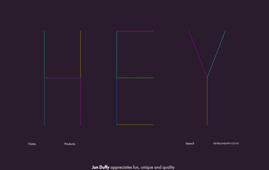
It probably isn’t appropriate for other online shops, but the freeform arrangement of the products as you scroll down is a welcome change from the rigid grid that defines majority of e-commerce. Hover on one article of clothing and short wiggle animation.

Si digital
Si digital

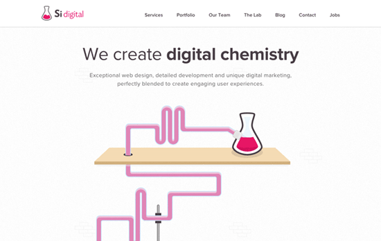
I always enjoy a mad scientist lab motif in the design, and this one even has a robot that lets you shoot Walter White.

Sam Skinner
Sam Skinner

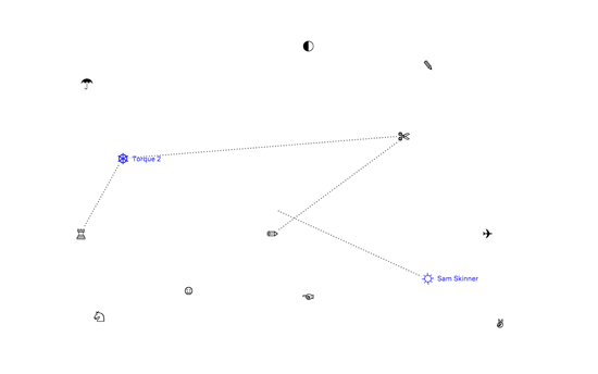
A super simple design that only makes use of icons (is that Wingdings?) and dotted lines that are drawn as you hover on one glyph and move to the next. Clicking loads the project description, and all the icons’ switching from one glyph to another that act as the loading “spinner gif”.

Social Media Weekly

Build on DIYThemes’ Thesis Framework for rock solid SEO and great layout customization options.

Web Typography – Seriously, Don’t Use Icon Fonts
“If you won’t stop using icon fonts for people with screen readers, people with dyslexia, people with browsers that don’t support @font-face, people who randomly didn’t load the icon font once for some reason, or designers who just want their icons to look right on-screen…”

Development – Key Considerations For Designing A Cross Platform Application
“To help you streamline your app design in an optimal fashion, here, is a list of noteworthy aspects that must be kept in mind while designing cross platform application.”

Design – Designing destinations at Lonely Planet
“We want to place an emphasis on organization, tools that help people quickly find the top things to do in each location, and a curated set of places and experiences that help people get to the heart of a destination.”

Design Focus: Drag-‘n’-Drop

October 30, 2015 By Sophia Lucero

These sites invite you to interact with them by more than points and clicks, and mouse around with drag and drop features.

Designs of the Week

Create unique, extraordinary websites with Squarespace. No experience necessary!

Minon
Minon

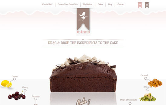
One of the best ways to up the dynamic ante especially with an online shop is drag and drop, and here it’s about putting ingredients on a cake to customize it. The best part is the puff of smoke that appears when the change happens, adding magic to the moment.

Prizma
Prizma

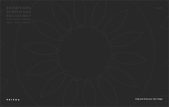
The site invites you to personalize the space by dragging an image and generating a kaleidoscope effect out of it.

Jakob de Boer
Jakob de Boer

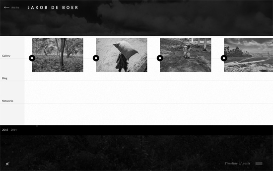
Horizontal scrolling is the next most common application for a drag action, and here it’s to scrub through the timeline of a gallery, blog, and Twitter feed.

Bryan James
Bryan James

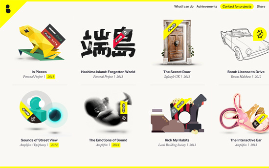
Yellow page border and matching custom scrollbars, a loading gif that’s based on the designer’s logo and other small touches that make the feel more coherent.

Files Rec.
Files Rec.

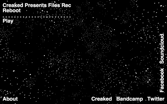
A spherical of white dots on black space come alive and change into different forms and letters when the music gets played.

Agency Survival Kit
Agency Survival Kit

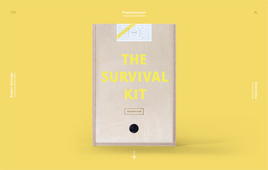
Switch through three diferent products sideways, then uncover the kit and more details about each by scrolling downwards.

Nerval
Nerval

The scrolling main text can be dragged left and right, and on inner pages they just scroll as a watermark in the background.

Social Media Weekly

Search Optimized, Turn-Key Designs, Unlimited Everything. Start building with the Genesis Framework today.

Design – Inside Hearst’s New Agile Design Process
“Watch as Hearst Digital’s Creative Director Theresa Mershon shows you how agile publishing and the process, skill and workflow changes that her team made this year allowed them to go from launching one website every few months to publishing a new title in as little as three days, helped double their traffic, and improved engagement.”

Typography – Typography Tools on the Web
“They each work in their own way to get the finer details into focus for designing websites, app or even typefaces. Some, for details that are often missed.”

« Previous Page
Next Page »

Code & Tutorials

Which Front-End Development Languages Will Grow in 2017?

Your Guide to Leveraging APIs as a Developer

Bitcoin Processing Website Integration For Web Developers

Website Security For 2016 That All Developers Need To Know

5 Reasons You Need to Be Using jQuery

About Devlounge

Want to read more about Devlounge, or maybe you want to contact us, or even advertise? Oh, and don't forget to subscribe to updates!

The Best of Devlounge

Best Infographics for Modern Web Designers and Developers

Search