Are You Designing for the Smaller Screen?

I’ve been thinking quite a lot about screen resolutions and, just as importantly, screen sizes the last year or so. Being a fan of small laptops and portability, I get constantly reminded that just because I pack a decent resolution of 1024×600 pixels (or whatever), that doesn’t mean that sites looking good on a traditional screen will work on my 8.9″ one, despite them both showing as much horizontally. The way I see it, there are X aspects of smaller devices you need to at least consider when doing designs, if you want to be future proof:

  • Smaller laptops/netbooks with decent resolution, like the Asus Eee PC or any screen under 12″ basically.
  • Smaller devices with a screen size at 5-7″, sporting a resolution at 640-800 pixels horizontally.
  • Mobile phones or similar with sub-640 pixels horizontal resolution, possibly with a vertical focused screen size ratio (like the iPhone).

That last one is easiest, they more or less require special treatment. Sure, you can use Opera on a mobile phone, or Safari on the iPhone, and surf the regular full-grown web well enough, but if you want it to look good and really work for the screen, it’ll need special adaptations. That is usually a completely different version of you standard site.

The Netbook Issue

The original Eee PC
The original Eee PC by Asus

Laptops and similar larger, but still small, devices are harder. The popular Asus Eee PCs started out with a 7″ screen with 800 pixels width, that’s too small for most sites today, usually optimized for a 1024 pixel horizontal limit. Some sideways scrolling is OK, I suppose, but fluid designs or smart choices could probably at least minimize the occurrence of that. However, your traditional site could work, if you laid it out in a reasonable fashion.

It gets worse when we’re talking 5″ or 6″. The resolution won’t be 800 pixels width, it’ll be something like 640 or less. That more or less makes any site designed for 1024 pixels width a nuisance to read. Everything will look like crap, basically, and we won’t want that as a designer. Visitors on small screens like that should be getting special treatment, probably with a completely different version of the site altogether.

Add Vertical Issues

a little bit of vertical scrolling isn’t really an issue

Web designers often concern themselves with a site’s width. It is indeed important to fit everything, from content and images, to ads and links and whatnot, in the Perfect Column Setup. Compared to that, a little bit of vertical scrolling isn’t really an issue when having access to decent screen real estate. I’d venture so far to say that the blogosphere helped push this forward, it is OK to scroll down again, although advertisers still yap about being above the fold all the time. That may be as it be, but what might be a little scrolling on a normal sized screen, say 768 pixels height (1024×768 being the most common screen resolution), or perhaps even more, but it’s not as fun if we’re talking 480 pixels height in screen real estate.

It is not that there’ll be a lot of scrolling per se, it is more an issue of the small amount of actual content being displayed. Take a site like this, and a post like this. Lots of text, which is fine and pretty easy on the scrolling factor after all. But add big strong graphics, add a powerful header image, add ads breaking up the post, and you’ll get a mess. Then take that to a really small screen, and you won’t be stuck surfing the web as much as you would otherwise.

This is a tough nut, however, because while we can optimize for less width to play with, the vertical scrolling is necessary on most websites today. There are solutions, some better than others, but the one thing they have in common is that they will probably not fit the big screen, just the smaller one. In other words, while vertical scrolling isn’t as big an issue as horizontal one, you might be better of optimizing for it.

Back to the Roots: Mobile Websites

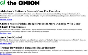
This concept would work on a mobile phone (showing The Onion anno 1997)

Mobile phones are getting more and more web friendly, with the iPhone leading the charge. What they have in common is that they are vertical aligned, meaning that there is more height than width to play with in your design. The fact that a mobile phone, or similar device, shouldn’t be too bulky is actually a good thing here. It means that it’ll be easier for us to do fluid designs, having text wrap from left to right, no fixed layouts or anything.

Like it was, once upon a time. Only prettier.

One thing is for sure though, these sites need special treatment. There are plugins for publishing platforms, and several services that repackage your content, and optimize it for mobile phones, and that’ll help us along the way. However, we do need to consider how we lay out these sites as well, and how we can design them to connect to their older siblings (being the traditional website, should you not be a fan of metaphor). After all, if you do have a special website for mobile devices, it should feel like a natural adaptation to the smaller screen, right?

Are you designing for the smaller screen, and what do you do to make it easier for visitors to your site using smaller devices?

Cymbolism: An Interview with Mubashar Iqbal

Picking the right color for your design can be a hassle, that’s why there’s so many color schemer tools out there, of course. Recently, a slightly different one was launched by Suffolk Software, called Cymbolism. What it does is that it asks you which color you associate with a word, “love” for instance, and use that data to suggest colors based on keywords, rather than just displaying sets. I found that interesting, so I decided to interview the developer, Mubashar Iqbal, about this service.

The Interview

So what is Cymbolism, your new web app?
Cymbolism is a crowd sourcing application that that attempts to quantify the association between colors and words. Users are shown a word, and are asked to select which color they associate with that word. The user votes are tallied to quantity which colors are most associated with that word.

How would you say a designer should use Cymbolism?
When working on a new design, the creative brief usually includes a few key words that help drive the design direction.

You can lookup these words on Cymbolism, via the search functionality, and see what color people associate with those words which can provide you starting point for your designs color scheme.

Even if you decided to go against the current trends, Cymbolism will tell you what the trend is.

What sparked the Cymbolism project?
I’m really bad a picking color schemes for my web projects, so I’ve been reading a lot of articles and books on color theory, and they mention the psychology of color a lot. I started searching around the web to see if there was something more up-to-date for those associations, when I couldn’t find anything the idea for Cymbolism was born.

What are your thoughts on how colors are used in web design today?
I think the bigger sites still play it a little too safe. Most of those sites have much the same light background with a little splash of color. Even companies that have strong color associations (UPS for example) don’t make strong enough use of these colors.

What do you think govern our color choices in design? Is it all trends?
External trends do play a large role in color choices. When we see one effective use of color it usually spawns a lot of copy cats.

Same is true off-line. We still pay too much attention to what the next big color will be at the annual fashion shows, driving a lot of color choice in the print world.

Online we are able to adapt quickly and easily so people should not be afraid to try new things.

I’d like to thank Mubashar Iqbal for the interview, and urge you all to take a look at Cymbolism. Maybe it can help you in your upcoming project!

Things To Consider When Using WordPress as a CMS

WordPress is first and foremost a blogging platform, but that doesn’t mean that it can’t be used for other things as well. In fact, the development of WordPress have been such that I wouldn’t be surprised to see a non-blog focused fork soon, because the necessary functionality for most web sites on the admin side of things are already there. I know, because I’ve installed and used WordPress as a content management system (CMS) for several clients the last year or so, and have had no complains yet.

“You’re crazy! Get Joomla/Drupal/Textpattern/something else instead!”

I would consider doing that, actually, if it wasn’t a fact that I know WordPress, can bend it to my will, and know that any necessary functionality I’d like to add is a mere plugin away. The fact that I’m using WordPress as a CMS for clients doesn’t mean that I don’t think that the other options out there, including TextPattern which intrigues me, are poor choices. I just know WordPress, and I know it is easy to use (as opposed to, say, Joomla) for not so familiar clients. Add a solid support for “static” content, being the WordPress Pages, and more newsy update flows controlled by the Posts, and you’ve got your needs pretty much covered for most websites online today.

Things to Consider when Choosing WordPress as a CMS

There are especially 3 things you need to consider before committing to WordPress as a CMS, and starting to plan it, as far as I can tell.

  1. Is the functionality needed covered by the WordPress core functions, and/or with the addition of (not too many) plugins? This is usually managing information pages (using Pages), and publishing news/press releases (using Posts). If I need to add a lot of custom stuff, including the custom fields, then perhaps it gets too complicated for the client.
  2. Is there a good translation of WordPress available, so that your client can get the backend in their own language? Why should my Swedish customers not have their CMS in Swedish? There is no reason, of course, and it is easy enough to install a language pack.
  3. Will my client be able to upgrade WordPress themselves, or do I need to make plans for this as well? This is true for most platforms out there, but nevertheless you’ll need to have an upgrade strategy.

The real issues present themselves when you’ve chosen WordPress as the CMS for your client project. That’s when you’ll have to think a bit outside the box, or not really, but at least peek over the blog focus edge at least.

Designing for Web Sites Powered by WordPress

In general, using WordPress as the CMS just means that you’ll design a theme as you would for a WordPress powered blog. Most of the things you need to keep in mind is what should be powering what on the site. For example, a company presentation should of course be a Page in WordPress, that way the company can edit it easily as well. With the 2.5 and 2.6 versions, the WYSIWYG editor is actually quite good as well, so there is no harm in this at all. Basically, you’ll use Pages for static content, just as you would on a blog, with the difference that Pages are your core content on the site, rather than posts, which is the core of any blog. This means that you’ll have to consider the Page hierarchy and presentation, possibly providing Page templates to control the layout a bit.

The front page of the website is another thing. These days, you can set a Page as the front page by visiting the WordPress settings (as opposed to the hacks of yonder). This is probably necessary for most traditional websites, so you’ll want to do a Page template for this particular front page Page as well, and make sure that the minimal (if any) editing that can be made from the WordPress backend should be used with caution. Breaking a front page isn’t a good thing, you know, and chances are there’s more than just text and a few images to manage, so keep the advanced stuff out of the editable part, putting them in the Page template instead.

Finally, there’s the updates, usually being company news or press releases or something similar. This content can easily be managed by using the Posts in WordPress, assigning a category for news, press releases, or whatever. This way you can have a page on the site (incidentally a Page in WordPress as well) that displays the content, and then link people to the category, possibly controlling it a bit by tweaking the category template. You could even bypass the page listing the content mentioned above, and just link the categories from the menu.

The Fiction page's sub menu

Speaking of the menu, chances are you can forget about using the WordPress functions to display Pages or categories, since that would and could mean that your client can break the design by accidentally creating un-necessary Pages or categories. I usually just put these links in the theme, and if they want to add a main category they’ll just have to contact me to do an edit. I do, however, try to make sure that adding sub-pages (i.e. Pages belonging to other Pages) will result in decent linkage on the mother Page, much like I’ve done on my fiction page over at tdhedengren.com.

Another thing you need to think about is what user priviligies your client will need to have. Sure, someone at “their side” needs to have admin priviligies, but that is probably not the general one needed. You need to consider this as well, as it is probably you that will be setting it up, and you don’t want the client to break the settings accidentally.

Checklist for Creating Web Sites with WordPress as the CMS

These are the things I tend to think about before choosing and designing a website where WordPress will be used as the CMS. There’s probably other things as well, things I just haven’t take into account since my clients haven’t had that kind of need yet. Feel free to add yours in the comments, sharing is caring after all.

  • Is there even a need for a CMS for the client?
  • Is WordPress the correct CMS? Will it fit the needs? Is the translations available for the WordPress backend good enough? How will it be upgraded?
  • Will I need to extend WordPress using plugins? Are any hacks to the core necessary, because if they are, how will I make sure that these won’t break when the core is upgraded?
  • What types of content will there be, and what should be deemed static (i.e. use Pages), and what is flowing updates (i.e. Posts)? How will I present this, and what is the main type of content?
  • How will the permalink structure be? Should it really say “category”, why not “view” or “updates” or something else?
  • Will the menu be static (i.e. coded into the theme) or controlled by WordPress (i.e. listing using WordPress tags for Pages and categories)? How could this go wrong in the future?
  • What hierarchy will the Pages have? This is important for the URL, since it should be coherent with the menu hierarchy after all.
  • How will I present sub-pages (i.e. Pages having a mother Page)? Should there be any at all?
  • Do I need Page templates for various sections? How will these work with sub-pages?
  • What categories will I use? Should the client be allowed to create new categories?
  • How will I present Posts content?
  • Do I need category templates for the various categories?

What is your experience with WordPress as a CMS, and have you anything to add to the list? Share in the comments.