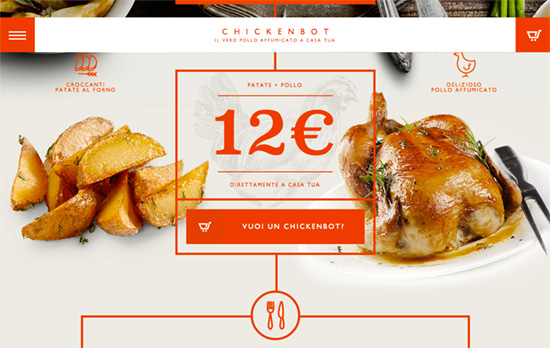
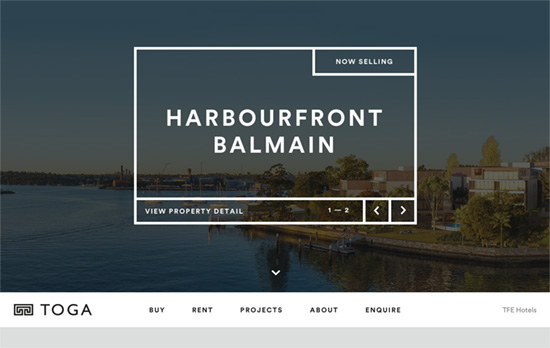
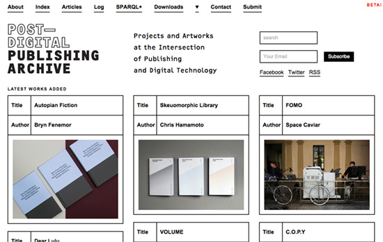
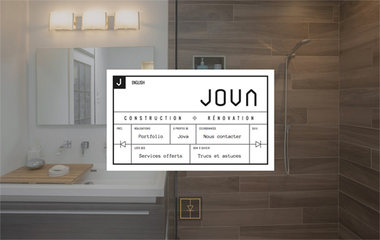
Besides the “ghost buttons” trend, we’re also seeing a lot of bordered boxes as design elements lately, which gives a classic retro feel in displaying and laying out information on websites.
Designs of the Week
Search Optimized, Turn-Key Designs, Unlimited Everything. Start building with the Genesis Framework today.

Gorgeous typography and interesting hover effects. The text is center-focused without resorting to center alignment all the time, and the site uses two major dropdown navigations affixed on the top left and right of the page.

A fresh take on the ubquitous carousel element, and the thick borders combined with the font choice conveys a builder motif on this property-themed site.

The bordered box look reminds me of tickets, library cards, and other things that curate and catalog information, so it definitely feels right at home here alongside that black and white palette and bold font weights.

There are few icons or graphical elements in the boxes, but here it’s particularly clever to use an electrical symbol for the arrows, blending in nicely. Said boxes are also animated with a “drawn in” effect, and a folding effect on important links. Most stylish construction company site ever? I’d say so!
Social Media Weekly
Ready to go out and design your next website? Try building with the Catalyst Framework.
HTML – Crazy classnames in HTML 4.01
Web Design – An Exhaustive Look At The Year In Web Design
