Design techniques are fleeting, so it’s hard to determine what’s simply trendy, and what actually works. Here we stand in 2016, though, and parallax design is still as popular as ever. If you haven’t experimented with parallax design, now may be the time to give it a try.
5 Reasons to Invest in Parallax Design
The power of parallax design is rooted in its simplicity and visual appeal. Not only is parallax design interactive and engaging, but it does an effective job of inspiring users to take action. In a world where high conversion rates are the gold standard, this is a valuable advantage.
Let’s briefly highlight why people are investing in parallax design.
Eye-Catching Display
As mentioned, parallax design is eye-catching. Just check out this example. It’s unlike anything you’ve ever seen before. When you visit this site, you aren’t going to have any trouble recalling what it’s about. The visual appeal of the design draws the user into an immersive experience. For websites drowning in mediocrity, parallax design is the answer.
Logical Flow of Information
Web design should push users through the conversion funnel one step at a time. With parallax design, this becomes exponentially easier. Generally speaking, parallax design presents information in a logical manner. Just take a look at this example from Sandata.
In this example, the user is encouraged to scroll down to learn more about the “five rights of care.” As you scroll, each of these individual rights is listed and explained. At the very end, you’re encouraged to view additional resources. This may not seem like anything special, but it’s amazing how many traditional websites miss the mark when trying to convey information. Fortunately, parallax design makes things easier.
Better Product Demonstration
Parallax design is especially valuable for ecommerce sites selling or advertising physical products. The website Bagagia is a good example. As you scroll, the product shifts and rotates, with more information being displayed alongside the image for additional context. When compared to a single static image or gallery slideshow, this approach is significantly more interactive and engaging.
Design Focus: You Are Here
Enhanced Storytelling
Parallax design is much more conducive to storytelling than traditional web design, which is highly fragmented. See, standard web design requires users to click from one page to the next in order to consume content. Parallax design – when coupled with infinite scrolling – removes these barriers. Users can seamlessly experience the story with the simple scroll of a mouse.
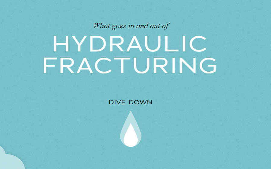
This Dangers of Fracking website is the perfect example. As the user scrolls, they are brought into the middle of a visual story. While the same information could be conveyed in paragraph form, it wouldn’t be nearly as effective. The majority of people are visual learners and parallax design plays to this preference.

Lower Bounce Rates
When you combine all of these benefits together, you’re naturally going to end up with a lower bounce rate. People are more engaged with your content and they don’t have to click away to learn more. Everything they want is consolidated into a single aesthetically friendly page. As a business owner, this subsequently adds value to your brand. As a designer, it creates more satisfied clients. It’s the best of both worlds!
The Case for Parallax Design
Parallax design isn’t exactly the newest web design technique, but it doesn’t appear to be going out of style any time soon. There are numerous reasons to invest in parallax design in 2016 – including the five referenced in this article.
Will you join the trend?
