CSS3 Is together with Canvas one of the more exciting elements of web design. With this post we want to showcase some awesome techniques to improve your design with the help of CSS3. [Read more…]
Have Fluid Layouts Fallen Out Of Fashion?
Remember when fluid layouts were all the rage? It seems like lately, more than 90% of the websites I frequent are using fixed layouts. The WordPress Theme Repository has more than twice the number of fixed-width themes than flexible ones. And all the sites I’ve made for clients in the past year have been fixed-width.
For the record, I usually do offer clients fluid-width designs. They choose to go fixed-width, it seems, because it makes them feel more in-control of the finished layout. And in a world of various browsers and various monitors and different resolutions, feeling in-control over something is a good thing.
The thing is: in a world of various browsers and various monitors and different resolutions, can we ever be in-control of precisely how a website is displayed?
It would be wonderful, indeed, if everyone in the world was using wide-screen monitors set at 1920×1080 resolutions and surfing on the same browser, but that’s simply not the case. My father-in-law, a tech-savvy man of 79, doesn’t like wide-screen monitors and refuses to use anything but 800×600. My mother, who insisted on a wide-screen monitor for the sole purpose of playing Farmville full-screen, doesn’t like having to scroll down a page even an inch.
Why, then, this move away from fluid layouts? Shouldn’t they be the answer to all our problems? Here, for example, is a screenshot of a 770-pixel fixed-width website, as seen on my wide-screen monitor:

I recently read about using resolution-specific stylesheets, sort of a “layout for every resolution”, and am curious to try this method out. Then again, wouldn’t it be better to design a rock-solid “hybrid” fixed and fluid layout? It may take more time, yes, but eliminates the need for multiple stylesheets or additional javascript.
I’d love to hear your thoughts on this. How many fluid-width sites have you designed lately?
10 Premium WordPress Themes Worth Paying For
As a custom theme developer, I’ve seen a lot of so-called “Premium” WordPress themes, and the truth is that a lot of them are simply not “worthy”. In many cases, a few hours on the WordPress Theme Repository will bring forth one or two similar themes for free.
So why bother? What makes a Premium WordPress theme worth paying cold, hard cash (or, perhaps more realistically, PayPal dollars) for?
Here are ten paid WordPress themes that truly deserve to be called “Premium”- and why I believe they’re worth every penny.
Market Theme ($55 Standard, $150 Developer)
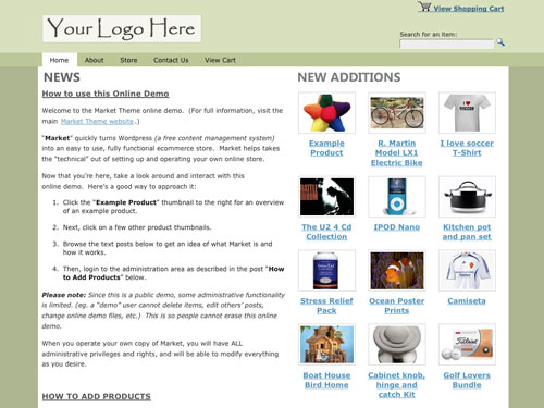
I’ve built a few WordPress eCommerce websites from scratch, and know how complex it can be. Market Theme, which I had the pleasure of utilizing on a project recently, takes all those complexities and simplifies them. The “Product Manager” is easy to use, the shopping cart is quick and painless to set up, and the default design- while not exactly sexy- is easily customized for good branding. For online stores selling tangible goods, you simply can’t go wrong with this one.
The Local ($69 Single, $169 Multi)
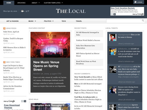
Created for local news sites (hence the name), The Local is actually an add-on theme to the same designers’ Elemental theme, and the price includes both Elemental and The Local, so it’s two excellent themes for the price of one here. Some special “local” features include the ability to add and manage weather statistics, and define your “news radius”. Journalists or small news publishers, particularly, will appreciate how simple it is to learn and use.
Mimbo Pro ($79 Single, $169 Multi)

From the same designers comes Mimbo Pro, a Premium WordPress theme that’s been around for quite a while now. It’s basically a magazine theme, but anyone who’s had the pleasure of using Mimbo Pro knows it can be so much more. Features everything from animated drop-down menus to an image “carousel” with variable speed to a built-in contact form with CAPTCHA support. Recommended for text-heavy blogs and sites.
Phototastic ($49 Single, $179 Multi)
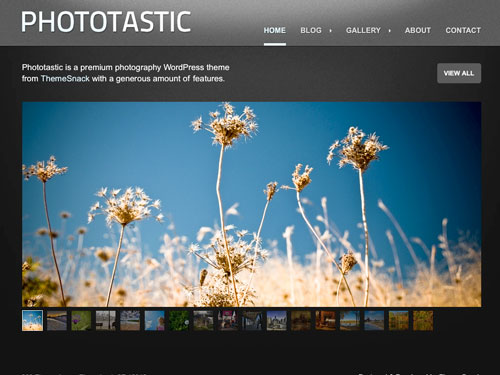
I know from experience how complicated it can be to design a good photo-themed WordPress theme, which is why I appreciate how detailed and beautifully coded Phototastic is. Created specifically for artists and photographers, this is the one to turn to for image-heavy blogs and sites.
Simply ($37)
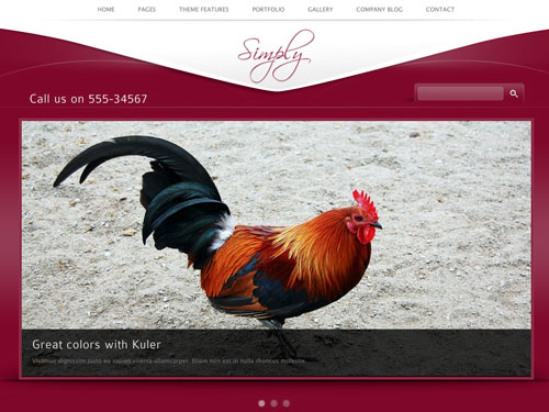
Most of the themes I’ve listed so far are “themed” themes, usually catering to a specific type of blog or site. Here’s one that’s quite a bit more flexible. Simply is- yes- simple, but it’s also quite powerful, and features a 10-page tabbed admin panel to prove it! 16 built-in color schemes and 5 header designs make it easy to get started right away, and there are a host of other cool elements to choose from, including slideshows, a lightbox, and the option to go full-width.
Revoltz ($37)
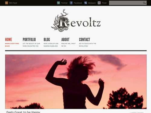
Also from ThemeForest is the lovely Revoltz, another theme with options o rama, which are always a good sign, imho. Delicious features range from a slideshow gallery to multiple page templates to dual (normal or full-width) layout choices- plus PSD files, and- my favorite- step-by-step instructions on using and troubleshooting the theme. Now that’s how you do it.
Social Life ($75)
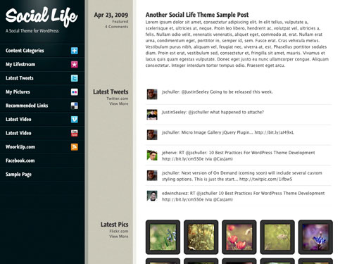
Love Tumblr-like “lifestreams”? This theme stands out because of the way it integrates feeds and information from your various social media services- so your friends / family / customers just need to check one place for everything “you”.
Super CMS ($75)
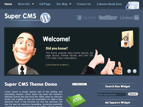
WordPress is definitely more a “CMS” (Content Management System) to me than just some “blogging software”. The Super CMS theme affirms this, proving just how powerful little ole WordPress can be. Built on PrimoThemes’ own framework, it includes very comprehensive theme options, support for Gravatars, threaded comments, and some nice pre-installed plug-ins.
One Theme (From $99)
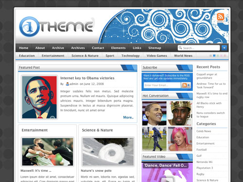
“One theme to rule them all…”? This one’s a little different, because- as I understand it- you purchase a license (single is $60) to use their “One Panel” plug-in, then select from four available themes: Default (shown above), Fun, Modern, and Professional at $39 each (which explains the “from $99” pricing I’ve listed above). A lot of work has obviously been put into this One Panel, as well as into each theme, with features so numerous I’ll just link to them.
Thesis ($87 Personal, $164 Developer)
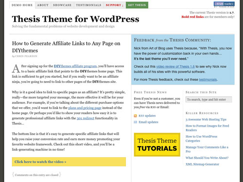
And finally, saving best for last yet again, is Thesis, an absolute gem of a Premium theme, and my favorite of the bunch. This may or may not be due to my tendency towards control-freak-iness, but I love the theme’s attention to detail and numerous features, which include SEO and accessibility elements. What really wins the prize, however, has to be Thesis’ support forums, which features thousands of posts on everything from basic getting-started questions to almost painfully specific theme customization topics.
Do you use a Premium WordPress theme?
15 Unique Silhouette Sets for Design
Most designers will agree that silhouettes makes life simpler. With silhouettes, you don’t need to worry about things like hair color or clothing styles or whether a particular model has been overused on other websites. The problem is that so many silhouettes do look the same. Here are 15 wonderfully unique, top quality and free silhouettes in various formats to use in your next project.
Costume Photoshop Shapes
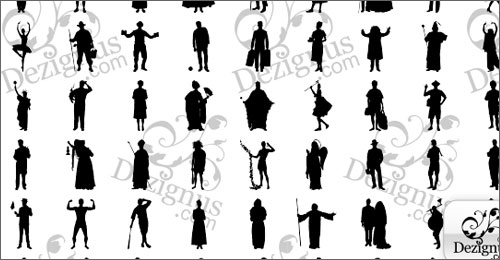
From Cowboys to Wizards, Princesses to Ballerinas, this collection of Photoshop shapes features a whole bevy of costumed silhouettes.
Victorian Silhouettes Font
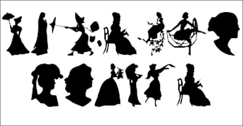
Gorgeous Victorian-style silhouettes in a dingbat font, for your next 1800-inspired design.
Children’s Silhouettes Photoshop Brushes
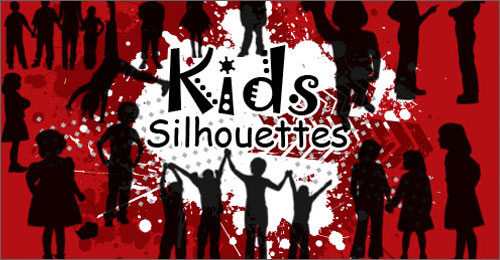
30 little boys and girls, individually and in groups, are featured in this collection of Photoshop brushes. For non-commercial and personal use only.
Egypt Silhouettes Font
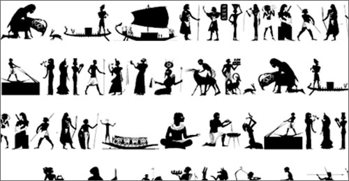
Egyptian heiroglyphic-inspired silhouette dingbats worthy of the walls of an ancient pyramid.
Kitchen Silhouette Vectors
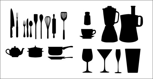
I run a food blog, so cooking-related design elements are something I always have in my library. These, which include silhouettes of pots, pans and whisks in vector format, are a personal favorite.
Facetype Font
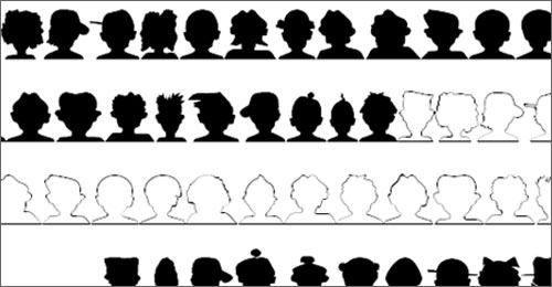
Perfect for avatar design or a community website, this font includes silhouettes of people’s heads in all shapes and sizes.
Fitness Silhouettes Vectors
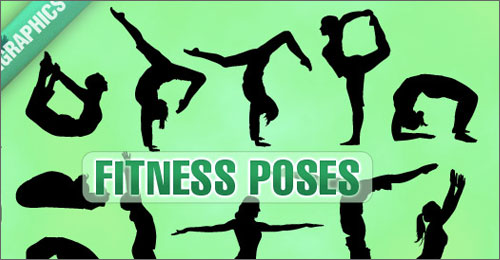
From traditional yoga poses to- the exercise I hate the most- lunges, these silhouettes of fitness poses are great for logo designs or to perk up your health-related blog.
The Rap Attack
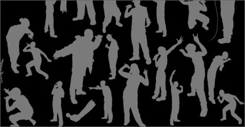
Yo yo yo! Here’s a vector pack of rap-related silhouettes, complete with rappers wearing hooded jackets and a particularly nice microphone vector.
117 Jumping People Vectors
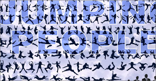
Might as well jump? Adding a jumping or flying person silhouette to your design adds an element of action, which is always good.
86 Dog Silhouette Vectors
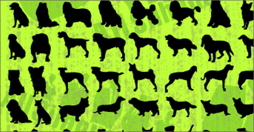
There are many dog silhouette collections out there, but this one stands out because of the sheer number of dog breeds it features. From a Poodle to a Lab, a Bulldog to a Terrier, the silhouettes are drawn well enough that they’re unmistakable.
Glamour Girls Silhouette Vectors

You might be tempted to pass this one up, thinking it’s just another “sexy girl”-type collection, but look again. The silhouettes here depict “modern” girls engaged in various activities, from walking a (little) dog to meeting a girlfriend for coffee (complete with cafe table!)
Regular People Silhouette Vectors

I like this one because it features “regular”-looking people, wearing casual everyday clothing.
Couples Silhouette Vectors
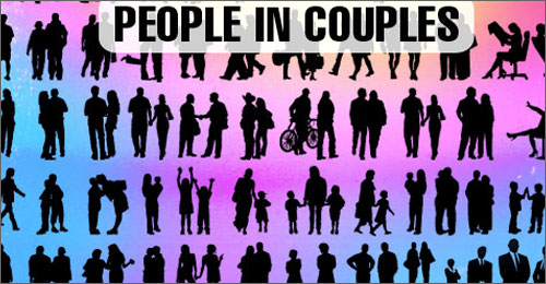
Because two silhouettes are better than one, this one features couples- and not just the romantic type, either. There are a mother and child, office workers, girlfriends and so forth.
SilhouetteA Font
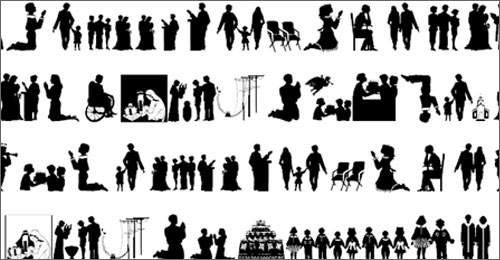
Dingbats of silhouettes with a religious/spiritual theme, including people kneeling in prayer, a nativity scene, and an angel with wings. Good for religious holidays.
Silhous Two Font
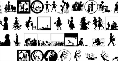
Finally, these are silhouettes I adore, mostly because they have a vintage feel to them, but also because they’re drawn in such detail.
Do you use silhouettes in your design work?
Designing WordPress Child Themes
I’ve mentioned before that more than 95% of the sites I’ve been hired to develop for the past few years have been built on WordPress. Now, while many of these require a completely customized, original theme built from scratch, most of them are built on a basic, well-crafted “framework”.
You already know about CSS framework systems, such as the Grid– but today I want to talk about WordPress child themes, which are sort of like using a framework system, but maybe even better.
If you create WordPress themes on a regular basis, this bit of text, which goes at the top of your style.css file, should be quite familiar to you:
/*
Theme Name: My Awesome Theme
Theme URI: http://devlounge.net/my-awesome-theme/
Description: An awesome, all-original theme.
Author: Mr. Awesome Author
Author URI: http://devlounge.net/mrawesomeauthor
Version: 1.0
.
My original, awesome theme.
.
*/
Now let’s say I want to create a child theme for My Awesome Theme, called “Eldest Daughter”. At the top of my child theme style.css file, I would do this:
/*
Theme Name: Eldest Daughter
Description: Child theme of My Awesome Theme
Author: Miss Eldest Daughter
Author URI: http://devlounge.net/miss-eldest-daughter
Template: my-awesome-theme
Version: 1.0
.
The eldest daughter of My Awesome Theme.
.
*/
@import url (“../my-awesome-theme/style.css”);
What you’re doing here is establishing Eldest Daughter as the child of My Awesome Theme with this line:
Template: my-awesome-theme
Then making sure to import the styles from My Awesome Theme with this line:
@import url (“../my-awesome-theme/style.css”);
And just like that, your child theme will inherit all the styles from its parent theme, and anything you put in the child theme’s style.css file will override its parents elements without making changes to the original styles.
And that’s how to get started creating WordPress child themes. You can learn more here: How to Modify Themes the Smart Way and at the WordPress Codex.
Do you create and/or use child themes?
