Sabrina Dent is a strong-willed, no-nonsense pixel pusher based in Ireland. Reading through her awesome blog will easily tell you that. [Read more…]
Sass x Class = Lea Alcantara
Lea Alcantara is one of the better-known web designers online. At only 27, she has already set up her own design company and has made a name for herself in the design community.
Cymbolism: An Interview with Mubashar Iqbal
Picking the right color for your design can be a hassle, that’s why there’s so many color schemer tools out there, of course. Recently, a slightly different one was launched by Suffolk Software, called Cymbolism. What it does is that it asks you which color you associate with a word, “love” for instance, and use that data to suggest colors based on keywords, rather than just displaying sets. I found that interesting, so I decided to interview the developer, Mubashar Iqbal, about this service.
The Interview
 So what is Cymbolism, your new web app?
Cymbolism is a crowd sourcing application that that attempts to quantify the association between colors and words. Users are shown a word, and are asked to select which color they associate with that word. The user votes are tallied to quantity which colors are most associated with that word.
How would you say a designer should use Cymbolism?
When working on a new design, the creative brief usually includes a few key words that help drive the design direction.
You can lookup these words on Cymbolism, via the search functionality, and see what color people associate with those words which can provide you starting point for your designs color scheme.
Even if you decided to go against the current trends, Cymbolism will tell you what the trend is.
What sparked the Cymbolism project?
I’m really bad a picking color schemes for my web projects, so I’ve been reading a lot of articles and books on color theory, and they mention the psychology of color a lot. I started searching around the web to see if there was something more up-to-date for those associations, when I couldn’t find anything the idea for Cymbolism was born.
What are your thoughts on how colors are used in web design today?
I think the bigger sites still play it a little too safe. Most of those sites have much the same light background with a little splash of color. Even companies that have strong color associations (UPS for example) don’t make strong enough use of these colors.
What do you think govern our color choices in design? Is it all trends?
External trends do play a large role in color choices. When we see one effective use of color it usually spawns a lot of copy cats.
Same is true off-line. We still pay too much attention to what the next big color will be at the annual fashion shows, driving a lot of color choice in the print world.
Online we are able to adapt quickly and easily so people should not be afraid to try new things.
I’d like to thank Mubashar Iqbal for the interview, and urge you all to take a look at Cymbolism. Maybe it can help you in your upcoming project!
Keegan Jones
It’s one noob after another. Today we check in with Keegan Jones, designer at Firewheel Design and one of the men behind Iconbuffet and Blinksale. Not to mention he also promotes how big of a noob he is on occasion.
Devlounge: Hello Keegan, thanks for taking the time to chat with us. Mind introducing yourself for anyone who may not know you?
Keegan Jones: Hello internets, I’m Keegan Jones. I am a designer for a small company in the Dallas/Fort Worth, Texas called Firewheel Design.
DL: How did you get started in design? Was it a life long hobby, or just something you kind of picked up on? Did you go through any specific schooling for it?
KJ: Back in 1999, my family got a 400MHZ iMac DV (graphite colored, baby!) for Christmas. At the time, I was in high school and skateboarded a lot. I started editing skate videos in iMovie, and wanted a place to post them online.
One day I was at the library and checked out a book titled “HTML for Dummies”. I installed a version of Adobe Golive (which I wouldn’t recommend), and started aimlessly figuring out how to put together a website. My dad, who is also a designer, brought home a copy of Adobe Photoshop 5.5. Long story short, I wasted a lot of time in Golive and Photoshop and ended up building a website called “Ollie Jones“.
To answer your question, I haven’t gone through any specific schooling for web/design stuff. Most everything I learned from reading books and looking at good design. When I got my first job at Neubix, Ryan Sims was a big influence and helped me become a better designer by critiquing my work.
DL: Firewheel Design, your design studio, is responsible for some truly kick ass products, which I’m sure most if not all of our readership is familiar with in both Blinksale and IconBuffet. What is it like running two successful projects like that our used by thousands upon thousands of people every day. Is it intimidating at all trying to get things “perfect”?
KJ: We have a lot of fun with Blinksale and IconBuffet. Our main goal is building things that we use ourselves, and hoping others will too. Thankfully, it has worked out so far. We don’t worry too much about getting things perfect. It’s easier to evolve by listening what users want.
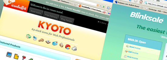
DL: For IconBuffet, what made you decide to allow users to “trade” free icons [through Free Delivery] with each other? In terms of marketing, has it worked successfully in getting more people to register and / or purchase premium icons?
KJ: For IconBuffet, we wanted to build a community around icons. Trading icons with others is the basis for our social network. It definitely has helped bring more people to the site. I’m actually not sure if the increase in registered users has translated into more purchasers of premium icons.
DL: According to the Firewheel splash at the moment, the doors have been locked while you work on a new project. Is there any way we can pry out any little bit of information about what this new project may involve?
KJ: Mums the word on our new stuff. If it peaks your interest, go to Firewheel Design and enter your email addy. We will drop you an email when we launch (which should happen before the end of the year).
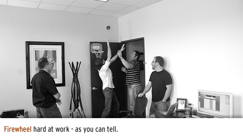
DL: Last summer when we talked to Ryan Sims, The Big Noob was basically turned off. Since that, it’s made a powerful return, most notably with some sharp blue Noob shirts that even you have sported. What brought the Noob back out from the shelf?
KJ: The Noob was turned off because a lot was happening in our lives. Brad Smith and Ryan Sims had just moved to Boston, and I to Dallas. During that transition, we didn’t have time to keep fresh content coming. But life has settled down now, and we are back. Noob power!
DL: Alright, last question. When not designing, what are your other main hobbies?
KJ: I enjoying playing Xbox 360 (currently a lot of Madden ’08), pretending to be a photographer, making silly videos, hanging out with friends, and trying new restaurants.
Thanks for your time!
Jonathan Snook
Today we are joined by Jonathan Snook, of Snook.ca, Withcake, Haylia, and the Sidebar Creative.
DL: I assume a good portion of my audience knows who you are, but care to introduce yourself and share some facts about yourself with us?
Jonathan Snook: My name is Jonathan Snook and I’m a web designer/developer based out of Ottawa, Canada. I’ve been running my blog at Snook.ca since 2003 although I’ve had posts from 2001 before I really called my site a blog. I’ve been tinkering on the web since 1995. These days, I freelance full time all the while just trying to be an active member of the online community.
DL: You’ve thrown a lot of your support behind the CakePHP framework, and not to long ago, your personal site was also updated to use Cake as the backend rather than Movabletype. What do you like best about Cake that convinced you to switch and play around with it?
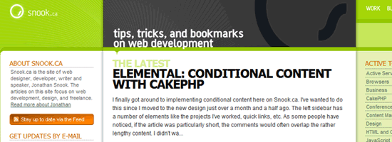
JS: The best part about Cake has to be the automation of mundane tasks. It takes the convention over configuration concept from Rails and does it in PHP. It’s been a pleasure to develop with and has given me the flexibility to customize my site in a way that wasn’t very easy to do in Movable Type or WordPress.
DL: On the topic of Cake, you also created your own CakePHP developer job board, called Withcake. With all the job boards already out there, how has Withcake been doing? Do you think it helps focusing on just one job field, in this case, Cake developing, as opposed to a bunch of different fields? (Personally, this would be my kind of job board – anything with Cake is usually good)
JS: By this point in time, I was hoping to see Withcake.com really see a surge but instead, it’s been in a maintenance pattern. Not enough people yet to have it complete at the level of other job boards but its specialization in a specific framework means it doesn’t have to either. There are companies and developers alike who’ve chosen CakePHP as the core to whatever they happen to be building. It’s great that they have a central place to go to and find like-minded people to work on projects together.
DL: The newest project just launched from Sidebar Creative is My Mile Marker. From what I understand, you were responsible for the UI. How long was this project planned for, and what was the inspiration behind it?
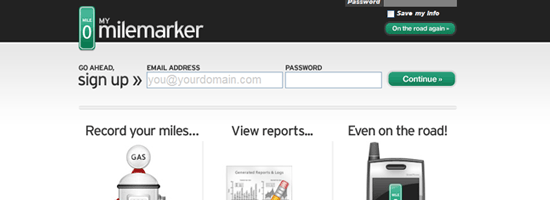
I’d have to look back but I believe the original idea behind this was Steve Smith’s. We often discuss various project ideas and this is one we had settled on as being the first as it would be fairly quick to put together and launch. There was no specific development plan; we just worked on it when we could with each of us providing insight or development along the way.
DL: Being part of Sidebar Creative, where each of you have your own obligations to other companies / sites / etc, how easy it is to find time for everyone to sit down and put work in on a project like this? Do you wait for everyone to have a free block in their schedules, or is everyone allowed to work at their own pace?
It’s worked out extremely well with each of us being able to pitch in at different times in different ways. None (or at least, very little) of the development was done simultaneously. We’d simply chat when we needed to, exchanging files until it was all done. It’s an oddly seamless process, that speaks to the power of the web and to the fantastic group of people I’m extremely happy to be associated with.
DL: Last project question, I swear. What do you hope your Haylia project accomplishes, and when can we expect to see it go live? For those that have not heard / seen it yet, Haylia is hosted blog solution for sharing adoption stories, inspired by your own adoption story. I think it is an excellent idea, and a great way to take the traditional hosted blog platform to a different, much more personal and focused level.
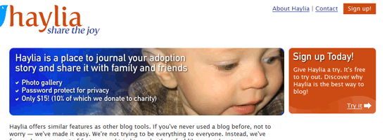
JS: I’d like Haylia to become a success, of course. Success means a few different things in this context, though. Sure, there’s the financial success one hopes for but more importantly, it’s enabling people to share their stories. My wife and I believe that adoption can be a great experience and one that should be shared with many people.
Launching the site for the masses, however, has taken longer than hoped. Working on it has taken a back seat while I work on client projects but I do intend to have it see a soft launch before the end of August. The majority of the functionality is already in place and ready to go. There’s just some polish and some templates that need to be added.
That’s been my biggest problem as a freelancer: I don’t spend as much time on my own projects as I should.
“It’s an oddly seamless process, that speaks to the power of the web and to the fantastic group of people I’m extremely happy to be associated with.” – Snook on working with Sidebar Creative
DL: If you could name five must have apps you use everyday (web and/or desktop based), what would they be?
JS: Very utilitarian, I’m afraid: Microsoft Outlook, Gmail, Firefox, Mint (I’m a stats junkie), and UltraEdit (currently my text editor of choice).
DL: Alright, last question. Here comes your free plugging opportunity. Could you please share some sites you visit / read daily? They can be on whatever topics imaginable – they don’t have to be design / development related.
JS: With the advent of RSS, Google Reader has become essential. There’s no sites that I specifically jump to on a daily basis to check if there’s new stuff. The sad consequence of that is that there has been the occasional RSS feed that gets changed up and I’ll lose track of a site for a couple months until I suddenly realize I’ve been missing some good content. Now, there are certain sites that are consistently good like Roger Johansson’s 456 Berea Street, Andy Rutledge’s Design View, and Simon Willison’s site, especially his daily links. Natalie Jost also has really good, insightful posts. There’s so much talent in the industry it’s hard to keep up with everybody!
DL: Thanks for answering a few questions for me. Good luck with the many projects you currently have on your plate, and of course, we will all be awaiting to see what else is next.
JS: You’re welcome and thank you very much!


