For years, web design has followed the same pattern of going to the drawing board, drafting up an idea, and putting it on the web. However, agile web development calls that methodology into question, and it may be exactly what your business needs for an overall better user experience. [Read more…]
8 Analog Tools to Help You Design
Design doesn’t just happen in software, editors, or the browser—it often starts offline with the simplest of tools: pen and paper. With that in mind, let’s do a round up of helpful analog tools that can aid you in the process of brainstorming, doodling, sketching, wireframing, or prototyping by hand.
BASICS Notebook

The BASICS Notebook keeps you both productive and creative so you can stay on top of your project timelines and do the ideation in one place. It has different page layouts like calendars and checklists plus blank sheets & erasable whiteboard pages right in the palm of your hand. It also has practical features like a back pocket for loose leaves and just enough of a gap so you can tuck in your pen at the top.
Website Deck
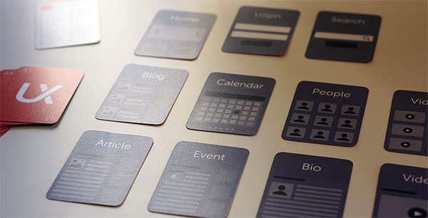
UX Kits Website Deck gives a tactile approach to website mapping & information architecture. Each card in the “deck” represent different types of content or interface patterns you can lay out and rearrange as you plan the the site or app structure. Numbered from 1-53, they’re also portable & reusable.
Whitelines
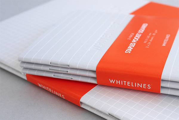
Whitelines produces pads & books that, as the name suggests, sport white lines on their sheets. One of its products, Whitelines Link, has marked corners which helps its companion app digitally capture your ideas.
The Psychology of Colour Pencil Set
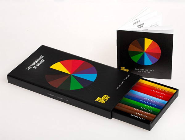
The Psychology of Colour Pencil Set consists of 12 colored pencils, each labeled with a word conveyed by its corresponding color. The set also includes a booklet that expounds on those concepts.
Dotgrid

Dotgrid features different incarnations of notepads and papers with dotted grids on their sheets. Special editions like a birch wood cover and a tribute to Steve Jobs are available.
Magnetic Blackboard Wallpaper

The Magnetic Blackboard Wallpaper lets you draw and stick stuff at the same time without the bulk of an actual board or the need to paint your walls. It’s available in three sizes: 63.5 x 265 cm, 127 x 265 cm, and 127 x 100 cm (width by roll length).
UI Stencils
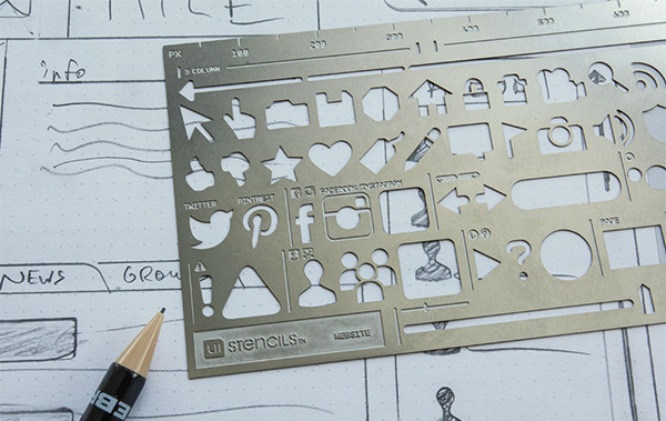
UI Stencils lets you sketch out different user interface elements on paper quickly with the help of different stainless steel and plastic stencils. They also have pixel rules & pads of browsers and mobile devices.
BreakThroughColour Cards + Cubes
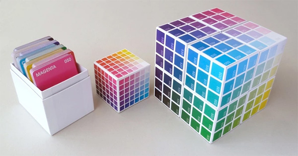
BreakThroughColour Cards + Cubes lets you explore or even play with a wide array of colors through dozens of colored cards and cubes. It special numbering system and and codes on the flip-side of the cards reveal how their vary on hue, saturation, and value.
Make your site more sociable with OpenGraph markup
These days, before people click on your site they will probably see it through a link shared on your social network of choice, such as Facebook, Twitter, Google+, and so on. Usually these sites are smart enough to extract descriptive information about your page and display that so followers already get a good idea of what they’d be clicking on, but wouldn’t it be great if you could optimize that information to ensure you get more engagement?
With a bit of HTML knowledge (and perhaps some programming knowledge, depending on what website templates you’re using), you can make more sites more “sociable” by adding these tags to the <head> portion of your site. Text in {CURLY BRACES} are placeholders for the values you need to insert.
og:url
<meta property="og:url" content="{URL}">
Use this to show the canonical url of your page, free from various query variables or tokens. If you use a CMS like WordPress, this can be automatically generated for posts and pages through a function like the_permalink()
og:title
<meta property="og:title" content="{TITLE}">
Use this to show the title of your page. By default sites like Facebook usually get the text from the <title> tag, displayed on the browser title bar or tab name, but that usually contains extra stuff like the site description. With a custom OG tag you can opt to modify that to your liking.
og:type
<meta property="og:type" content="{TYPE}">
Use this to indicate the type of content your link is all about. Of course all links are websites, but they can also be more specific things like articles, products, books, movies, restaurants, and more.
og:image
<meta property="og:type" content="{IMAGE}">
A lot of times the images that displays with your link can encourage or prevent people from clicking, so make sure that you define this. There are optimal sizes for what Facebook, Twitter, and Google+ recommend, so be sure to check their individual documentation on that.
og:description
<meta property="og:type" content="{DESCRIPTION}">
Similar to title and image, you’ll want to optimize the description of your webpage since there is only so much text social networking sites can include in their link previews.
Closing note: on Twitter and Testing
When you’ve plugged in the above tags, you’ve pretty much guaranteed Facebook and Google+ to display your website links the way you customized it. However, Twitter has a couple more tags you might want to integrate, including twitter:site, where you can plug in the Twitter handle of your website, and twitter:creator, a different person or organization that is behind the website.
Twitter also has content types called Cards, which lets you specify the most appropriate layout for a link preview—whether it’s a summary card, a summary card with a large image, an app card, or a player card. Each card type emphasizes different data, so choose wisely or switch things up as you see fit.
Finally, it’s always the best practice to test things before rolling them out. Check out the links below for more detailed documentation and tips for sharing content on each social network:
- Facebook Debugger Tool
- Facebook Guide to Sharing for Webmasters
- Google+ Platform for the Web
- Twitter Cards Guide
- Twitter Card Validator
Schema: Using Structured Data Markup to Improve Your Site’s SEO
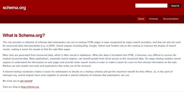
A beautifully developed website doesn’t matter if no one ever sees it. Incorporating structured data markup, according to standards from the Schema.org project, makes it easier for search engines to crawl your site.
Although there’s no hard evidence that structured data markup directly improves search rankings, it can increase the number of referrals from search engines to your site, and it can help your search rankings by working hand-in-hand with Knowledge Graph. [Read more…]
4 Tips to Personalize E-Commerce Websites
It takes a lot of work and an aesthetic eye to create a well-designed Web site. It also takes expertise to present your e-Commerce story in a way that will attract customers and traffic to your website. With quality images, a simple but transparent check-out process, customer service options and a user-friendly navigation mechanism, personalizing e-Commerce sites with today’s tips is a way to become more competitive in your field of business.
First impressions
For a new e-Commerce site, it’s important to put your best foot forward. This means that everything you do in design should not only be pleasing to the eye, but functional. Web designer have to constantly code a brand’s website with the customer in mind. The site should be hassle-free. Any confusion caused by an ill-thought-out design could cause you to lose customers. There are too many options and too much competition to even lose one customer. It’s the Web designer’s obligation to never create any doubt in the customer’s mind as to how to navigate properly, or, more importantly, how to complete a transaction.
Social integration
By adding the brand’s social network icons to the page, you’re telling customers that you are not only current with today’s Web 2.0 technology, but also that you would like to engage them. Facebook, Twitter, Google+ and Pinterest are mainstays for customers who want to provide brands with feedback on an ongoing basis. Additionally if the e-Commerce site also features a blog page, it shows they are thought-leaders in their field.
Search Engine Optimization
If an e-Commerce site has a large number of products that frequently change, it’s important that the Web designers adhere to the “white hat” search engine optimization rules. These include targeted page titles and meta descriptions. According to SEO experts, “One of the fundamental rules of SEO for an e-Commerce site is you should treat every page on your website as a landing page focused around performing for a single SEO search term and converting the resulting traffic.”
Fastest route between two points
Everyone knows that the fastest route between two points is a straight line. This applies to e-Commerce sites as well. It’s a fact that the quicker a website can get the customer from the landing page to a completed order, the more likely it is to keep the customer. Well-designed e-Commerce Web sites always have that goal in mind.
Personalized e-Commerce
Personalized gift shops are a sub-set of e-Commerce websites. While some of the products these sites sell can be purchased elsewhere, their unique advantage to the customer is that they can personalize all orders in accordance with the customer’s preferences. Personalised Gifts Shop in the UK is well-designed website that provided their web designers with a lot inspiration to not only create an aesthetically pleasing design but one that prompts buyers to proceed through the personalization process in a quick and efficient manner. [Read more…]

