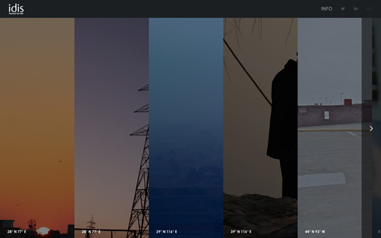
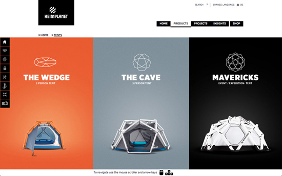
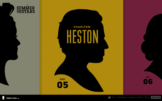
This week’s designs feature a primary layout of multiple columns spanning the height of the screen, with some horizontal navigation thrown in.
Designs of the Week
Ready to go out and design your next website? Try building with the Catalyst Framework.

Not all the columns are squeezed in the width of the browser, which could have easily been done but they chose to let you scroll left or right to see the rest. Everything’s bright on first load but the others fade out when you start hovering on a specific area.

With the keyboard navigation enabled on this site there’s also controlled scrolling; it’s kind of a package deal for that interface pattern. Color palette’s predominantly black and white, with bright accent colors in the products and backgrounds.

The images are divided with skewed lines, a motif that carries over to other sections, while the navigation is located at the bottom. On the Project page that menu moves to the middle and the arrows slide content in on both halves of the screen in opposite directions. The Team page also uses a similar sliding pattern done vertically and a bento layout.

The silhouettes idea is great. When you hover you’ll see the names of each star typeset uniquely too.
Social Media Weekly
Search Optimized, Turn-Key Designs, Unlimited Everything. Start building with the Genesis Framework today.
Design – Government Digital Service Design Principles
“The design process must start with identifying and thinking about real user needs.”
User Experience – Why cards are the future of the web
“This is driving the web away from many pages of content linked together, towards individual pieces of content aggregated together into one experience.”
Design – Be nicer
“We designers are a critical group. Part of our job to find fault and improve but there is both a right and a wrong way to go about things.”
