Logos are the keys to success – the starting point for branding of any kind. But how can you put one together that stands out, and creates an original remember-able icon for your site? Today, we’re breaking down some of the best rated logos on Colin and David’s Logopond, and focusing on what makes them great. We’ll also take a look at more larger, well known logos, and see what has made them work.
What is a logo?
First, what exactly is a logo? Let’s take a look at an official definition from dictionary.com:
“lo·go (n) – A name, symbol, or trademark designed for easy and definite recognition, especially one borne on a single printing plate or piece of type.”
Ah I see, so a logo is something (can be anything) used to represent someone or something. Pretty obvious huh? We seen logos all around us, store after store, billboard after billboard, and even person after person. We all have our own branding, that distinguishes us from anyone else.
When creating logos on the web, you’re looking for that same effect. You want to stand out, and have something that makes it easier for everyone to remember “oh yeah, that’s this site”. Let’s get into how we do that.
Get Your Ideas on Paper
The best place to start logo designs, particular if there going to include some kind of symbol, is with a piece of paper and a pencil. Here, you can let your ideas flow, and sketch up anything that comes to mind. Even if you yourself don’t plan on designing it, sketches can really help logo designers by giving them definitive directions to head off in.
Let’s use our logo’s example. While a horrible one because of how simple and basic it is, I did put a lot of thought into it when we first began constructing Devlounge in late 2005.

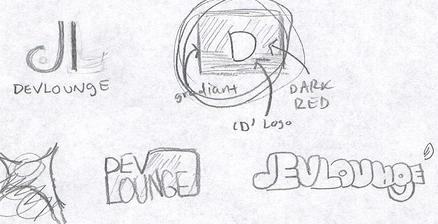
We wanted something simple, especially because, at the time, the logo was the least of our concerns. For the most part, we had thought the logo would be text and text only, until we put together the simple box with a letter in it. It worked for us, so we have left it as it for now, but we do want to start fresh soon. You can see some of the rough (very rough) sketches above.
Details Matter
Even some of the smallest details matter when creating logos. It’s not always the big things that can leave effect, but minuet details.
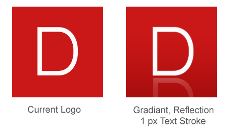
Let’s first look at our logo again. In the image below, you’ll see a comparison of our current logo, and a quickly mocked up version which added just a few small details: A light to dark red gradient, reflection, and 1 pixel border around the “D”. Looks a lot better, doesn’t it?

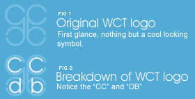
Many times, logos also have hidden details you may not see right away. In text, they can be cutout shapes or images, which adds a symbol but doesn’t make it all too obvious. There there are symbols would actually represent something else. Take a look at the Wecreatethings synergy logo below. I looked at this so many times, and all I ever saw was what figure 1 below shows – a cool looking symbol representing synergy.

But last night as I was half asleep and looking at it again, I noticed something. The logo was actually made up of text, a CC and DB, the initials of the two people behind WCT (Fig. 2). I thought it was ingenious, and I could not believe how long it took me to notice.
